
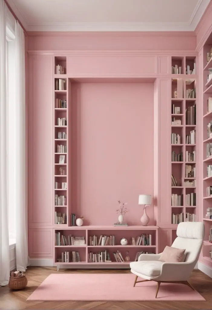
In the ever-evolving landscape of interior design, the significance of color cannot be overstated. Each hue carries its own unique energy and ambiance, capable of transforming a space from mundane to extraordinary. In 2024, one shade stands out as a beacon of elegance and sophistication: Bella Pink. This subtle yet striking color has been making waves in the design world, particularly in library spaces, where its soft warmth enhances the atmosphere and encourages creativity and contemplation.
Why Bella Pink?
Bella Pink is more than just a color; it’s an experience. Here’s why it’s the perfect choice to elevate your library space:
- Subtle Sophistication: Bella Pink exudes a sense of understated elegance, making it ideal for libraries seeking a refined ambiance. Its delicate hue adds a touch of sophistication without overwhelming the space, creating a welcoming environment for readers of all ages.
- Versatile Appeal: Unlike bolder shades that may dominate a room, Bella Pink is remarkably versatile. It complements a wide range of design styles, from classic to contemporary, making it suitable for libraries with diverse aesthetics. Whether your space features traditional wooden shelves or sleek modern furniture, Bella Pink effortlessly harmonizes with its surroundings.
- Calming Aura: Libraries are sanctuaries of peace and tranquility, where individuals seek solace from the hustle and bustle of daily life. Bella Pink’s soft, muted tones evoke a sense of serenity, inviting visitors to unwind and immerse themselves in the world of literature. Its calming aura fosters focus and concentration, creating an optimal environment for studying, research, or simply getting lost in a good book.
- Timeless Elegance: While design trends come and go, Bella Pink stands the test of time. Its timeless appeal ensures that your library remains stylish and relevant for years to come, transcending fleeting fads and maintaining its allure for generations. By choosing Bella Pink, you invest in a color that will continue to captivate and inspire for decades ahead.
- Enhanced Lighting: One often overlooked aspect of interior design is the impact of color on lighting. Bella Pink’s warm undertones have a flattering effect on natural and artificial light, imbuing your library with a soft, flattering glow. This subtle enhancement not only brightens the space but also elevates the overall atmosphere, creating a welcoming haven for book lovers.
Tips for Matching Bella Pink:
When incorporating Bella Pink into your library design, consider the following tips to ensure a harmonious and cohesive look:
- Neutral Foundations: Pair Bella Pink with neutral tones such as crisp whites, soft grays, or warm beiges to create a balanced color palette. Neutral backgrounds allow Bella Pink to take center stage while providing a calming backdrop for reading and relaxation.
- Natural Accents: Introduce elements of nature, such as wood furniture, woven textiles, or indoor plants, to complement Bella Pink’s organic warmth. These natural accents add depth and texture to your library space, enhancing its visual appeal and creating a connection to the outdoors.
- Metallic Accents: For a touch of glamour, incorporate metallic accents such as brass, gold, or copper. These luxurious finishes contrast beautifully with Bella Pink’s softness, adding a hint of opulence to your library decor.
- Artwork Selection: Choose artwork that complements Bella Pink’s color palette and enhances its aesthetic impact. Look for pieces with similar tones or themes to create a cohesive visual narrative within your library space.
- Layered Textures: Experiment with different textures and materials to add dimension to your design. Consider velvet upholstery, plush rugs, or textured wallpaper to create visual interest and depth, enhancing the tactile experience of your library.
Hue Matching:
While Bella Pink reigns supreme as a timeless choice for library spaces, exploring alternative hues can offer new dimensions to your design palette. Consider these five hues for inspiration:
- Blush Rose: A slightly deeper shade than Bella Pink, Blush Rose infuses your library with a romantic and nostalgic charm. Pair it with soft whites and dusty blues for a dreamy, ethereal aesthetic.
- Mauve Mist: With its subtle gray undertones, Mauve Mist adds a touch of sophistication to your library decor. This muted hue pairs beautifully with warm woods and metallic accents for a modern yet timeless look.
- Dusty Lavender: Embrace tranquility with Dusty Lavender, a serene hue that evokes the beauty of a summer garden. Pair it with sage green and pale yellows for a fresh and inviting atmosphere in your library.
- Coral Blush: Infuse your library with energy and warmth with Coral Blush, a vibrant hue that exudes joy and vitality. Contrast it with crisp whites and navy blues for a bold and eclectic aesthetic that sparks creativity.
- Soft Peach: For a subtle and understated look, consider Soft Peach, a delicate hue that radiates warmth and comfort. Pair it with soft grays and warm neutrals for a cozy and inviting atmosphere in your library.
Alternative Colors from Sherwin Williams and Benjamin Moore:
If Bella Pink isn’t quite the right fit for your library space, explore these alternative colors from Sherwin Williams and Benjamin Moore:
Sherwin Williams:
- Romance (SW 6323): A soft and romantic pink with warm undertones, perfect for adding a touch of elegance to your library decor.
- Delicate White (SW 7018): A crisp and clean white with subtle undertones of gray, ideal for creating a timeless backdrop for your library design.
- Misty (SW 6232): A muted gray with hints of blue, evoking the tranquility of a misty morning and creating a serene atmosphere in your library.
Benjamin Moore:
- Pink Bliss (2109-60): A pale and ethereal pink with a hint of peach, reminiscent of a gentle sunrise and perfect for infusing your library with warmth and serenity.
- Gray Owl (OC-52): A soft and versatile gray with subtle undertones of blue, creating a soothing backdrop for your library design while allowing other colors to shine.
- Sparrow (AF-720): A rich and sophisticated taupe with warm undertones, adding depth and elegance to your library decor.
Other Rooms to Use Bella Pink:
While Bella Pink shines brightest in library spaces, its versatility allows it to enhance a variety of rooms throughout your home:
Living Room:
Create a cozy and inviting atmosphere in your living room by incorporating Bella Pink accents such as throw pillows, curtains, or artwork. Pair it with neutral tones and natural textures for a relaxed yet refined aesthetic.
Bedroom:
Transform your bedroom into a serene sanctuary with Bella Pink bedding, accent walls, or upholstery. Combine it with soft linens, plush rugs, and ambient lighting for a tranquil and restful retreat.
Home Office:
Boost productivity and creativity in your home office with Bella Pink walls or furniture. This subtle hue fosters focus and concentration while infusing the space with warmth and sophistication.
Nursery:
Welcome your little one into the world with a nursery adorned in Bella Pink decor. Create a soothing and nurturing environment with soft textiles, whimsical accents, and subtle pops of color for a space that grows with your child.
Dining Room:
Elevate your
dining experience with Bella Pink table linens, dinnerware, or wall paint. Whether hosting intimate gatherings or festive celebrations, this versatile hue adds an element of refinement and charm to your dining room decor.
Conclusion:
In the realm of interior design, color plays a pivotal role in shaping the ambiance and character of a space. Bella Pink emerges as a timeless choice for libraries in 2024, offering a perfect balance of elegance, versatility, and tranquility. Whether adorning the walls of a cozy reading nook or accentuating the shelves of a grandiose library, Bella Pink elevates the atmosphere and enhances the overall experience for visitors. By incorporating this subtle yet striking hue into your library design, you create a haven of inspiration and imagination that transcends time and trends. So, dare to embrace the allure of Bella Pink and embark on a journey of timeless elegance and sophistication in your library space.


