In the realm of interior design, choosing the right paint color can be a transformative decision, setting the tone and ambiance of a space. As we navigate through the trends of 2024, one color stands out for its ability to infuse a room with a sense of freshness and vitality: Crisp Linen. This versatile hue not only brings a touch of modernity but also exudes warmth and sophistication. Here’s why you should consider Crisp Linen paint for your living room makeover:
Why Crisp Linen?
Crisp Linen paint embodies a sense of purity and airiness, reminiscent of a sunlit morning in a cozy bedroom. Its soft, neutral tones evoke a feeling of serenity, making it the perfect backdrop for any decor style. Whether your aesthetic leans towards minimalist chic or classic elegance, Crisp Linen adapts effortlessly, allowing your furnishings and accents to shine.
5 Tips to Match Color:
- Consider Natural Light: Before committing to Crisp Linen, assess how natural light interacts with your living room throughout the day. This shade beautifully reflects sunlight, creating a luminous atmosphere. For rooms with limited natural light, Crisp Linen can still work wonders, but you may want to supplement with strategically placed lighting.
- Coordinate with Furniture: Take stock of your existing furniture pieces and consider how Crisp Linen will complement them. This versatile hue pairs exceptionally well with both warm and cool tones, allowing you to play with textures and patterns without overwhelming the space.
- Sample Before Painting: Always test paint swatches in your living room before making a final decision. Lighting conditions and surrounding colors can significantly influence how Crisp Linen appears on your walls. By sampling the color, you can ensure it aligns with your vision for the space.
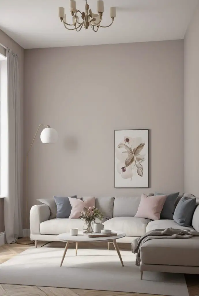
- Accent with Accessories: Enhance the vibrancy of Crisp Linen walls by incorporating accessories in complementary shades. Soft blues, muted greens, and blush pinks harmonize beautifully with this neutral base, infusing your living room with subtle pops of color.
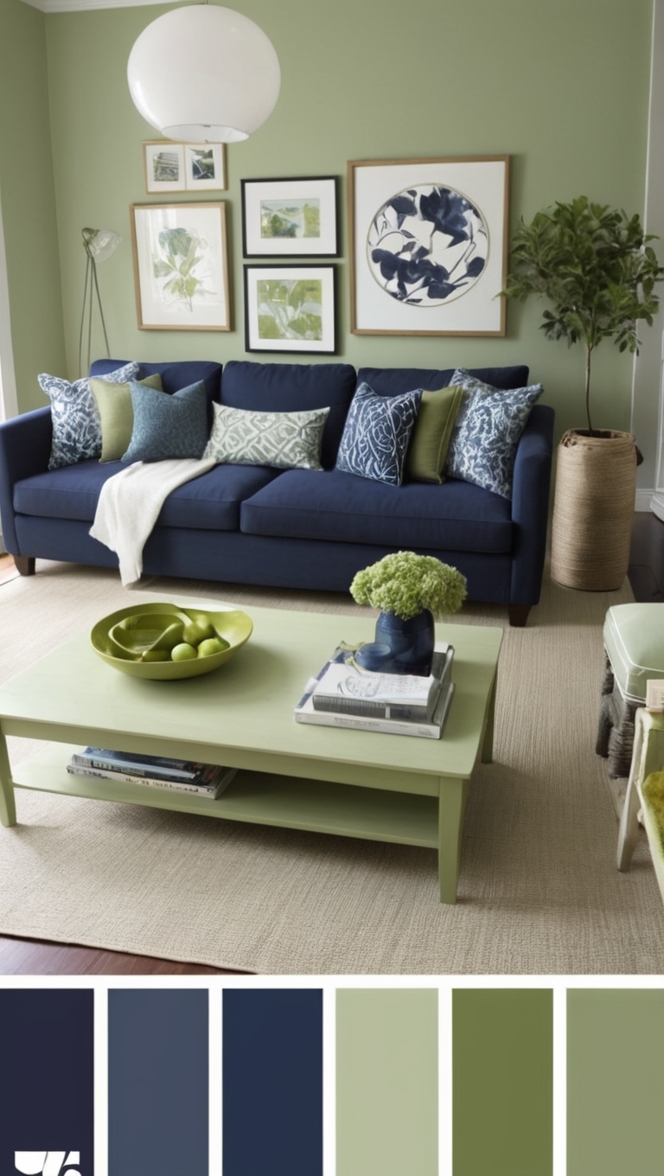
- Embrace Contrast: Don’t shy away from contrast when styling your Crisp Linen-clad living room. Rich, dark accents such as navy blue or charcoal gray can create striking focal points, adding depth and visual interest to the space.
5 Hue Matching Options:
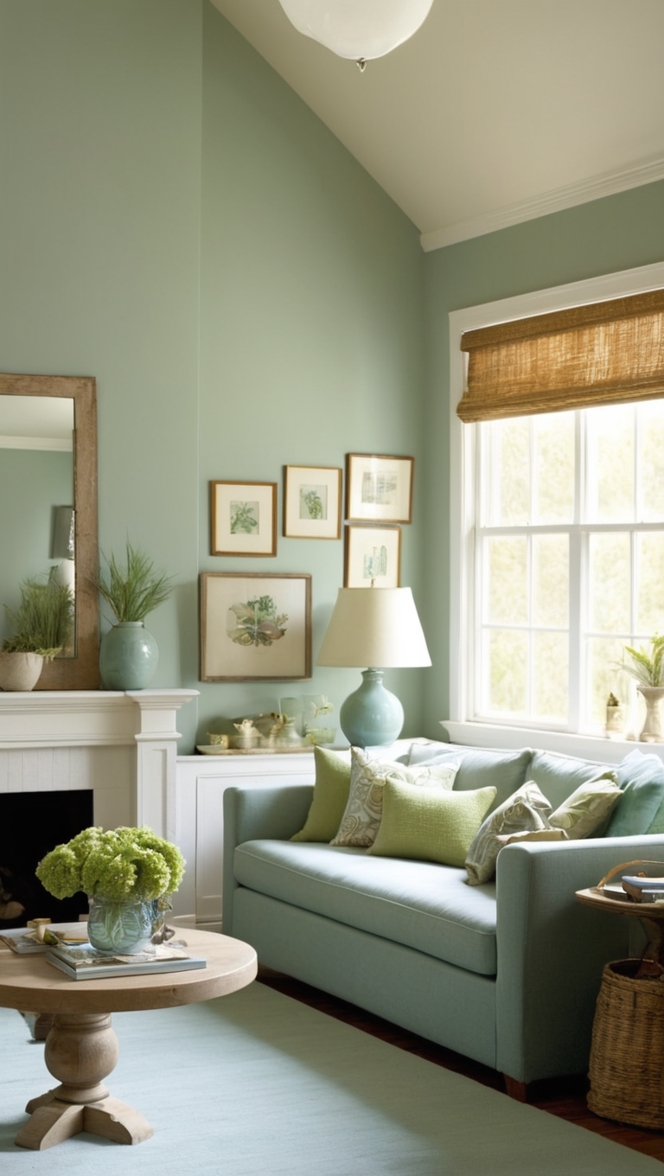
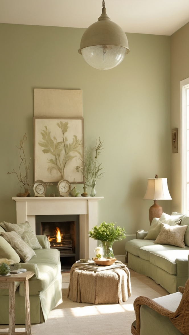
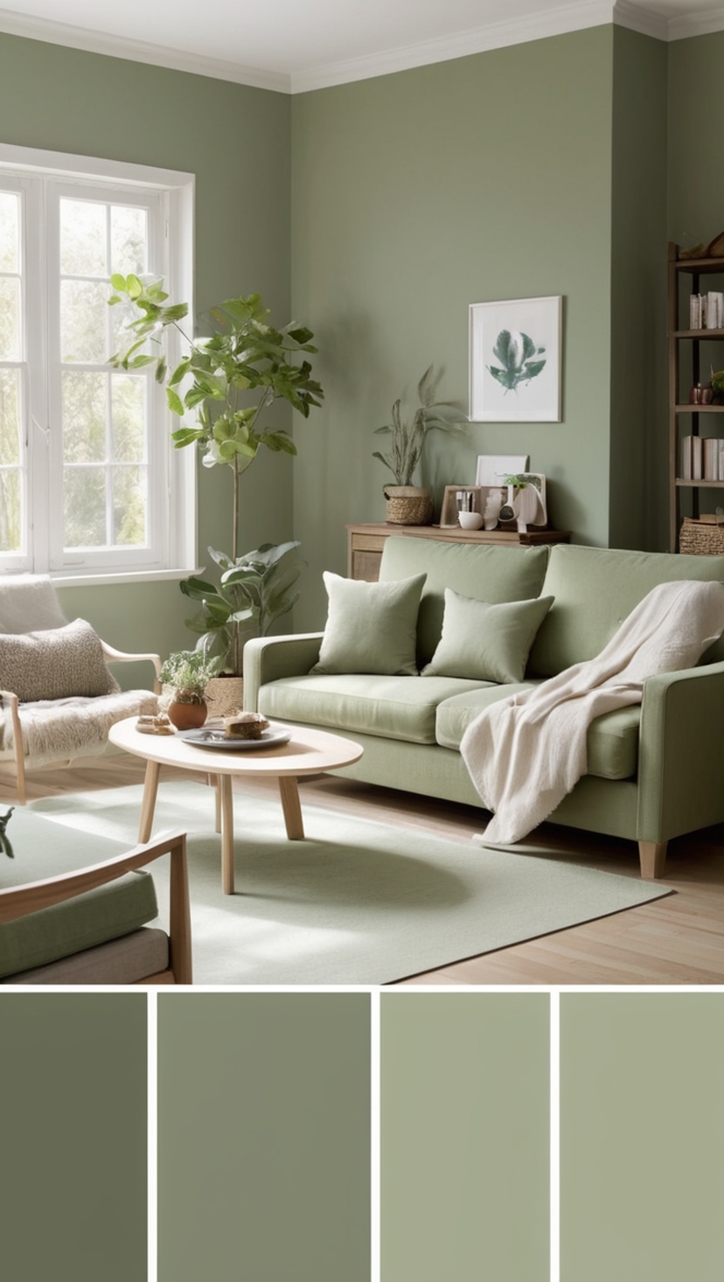
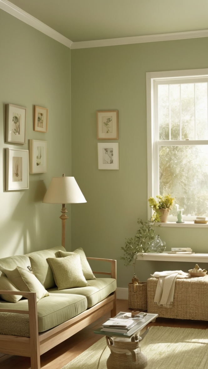
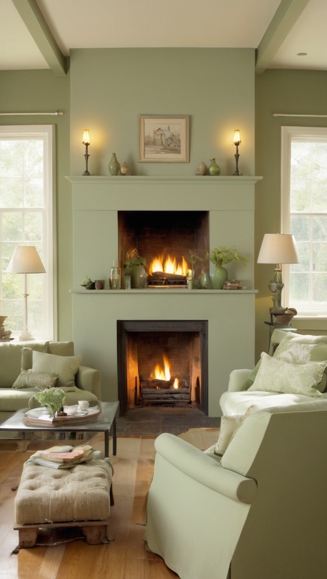
- Soft Sage: Pair Crisp Linen with soft sage accents to evoke a tranquil, nature-inspired ambiance. This combination is particularly well-suited for those seeking a calming retreat within their living space.
- Warm Sand: For a beachy, coastal vibe, consider incorporating warm sand hues alongside Crisp Linen walls. This pairing exudes casual elegance and invites relaxation, perfect for coastal-inspired decor themes.
- Dusty Rose: Infuse a hint of romance into your living room by complementing Crisp Linen with dusty rose accents. This delicate pairing lends an air of sophistication while maintaining a soft, inviting atmosphere.
- Charcoal Gray: Opt for a modern, monochromatic look by juxtaposing Crisp Linen with charcoal gray elements. The contrast between light and dark creates a dynamic visual interplay, adding depth and dimension to your living room design.
- Navy Blue: Elevate the sophistication of your living room with accents in deep navy blue. This classic pairing exudes timeless elegance and lends a sense of gravitas to any space, making it ideal for those with a penchant for refined aesthetics.
5 Alternative Colors from Sherwin Williams and
Benjamin Moore:
- Sherwin Williams’ Alabaster: A timeless off-white hue, Alabaster complements Crisp Linen beautifully, creating a harmonious, light-filled space.
- Benjamin Moore’s White Dove: Another classic choice, White Dove offers a subtle warmth that pairs effortlessly with Crisp Linen, infusing your living room with cozy charm.
- Sherwin Williams’ Agreeable Gray: For those seeking a slightly cooler undertone, Agreeable Gray strikes the perfect balance between warmth and neutrality when paired with Crisp Linen.
- Benjamin Moore’s Revere Pewter: With its soft, greige undertones, Revere Pewter provides a sophisticated backdrop for Crisp Linen, allowing both colors to shine in harmony.
- Sherwin Williams’ Sea Salt: Add a touch of coastal-inspired serenity to your living room by combining Crisp Linen with the subtle blue-green hues of Sea Salt, creating a tranquil oasis within your home.
Other Rooms to Use Crisp Linen:
Bedroom: Transform your bedroom into a serene sanctuary by painting the walls in Crisp Linen. This calming hue promotes restful sleep and serves as a versatile backdrop for layering textures and patterns in bedding and decor.
Kitchen: Bring a breath of fresh air into your kitchen with Crisp Linen cabinets or an accent wall. Paired with natural wood accents and metallic finishes, this color creates a welcoming atmosphere ideal for both cooking and entertaining.
Conclusion:
In the ever-evolving landscape of interior design, Crisp Linen emerges as a timeless yet contemporary choice for elevating your living room in 2024. Its soft, neutral tones provide a versatile canvas for expressing your personal style, while its inherent warmth fosters a sense of comfort and tranquility. Whether paired with soft pastels for a romantic aesthetic or anchored by bold accents for a modern twist, Crisp Linen paint brings a touch of freshness and sophistication to any space. Embrace its understated elegance and let your living room shine with newfound vibrancy and charm.