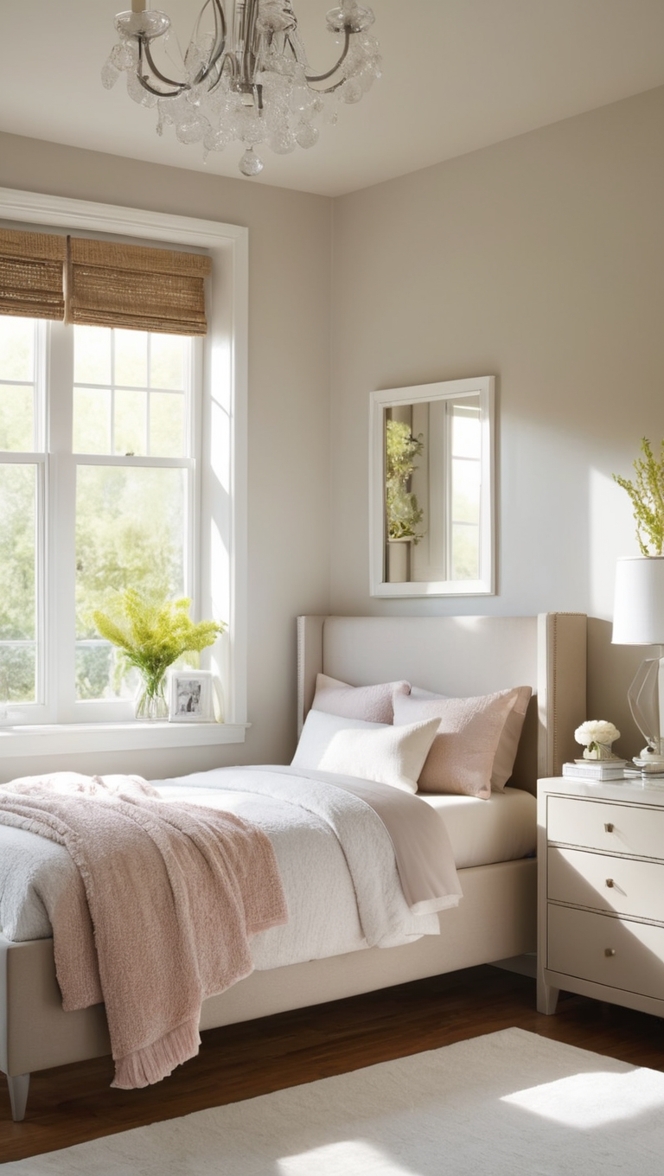
In the ever-evolving realm of interior design, the color palette sets the tone for the entire space. As we step into 2024, one hue that’s capturing attention and transforming bedrooms into serene sanctuaries is Impatiens Petal. This delicate shade of pink offers a perfect balance of warmth and tranquility, making it an ideal choice for creating a soothing ambiance in your sleep space.
Why Choose Impatiens Petal?
- Calming Effect: Impatiens Petal exudes a calming aura, making it conducive to relaxation and unwinding after a long day. Its soft, muted tone brings a sense of serenity to the bedroom environment, helping to induce a restful night’s sleep.
- Versatile Pairing: This subtle pink hue is incredibly versatile, effortlessly complementing a wide range of decor styles. Whether your bedroom features modern, minimalist furnishings or embraces a more eclectic aesthetic, Impatiens Petal seamlessly integrates into the design scheme.
- Light-Reflective Properties: As a pale shade of pink, Impatiens Petal has light-reflective properties that can visually expand the space, making smaller bedrooms appear airier and more spacious. This attribute is particularly beneficial for rooms with limited natural light.
- Timeless Elegance: While trends come and go, Impatiens Petal exudes a timeless elegance that transcends fleeting fads. By incorporating this sophisticated hue into your bedroom decor, you can create a space that feels both contemporary and enduring.
- Emotional Resonance: Pink is often associated with feelings of compassion, nurturing, and self-love. By incorporating Impatiens Petal into your sleep space, you infuse the room with these positive emotions, fostering a sense of comfort and well-being.
Tips to Match Impatiens Petal with Your Decor:
- Neutral Accents: Pair Impatiens Petal walls with neutral accents such as crisp white bedding, light wood furniture, or metallic accents in silver or gold. These understated elements will complement the soft pink hue without overwhelming the space.
- Subtle Contrast: Introduce subtle contrast by incorporating accents in shades of blush, mauve, or dusty rose. These tonal variations will add depth to the room while maintaining a cohesive color palette.
- Natural Textures: Incorporate natural textures like linen, cotton, or rattan to enhance the organic feel of Impatiens Petal. These tactile elements bring warmth and visual interest to the space while harmonizing with the gentle ambiance of the pink walls.
- Greenery: Infuse your bedroom with touches of greenery to create a tranquil oasis inspired by nature. Potted plants or a vase of fresh flowers not only add a pop of color but also contribute to a sense of vitality and rejuvenation.
- Artwork and Accessories: Select artwork and accessories that complement the soft, romantic aesthetic of Impatiens Petal. Opt for pieces with subtle floral motifs, abstract watercolors, or delicate line drawings to enhance the ethereal vibe of the space.
Hue Matching with Impatiens Petal:
- Soft Gray: Pairing Impatiens Petal with soft gray accents creates a sophisticated yet soothing color combination that evokes a sense of modern elegance.
- Creamy White: Incorporating creamy white hues alongside Impatiens Petal adds a touch of freshness and purity to the bedroom, enhancing its serene ambiance.
- Powder Blue: For a subtle pop of color, consider pairing Impatiens Petal with soft powder blue accents. This pairing creates a harmonious palette reminiscent of a tranquil sky at dusk.
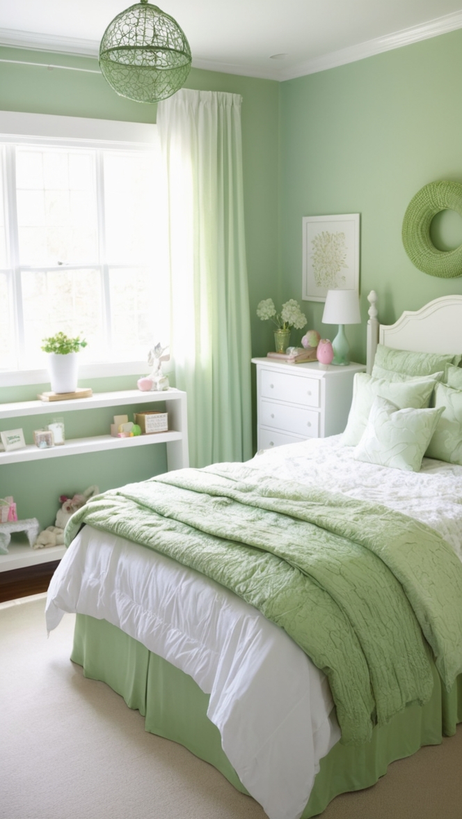
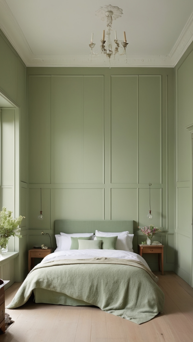
- Muted Mint: Infusing hints of muted mint green into your decor alongside Impatiens Petal can evoke a sense of tranquility and serenity, reminiscent of a peaceful garden retreat.
- Warm Taupe: Combining Impatiens Petal with warm taupe tones creates a cozy, inviting atmosphere with a timeless appeal that exudes understated sophistication.
Alternative Colors from Sherwin Williams and Benjamin Moore:
Sherwin Williams:
- Rose Quartz: A soft and romantic pink hue that complements Impatiens Petal beautifully, adding depth and warmth to the space.
- Blushing Bride: A delicate shade of blush that pairs effortlessly with Impatiens Petal, creating a dreamy and feminine ambiance.
Benjamin Moore:
- Ballet Slipper: A pale pink hue with subtle peach undertones, Ballet Slipper complements Impatiens Petal, adding a touch of warmth and elegance to the bedroom.
- First Light: A soft, rosy pink that harmonizes with Impatiens Petal, creating a serene and inviting atmosphere perfect for unwinding at the end of the day.
Other Rooms to Use Impatiens Petal:
Living Room: Incorporate Impatiens Petal into your living room decor to create a cozy yet sophisticated atmosphere. Pair it with plush textiles, comfortable seating, and accents in complementary hues for a harmonious and inviting space.
Home Office: Infuse your home office with the calming energy of Impatiens Petal to enhance focus and productivity. Combine it with natural wood furniture, ergonomic essentials, and inspiring artwork for a workspace that promotes creativity and well-being.
Nursery: Create a serene and nurturing environment for your little one by decorating the nursery with Impatiens Petal. Pair it with soft textiles, whimsical decor, and accents in shades of white and gray for a dreamy and inviting space.
Conclusion:
Incorporating Impatiens Petal into your sleep space is a surefire way to elevate its ambiance and create a tranquil sanctuary where you can relax and rejuvenate. With its calming effect, versatility, and timeless elegance, this delicate pink hue brings a sense of serenity and sophistication to any bedroom decor. By following these tips for matching colors and exploring alternative hues from Sherwin Williams and Benjamin Moore, you can design a sleep space that reflects your personal style while promoting restful nights and peaceful mornings.