
In the realm of interior design, selecting the right paint color can significantly enhance the ambiance of any space. For libraries, a sanctuary of knowledge and tranquility, the choice of color is paramount. Enter Blue Horizon, a serene and sophisticated hue that promises to elevate your reading experience to new heights in 2024. Let’s delve into why this color is the perfect choice for libraries.
Why Choose Blue Horizon?
- Tranquility and Serenity: Libraries are sanctuaries of calm and concentration. Blue Horizon, with its soothing undertones, fosters an atmosphere of tranquility, conducive to deep focus and uninterrupted reading sessions. The color’s calming effect can help visitors relax and immerse themselves in the world of books.
- Stimulates Creativity: While libraries are spaces for quiet contemplation, they also serve as incubators for creativity and imagination. Blue Horizon, with its cool yet inviting tones, inspires creative thinking. Whether you’re writing a novel, studying for exams, or simply exploring new ideas, this color can stimulate the mind and encourage innovative thoughts.
- Timeless Elegance: Unlike trendy colors that may quickly become outdated, Blue Horizon exudes timeless elegance. Its classic appeal ensures that your library remains stylish and sophisticated for years to come. Whether your library features modern or traditional aesthetics, this versatile hue seamlessly integrates into any design scheme, making it a long-term investment.
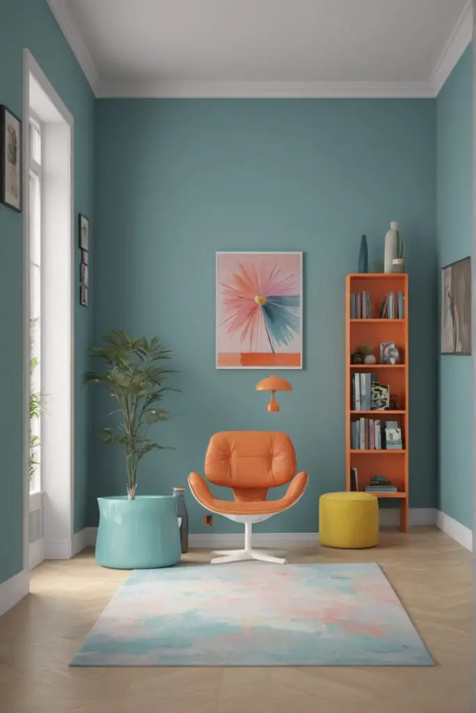
- Versatility in Design: Blue Horizon serves as a versatile backdrop for various design elements. From sleek metallic accents to warm wooden furniture, this color complements a wide range of textures and materials, allowing you to personalize your library according to your preferences. Whether you prefer minimalist or eclectic décor, Blue Horizon provides a versatile canvas for creative expression.
- Psychological Benefits: Studies have shown that blue hues have positive effects on mental well-being. Blue Horizon promotes feelings of calmness and stability, reducing stress levels and promoting a sense of tranquility. By incorporating this color into your library design, you create a nurturing environment that supports mental health and emotional well-being.
Tips to Match Color:
- Lighting Considerations: Assess the natural and artificial lighting in your library space. Blue Horizon may appear darker or lighter depending on the lighting conditions. Opt for softer, warmer lighting to enhance the color’s soothing effect and create a cozy atmosphere for reading.
- Complementary Accents: Pair Blue Horizon with complementary accent colors to enhance its visual appeal. Shades of white, cream, and soft gray can accentuate the calming qualities of this hue while adding depth and dimension to your library’s design.
- Consider the Space: Take into account the size and layout of your library when choosing Blue Horizon as the primary paint color. In smaller spaces, lighter shades of Blue Horizon can create an illusion of openness and airiness, while darker shades add intimacy and coziness to larger rooms.
- Furniture and Décor: Coordinate your furniture and décor with Blue Horizon to create a cohesive design scheme. Opt for furniture pieces in neutral tones or natural materials to complement the color’s understated elegance. Incorporate pops of color through throw pillows, rugs, and artwork to add visual interest without overwhelming the space.
- Sample Testing: Before committing to painting your entire library in Blue Horizon, test the color on a small section of the wall to gauge its appearance in different lighting conditions. Consider how the color interacts with other elements in the room and adjust accordingly to achieve the desired aesthetic.
Hue Matching:
- Ocean Blue: For a deeper variation of Blue Horizon, consider hues inspired by the ocean. Shades like Deep Sea Blue or Navy Mist evoke the tranquil beauty of the sea, adding depth and sophistication to your library’s ambiance.
- Sky Blue: Lighter shades of Blue Horizon reminiscent of the sky can create a sense of openness and serenity in your library. Opt for hues like Azure Sky or Celestial Blue to infuse your space with a soft, ethereal quality.
- Slate Gray: Incorporating subtle hints of gray into Blue Horizon can enhance its versatility and sophistication. Shades like Slate Gray or Storm Cloud add depth and contrast to your library design while maintaining the color’s calming effect.
- Teal Accents: Infuse your library with a touch of vibrancy by incorporating teal accents alongside Blue Horizon. Shades like Teal Waters or Turquoise Dream add a refreshing pop of color, creating a dynamic and visually engaging environment for reading and relaxation.
- Warm Neutral Undertones: Balance the cool tones of Blue Horizon with warm neutral hues for a harmonious color palette. Consider incorporating shades like Sandy Beige or Soft Taupe to add warmth and balance to your library’s design, creating a welcoming and inviting atmosphere.
Alternative Colors from Sherwin Williams and
Benjamin Moore:
- Sherwin Williams: Morning Fog: This soft, misty gray hue from Sherwin Williams complements Blue Horizon beautifully, creating a serene and elegant color scheme for your library. Morning Fog adds depth and sophistication to any space, enhancing the tranquil ambiance of your reading sanctuary.
- Benjamin Moore: Quiet Moments: Embrace tranquility with Quiet Moments, a subtle blue-gray hue from Benjamin Moore. This versatile color pairs effortlessly with Blue Horizon, creating a calming and cohesive design scheme for your library. Quiet Moments exudes understated elegance, making it the perfect choice for a serene reading retreat.
Other Rooms to Use Blue Horizon:
Living Room:
Transform your living room into a cozy haven for relaxation by incorporating Blue Horizon into your design scheme. Pair this serene hue with plush sofas and accent chairs in neutral tones for a harmonious and inviting ambiance. Add warmth and texture with soft throw blankets, area rugs, and decorative pillows in complementary shades, creating a tranquil retreat for unwinding with a good book or enjoying leisurely conversations with loved ones.
Bedroom:
Create a serene and tranquil bedroom retreat with Blue Horizon as the primary paint color. This calming hue promotes rest and relaxation, making it the perfect choice for a peaceful sleep sanctuary. Pair Blue Horizon walls with crisp white bedding, soft linen curtains, and natural wood furniture for a soothing and sophisticated ambiance. Incorporate touches of soft blue through accent pillows, throws, and artwork to enhance the tranquil atmosphere, ensuring a restful night’s sleep.
Conclusion:
Incorporating Blue Horizon into your library design promises to elevate your reading experience to new heights in 2024. With its tranquil and sophisticated qualities, this timeless hue fosters a sense of calmness and creativity, creating the perfect environment for deep focus and uninterrupted exploration of the written word. By following these tips for color matching and exploring alternative hues from Sherwin Williams and Benjamin Moore, you can create a personalized and inviting library sanctuary that inspires both mind and soul. Whether you’re curling up with a classic novel or embarking on a journey of discovery, Blue Horizon sets the stage for unforgettable reading adventures in the comfort of your own home.


