
In the realm of interior design, the choice of paint color plays a pivotal role in defining the ambiance and character of a space. One color that stands out as both sophisticated and calming is Lotus Petal. This subtle yet elegant hue can transform your library into a haven of tranquility and sophistication. In this article, we will delve into the reasons why Lotus Petal paint is the perfect choice for your modern library in 2024.
The Allure of Lotus Petal:
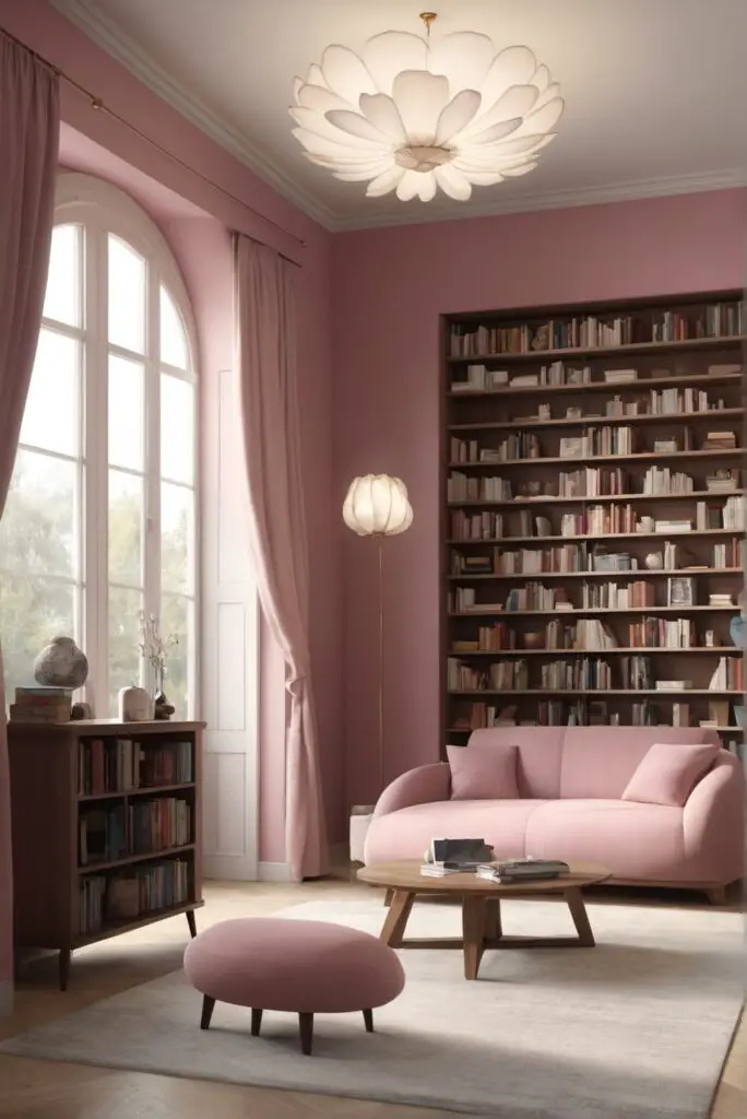
Lotus Petal is a delicate shade that exudes a sense of purity and tranquility. Its soft, pale pink undertones create an inviting atmosphere while maintaining a modern and timeless appeal. The color is reminiscent of the graceful petals of a lotus flower, which carries cultural and symbolic significance across various traditions. Choosing Lotus Petal for your library walls can infuse the space with a touch of nature’s serenity.
5 Tips to Perfectly Match Lotus Petal with Your
Library:
1. Neutral Furnishings and Accents
To complement Lotus Petal’s subtlety, opt for neutral furnishings and accents. Cream-colored sofas, beige rugs, and light wooden bookshelves will harmonize with the softness of Lotus Petal, creating a cohesive and balanced look.
2. Brass and Gold Accents
Lotus Petal pairs exceptionally well with metallic accents, particularly brass and gold. Consider incorporating brass or gold-framed mirrors, bookends, or lighting fixtures to add a touch of luxury and warmth to the space.
3. Natural Greenery
Introduce a breath of fresh air by incorporating natural greenery into your library. Lush plants or a vase of fresh flowers with green stems can provide a vibrant contrast to Lotus Petal’s muted tones, bringing life and energy to the room.
4. Dark Wood Elements
Balance the softness of Lotus Petal with the richness of dark wood elements. Dark wooden bookcases, tables, or frames can add depth and sophistication to the overall design, creating a visually pleasing contrast.
5. Statement Artwork
Elevate your library’s aesthetic by incorporating statement artwork that complements Lotus Petal. Consider art pieces with bold colors or intricate designs that enhance the overall ambiance without overpowering the subtlety of the paint color.
5 Hue Matching Options for Lotus Petal:
1. Soft Gray
Lotus Petal pairs effortlessly with soft gray tones. Consider using gray for furniture upholstery, area rugs, or accent pieces. This combination creates a refined and soothing palette, perfect for a reading retreat.
2. Blush Pink
Embrace the monochromatic elegance by combining Lotus Petal with blush pink accents. Blush pink throw pillows, blankets, or wall art can enhance the overall warmth and femininity of the space.
3. Mint Green
For a refreshing and eclectic look, consider pairing Lotus Petal with mint green. This unexpected combination brings a playful and modern twist to the traditional library setting, infusing the space with energy and creativity.
4. Navy Blue
Create a sense of depth and sophistication by incorporating navy blue elements. Navy blue accents, such as a statement chair or decorative items, can provide a striking contrast to Lotus Petal, adding a touch of drama to the room.
5. Champagne Gold
Enhance the luxurious feel of Lotus Petal by introducing champagne gold accents. From picture frames to hardware, these subtle gold tones can elevate the overall aesthetic, creating a space that exudes opulence and charm.
5 Alternative Colors from Sherwin Williams and
Benjamin Moore:
1. Sherwin Williams – Rose Quartz
If Lotus Petal feels too subtle, Sherwin Williams’ Rose Quartz offers a slightly bolder take on pink. This color adds warmth and sophistication to your library while maintaining a contemporary feel.
2. Sherwin Williams – Sea Salt
For a tranquil and timeless alternative, consider Sherwin Williams’ Sea Salt. This soft, greenish-gray hue pairs well with Lotus Petal, creating a serene and cohesive color palette.
3. Benjamin Moore – Misty Gray
Benjamin Moore’s Misty Gray is a versatile and neutral option that complements Lotus Petal beautifully. This muted gray works well for furniture and accents, providing a sophisticated backdrop for your library.
4. Benjamin Moore – Ballet Slippers
If you desire a slightly warmer alternative to Lotus Petal, Benjamin Moore’s Ballet Slippers is an excellent choice. This blush pink hue adds a touch of romance and femininity to the space.
5. Sherwin Williams – Accessible Beige
For those who prefer a more subdued and classic look, Sherwin Williams’ Accessible Beige is a timeless option. This neutral color pairs seamlessly with Lotus Petal, creating an elegant and understated aesthetic.
Other Rooms to Incorporate Lotus Petal:
Living Room
Infuse your living room with the calming presence of Lotus Petal. Use this delicate hue on an accent wall or for larger furniture pieces, creating a serene and welcoming space for relaxation and socializing.
Bedroom
Transform your bedroom into a peaceful sanctuary by incorporating Lotus Petal on the walls or as part of the bedding and decor. This gentle color promotes a sense of tranquility, fostering a restful atmosphere.
Home Office
For a productive yet soothing work environment, consider using Lotus Petal in your home office. Pair it with functional and stylish furniture to create a workspace that inspires creativity and focus.
Nursery
Lotus Petal’s soft and calming nature makes it an ideal choice for a nursery. Create a nurturing and serene atmosphere for your little one by incorporating this gentle hue in the nursery’s decor and furnishings.
Conclusion:
In conclusion, Lotus Petal emerges as an exemplary choice for painting your modern library in 2024. Its delicate and timeless charm, paired with versatile matching options and alternative colors, allows you to create a space that exudes sophistication and tranquility. By implementing the tips and exploring various color combinations suggested in this article, you can elevate your reading escape to new heights. Whether in the library, living room, bedroom, home office, or nursery, Lotus Petal proves to be a color that stands the test of time, enveloping your home in a cocoon of elegance and style.


