
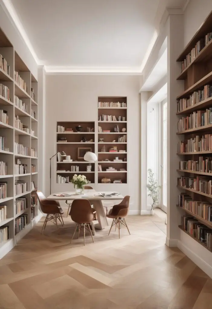
In the realm of interior design, selecting the perfect paint color is akin to choosing the backdrop for a masterpiece. It sets the tone, establishes the ambiance, and ties the entire room together. Enter Nacre Paint, the 2024 trendsetter in chic color choices. With its subtle elegance and versatile appeal, Nacre Paint has emerged as the go-to option for those seeking to elevate their library’s ambiance to new heights.
Why Nacre Paint?
Nacre Paint, named after the luminous inner layer of a mollusk shell, embodies sophistication and refinement. Its soft, pearlescent sheen adds a touch of luxury to any space, making it particularly well-suited for libraries, where comfort and style converge. Here’s why Nacre Paint should be your top choice:
- Timeless Elegance: Nacre Paint transcends fleeting trends, boasting a timeless quality that ensures your library remains chic for years to come. Its understated beauty lends an air of sophistication without overwhelming the space, making it perfect for both traditional and contemporary design schemes.
- Versatile Aesthetics: Whether your library features rich wooden accents, modern minimalist furnishings, or eclectic decor elements, Nacre Paint effortlessly complements a variety of styles. Its neutral undertones blend seamlessly with different color palettes, allowing for endless design possibilities.
- Reflective Properties: The pearlescent sheen of Nacre Paint isn’t just visually stunning—it also has practical benefits. Its reflective properties help bounce light around the room, making even small or dimly lit libraries feel brighter and more spacious.
- Calming Effect: Libraries are havens of relaxation and intellectual exploration, and Nacre Paint enhances this ambiance with its soothing presence. Its soft, serene hue creates a tranquil atmosphere conducive to reading, studying, and contemplation.
- Durability and Ease of Maintenance: Beyond its aesthetic appeal, Nacre Paint is also a practical choice for libraries. Its durable formula withstands the wear and tear of frequent use, while its easy-to-clean surface ensures that spills and smudges won’t detract from its beauty.
Tips to Match Color:
When incorporating Nacre Paint into your library design, consider these five tips to ensure a harmonious color scheme:
- Natural Materials: Pair Nacre Paint with furnishings crafted from natural materials such as wood, leather, and stone to enhance its organic appeal and create a cozy yet refined atmosphere.
- Accent Colors: Introduce pops of color through accent pieces such as throw pillows, rugs, and artwork. Soft shades of blue, green, or blush complement Nacre Paint beautifully, adding visual interest without overpowering the space.
- Texture Play: Experiment with different textures to add depth and dimension to your library. Velvet upholstery, plush rugs, and metallic accents create contrast against the smooth, lustrous finish of Nacre Paint, resulting in a dynamic and inviting environment.
- Lighting Considerations: Take into account the natural and artificial lighting in your library when choosing complementary colors. Warm lighting enhances the warmth of Nacre Paint, while cool-toned lighting can bring out its pearlescent qualities even further.
- Personal Touches: Infuse your library with personal touches that reflect your unique style and interests. Whether it’s vintage book collections, family heirlooms, or travel souvenirs, these cherished items add character and warmth to the space, enhancing the beauty of Nacre Paint.
Hue Matching:
For a cohesive color palette, consider these five hues that pair effortlessly with Nacre Paint:
- Soft Gray: A timeless companion to Nacre Paint, soft gray creates a sophisticated backdrop that allows the pearlescent sheen to take center stage.
- Pale Blue: Evoking a sense of serenity and tranquility, pale blue complements Nacre Paint beautifully, creating a harmonious palette reminiscent of tranquil skies and calm waters.
- Blush Pink: Infuse your library with a touch of romance and femininity by pairing Nacre Paint with blush pink accents. This delicate hue adds warmth and softness to the space, creating a welcoming and inviting ambiance.
- Sage Green: Bring the beauty of the outdoors inside with sage green, a versatile hue that pairs effortlessly with Nacre Paint. This earthy tone infuses your library with a sense of freshness and vitality, reminiscent of lush botanical gardens.
- Deep Navy: For a bold and dramatic look, consider pairing Nacre Paint with deep navy accents. This rich, luxurious hue creates a striking contrast against the pearlescent backdrop, adding depth and sophistication to your library design.
Alternative Colors from Sherwin Williams and Benjamin Moore:
If Nacre Paint isn’t readily available, consider these alternative options from Sherwin Williams and Benjamin Moore:
- Sherwin Williams Alternative: Alabaster (SW 7008) – This soft, creamy white hue exudes warmth and elegance, creating a timeless backdrop for your library.
- Sherwin Williams Alternative: Agreeable Gray (SW 7029) – A versatile greige with warm undertones, Agreeable Gray complements Nacre Paint beautifully, creating a cohesive and inviting color palette.
- Benjamin Moore Alternative: Revere Pewter (HC-172) – A classic greige with subtle undertones of taupe and gray, Revere Pewter adds depth and sophistication to any space, making it an ideal companion to Nacre Paint.
- Benjamin Moore Alternative: Simply White (OC-117) – Crisp and clean, Simply White provides a fresh backdrop that allows the pearlescent sheen of Nacre Paint to shine.
- Benjamin Moore Alternative: Pale Oak (OC-20) – Soft and understated, Pale Oak is a timeless neutral that pairs seamlessly with Nacre Paint, creating a cohesive and harmonious color palette.
Other Rooms to Use Nacre Paint:
While Nacre Paint is particularly well-suited for libraries, its versatile appeal extends to other rooms in your home as well. Consider using Nacre Paint in the following spaces:
Living Room: Create a sophisticated yet inviting atmosphere in your living room by incorporating Nacre Paint on the walls. Pair it with plush furnishings, metallic accents, and soft textiles for a cozy yet luxurious look.
Bedroom: Transform your bedroom into a serene retreat with Nacre Paint. Its calming presence promotes relaxation and restful sleep, while its pearlescent sheen adds a touch of romance and elegance to the space.
Dining Room: Set the stage for memorable meals with Nacre Paint in your dining room. Its soft, neutral hue provides the perfect backdrop for entertaining, allowing your culinary creations to take center stage.
Home Office: Foster creativity and productivity in your home office with Nacre Paint. Its soothing presence enhances focus and concentration, while its timeless elegance creates a professional yet inviting work environment.
Conclusion:
In the ever-evolving landscape of interior design, Nacre Paint stands out as a chic and timeless choice for elevating your library’s ambiance. With its subtle elegance, versatile appeal, and practical benefits, Nacre Paint embodies sophistication and refinement, making it the perfect backdrop for literary adventures and intellectual pursuits. Whether paired with natural materials, accent colors, or complementary hues, Nacre Paint transforms your library into a sanctuary of style and comfort. So why wait? Embrace the allure of Nacre Paint and reimagine


