
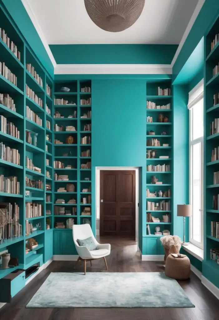
In 2024, interior design trends are embracing bold yet soothing colors that inspire creativity and calm. One standout hue that promises to transform your library into a haven of relaxation and focus is Nifty Turquoise. This vibrant shade of turquoise brings together the calming properties of blue with the revitalizing energy of green, making it an ideal choice for your library walls. Whether you’re revamping your home office or creating a cozy reading nook, here’s why Nifty Turquoise should be your color of choice this year.
Why Choose Nifty Turquoise?
Nifty Turquoise strikes the perfect balance between sophistication and tranquility. Its serene undertones create a welcoming atmosphere that encourages concentration and productivity, making it an excellent option for a library space. Here are several compelling reasons to incorporate this color into your interior design palette:
- Calming Effect: Turquoise is known for its calming properties, promoting relaxation and reducing stress levels. In a library setting, this can help create a conducive environment for reading, studying, or working from home.
- Versatility: Despite its bold appearance, Nifty Turquoise is surprisingly versatile. It pairs well with a variety of interior styles, from modern minimalist to classic elegance, making it suitable for any library design theme.
- Enhanced Focus: The color turquoise has been associated with clarity of thought and enhanced concentration. By painting your library walls in Nifty Turquoise, you can potentially boost productivity and focus during work or study sessions.
- Aesthetic Appeal: The vibrant yet soothing hue of Nifty Turquoise adds a touch of elegance and sophistication to any space. It can serve as a striking backdrop for bookshelves, artwork, or antique furniture, enhancing the overall aesthetic of your library.
- Timelessness: Unlike trendy colors that may quickly become outdated, turquoise has enduring popularity in interior design. Nifty Turquoise, with its modern twist, ensures your library remains stylish and relevant for years to come.
Tips to Match Nifty Turquoise in Your Library:
When integrating Nifty Turquoise into your library design, consider the following tips to achieve a harmonious and balanced space:
- Neutral Accents: Pair Nifty Turquoise walls with neutral accents such as white, cream, or light gray furniture to create a clean and contemporary look.
- Natural Elements: Incorporate natural textures like wood and plants to complement the calming vibe of turquoise and create a more organic feel in your library.
- Metallic Finishes: Add a touch of luxury by incorporating metallic finishes in gold or brass for light fixtures, picture frames, or bookends against the turquoise backdrop.
- Artwork Selection: Choose artwork or wall decor that includes complementary colors such as shades of green, navy blue, or even coral to enhance the visual interest without overwhelming the space.
- Layered Lighting: Opt for layered lighting with adjustable wall sconces, table lamps, and overhead lights to create a warm ambiance that complements the turquoise walls throughout different times of the day.
Hue Matching with Nifty Turquoise:
To create a cohesive color scheme with Nifty Turquoise, consider these complementary hues:
- Soft Gray: Provides a neutral base that enhances the calming effect of turquoise.
- Warm Coral: Adds a contrasting pop of color that complements turquoise beautifully.
- Olive Green: Creates a harmonious earthy palette when paired with Nifty Turquoise.
- Navy Blue: Offers a deep contrast that highlights the vibrancy of turquoise.
- Creamy Beige: Softens the overall look and adds warmth to the turquoise-dominated space.
Alternative Colors from Sherwin Williams and Benjamin Moore:
If you’re considering similar shades from other popular paint brands like Sherwin Williams and Benjamin Moore, here are a few alternatives that capture the essence of Nifty Turquoise:
Sherwin Williams:
- SW 6476 Glimmer: A softer, more muted turquoise with gray undertones, perfect for a subtle yet elegant library setting.
- SW 6765 Spa: A lighter, more airy turquoise that creates a refreshing atmosphere ideal for smaller or well-lit library spaces.
- SW 6758 Aqueduct: A deeper, richer turquoise that adds drama and depth to larger library rooms or accent walls.
Benjamin Moore:
- Benjamin Moore 764 Poolside: A vibrant turquoise that leans slightly towards blue, injecting energy and vitality into your library space.
- Benjamin Moore 831 Bird’s Egg: A delicate turquoise with hints of green, offering a soothing backdrop for focused work or leisurely reading.
Other Rooms to Use Nifty Turquoise:
While Nifty Turquoise is particularly suited for libraries, its versatile nature allows it to enhance other rooms in your home as well:
Home Office:
Create a productive and inspiring workspace by painting your home office walls in Nifty Turquoise. Pair with ergonomic furniture and ample natural light for a comfortable and focused environment.
Bedroom:
Incorporate Nifty Turquoise into your bedroom design for a serene and restful atmosphere. Balance with soft bedding, wooden accents, and ambient lighting to create a calming retreat.
Living Room:
Transform your living room into a stylish gathering space by using Nifty Turquoise on an accent wall or as a backdrop for artwork. Combine with plush seating and metallic accents for a contemporary look.
Bathroom:
Elevate your bathroom design with Nifty Turquoise walls paired with white fixtures and natural stone accents. This combination creates a spa-like ambiance that promotes relaxation.
Dining Room:
Infuse your dining room with elegance by painting the walls in Nifty Turquoise. Coordinate with a wooden dining table, upholstered chairs, and soft lighting for a welcoming dining experience.
Conclusion:
Nifty Turquoise paint offers a refreshing and sophisticated choice for enhancing your library design in 2024. Its calming properties, versatility in matching with other hues, and timeless appeal make it a perfect option for creating a tranquil yet inspiring space. Whether you’re redesigning your home office, bedroom, or living room, Nifty Turquoise can transform any room into a haven of creativity and relaxation. Embrace this vibrant hue and elevate your interior design to new heights this year.


