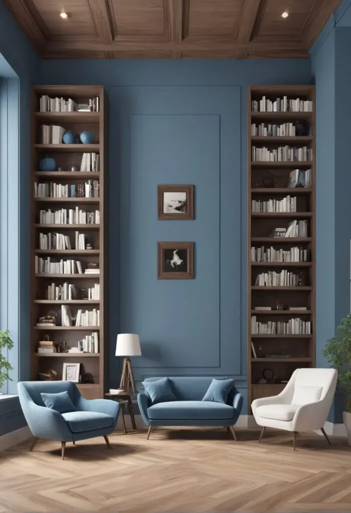
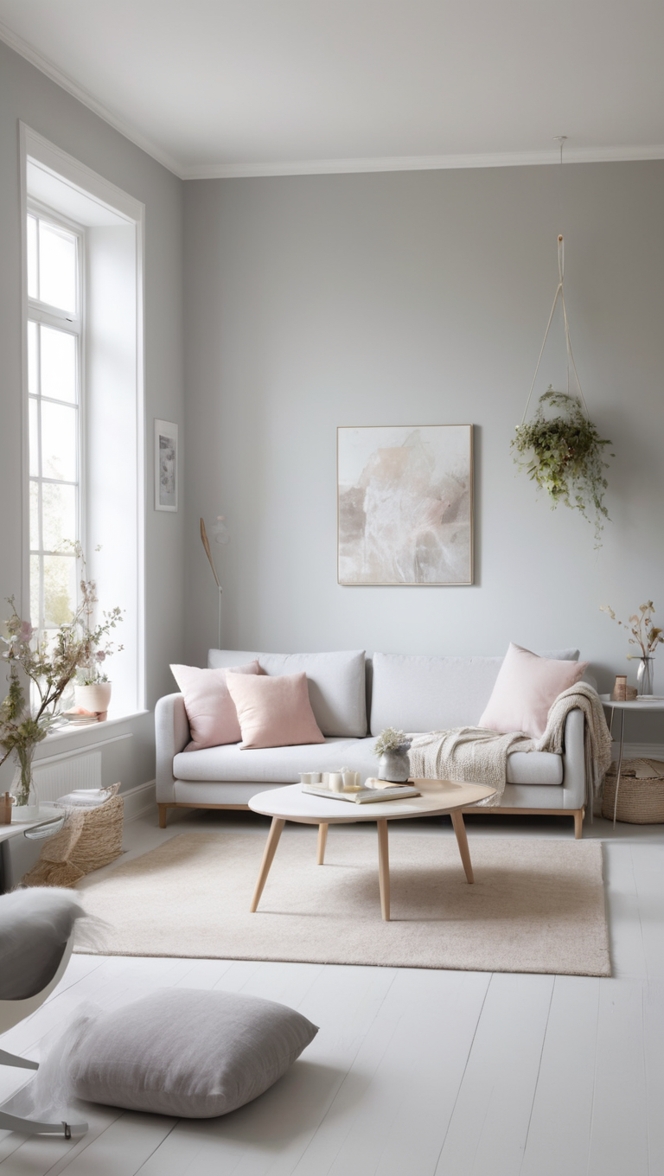
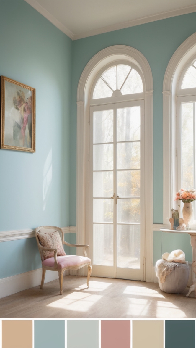
In the realm of interior design, the choice of paint color holds immense power. It can transform a space, imbuing it with personality, mood, and style. As we step into 2024, the trend forecast for library aesthetics leans toward a classic yet refreshing hue: Something Blue. This versatile shade offers a timeless appeal while infusing spaces with a sense of tranquility and sophistication.
Why Something Blue?
The allure of Something Blue lies in its ability to evoke a myriad of emotions and associations. Blue, as a color, is often associated with calmness, depth, and stability. In the context of a library—a space dedicated to knowledge, contemplation, and creativity—these attributes are particularly desirable.
- Calming Influence: Libraries are sanctuaries of serenity, where individuals seek solace in the world of books. Something Blue, with its soothing undertones, fosters an environment conducive to concentration and relaxation. It envelops the space in a gentle embrace, inviting visitors to unwind and immerse themselves in literary journeys.
- Timeless Elegance: Unlike fleeting design trends, Something Blue transcends the limitations of time. Its classic appeal ensures that your library remains stylish and relevant for years to come. Whether your design aesthetic leans towards traditional or contemporary, this versatile hue seamlessly integrates into various design schemes, adding a touch of elegance to the space.
- Enhanced Focus: The subtle yet commanding presence of Something Blue aids in fostering concentration and mental clarity. In a world fraught with distractions, a well-appointed library should serve as a haven for focused thought and introspection. This serene hue creates an environment conducive to deep thinking and intellectual exploration.
- Versatile Pairing: Something Blue serves as an excellent backdrop for a myriad of design elements. It complements a wide range of materials, from rich mahogany and warm oak to sleek metal accents. Whether you prefer a cozy, intimate ambiance or a more formal setting, this adaptable hue effortlessly harmonizes with existing furnishings and décor, allowing for seamless integration of personal style.
- Emotional Resonance: Color psychology suggests that blue elicits feelings of trust, stability, and introspection. By incorporating Something Blue into your library design, you not only elevate the aesthetic appeal but also evoke emotional responses that resonate with visitors on a subconscious level. It establishes a sense of familiarity and comfort, making the library a welcoming retreat for book lovers and scholars alike.
Tips to Match Something Blue:
- Natural Light Enhancement: Capitalize on natural light to enhance the ethereal beauty of Something Blue. Opt for sheer curtains or strategically placed mirrors to maximize the influx of sunlight, creating a luminous ambiance that complements the soft hue.
- Contrast with Warm Accents: Balance the cool tones of Something Blue with warm accents such as brass fixtures, wooden furniture, or plush textiles in earthy hues. This juxtaposition adds depth and visual interest to the space, creating a dynamic interplay of color and texture.
- Layered Textures: Incorporate layered textures to add dimension and visual intrigue to the room. Consider introducing elements such as woven rugs, velvet upholstery, or textured wallpaper to create a tactile experience that complements the understated elegance of Something Blue.
- Artful Display: Curate a collection of artwork or decorative accents that complement the serene ambiance of Something Blue. Opt for pieces with subtle pops of color or intricate details that serve as focal points within the space, adding visual interest without overwhelming the overall aesthetic.
- Personalized Touches: Infuse the library with personal touches that reflect your unique interests and personality. Whether it’s cherished family heirlooms, travel mementos, or handmade treasures, incorporating meaningful elements into the design adds character and warmth to the space, making it truly your own.
Hue Matching with Something Blue:
- Crisp White: Pair Something Blue with crisp white accents to create a fresh, clean aesthetic that exudes timeless sophistication.
- Soft Gray: Enhance the calming effect of Something Blue by pairing it with soft gray tones for a harmonious color palette that promotes relaxation and tranquility.
- Earthy Green: Inject a touch of nature into your library design by pairing Something Blue with earthy green hues. This botanical-inspired palette evokes a sense of serenity and connection to the outdoors.
- Rich Burgundy: Add a touch of drama and opulence to your library with accents of rich burgundy. The deep, jewel-toned hue provides a striking contrast to Something Blue, creating a luxurious ambiance reminiscent of old-world libraries.
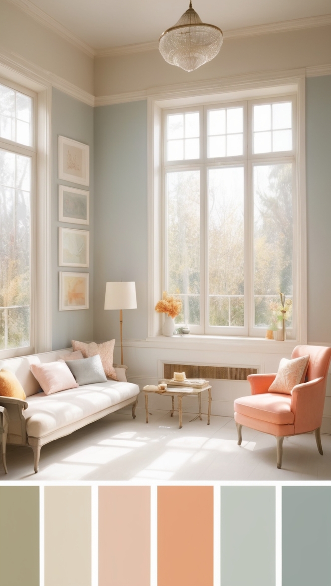
- Blush Pink: For a soft, romantic vibe, pair Something Blue with blush pink accents. This delicate color combination infuses the space with a sense of warmth and intimacy, perfect for cozy reading nooks or intimate seating areas.
Alternative Colors from Sherwin Williams and Benjamin Moore:
- Sherwin Williams – Rainstorm (SW 6230): Embrace the moody elegance of Rainstorm, a deep, inky blue hue that adds depth and drama to any space. Pair it with metallic accents and rich textiles for a luxe aesthetic that exudes sophistication.
- Sherwin Williams – Sea Salt (SW 6204): Capture the serene beauty of the sea with Sea Salt, a soft, muted blue-green hue that brings a sense of calm and tranquility to your library. Pair it with natural materials and coastal-inspired décor for a relaxed, coastal-chic vibe.
- Benjamin Moore – Hale Navy (HC-154): Make a bold statement with Hale Navy, a rich, navy blue hue that commands attention and adds a sense of drama to your library. Pair it with crisp white trim and brass accents for a classic, nautical-inspired look.
- Benjamin Moore – Gentleman’s Gray (2062-20): Channel timeless sophistication with Gentleman’s Gray, a deep, charcoal blue hue that exudes understated elegance. Pair it with rich, masculine furnishings and leather accents for a refined, gentlemanly aesthetic.
- Benjamin Moore – Silver Lake (1598): Create a serene sanctuary with Silver Lake, a soft, ethereal blue-gray hue that evokes the tranquility of a misty morning. Pair it with pale wood accents and sheer curtains for a light, airy feel that promotes relaxation and introspection.
Other Rooms to Use Something Blue:
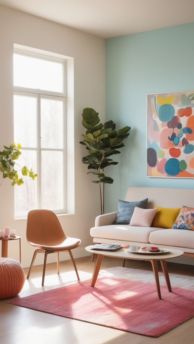
Living Room: Infuse your living room with the calming presence of Something Blue for a tranquil retreat where you can unwind and entertain guests in style. Pair it with plush velvet sofas, oversized floor pillows, and metallic accents for a luxurious yet inviting ambiance.
Bedroom: Create a serene sleep sanctuary by incorporating Something Blue into your bedroom design. Opt for soft, breathable linens, plush area rugs, and soothing lighting to enhance the restful ambiance of the space, promoting restful sleep and relaxation.
Home Office: Foster productivity and focus in your home office by incorporating Something Blue into the design scheme. Pair it with sleek, modern furnishings, ergonomic seating, and ample natural light to create a functional yet stylish workspace that inspires creativity and innovation.
Conclusion:
In the ever-evolving landscape of interior design, the choice of paint color plays a pivotal role in shaping the ambiance and aesthetic of a space. Something Blue emerges as a timeless yet refreshing hue for library aesthetics in 2024, offering a perfect balance of
elegance, tranquility, and versatility. Whether you’re seeking to create a serene reading nook, a cozy study retreat, or a sophisticated home library, Something Blue provides a captivating canvas upon which to build your design vision. With its calming influence, timeless elegance, and emotional resonance, Something Blue elevates library aesthetics to new heights, fostering an environment of inspiration, introspection, and creativity for years to come.

