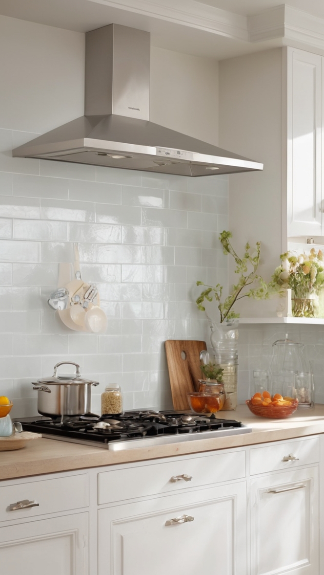
In the world of interior design, the choice of paint color holds the power to transform a space. If you’re yearning for a sophisticated and modern look in your culinary haven, consider the timeless charm of Silverpointe. In 2024, this exquisite hue is making waves in the design community, offering a perfect blend of sleekness and sophistication.
Why Silverpointe?
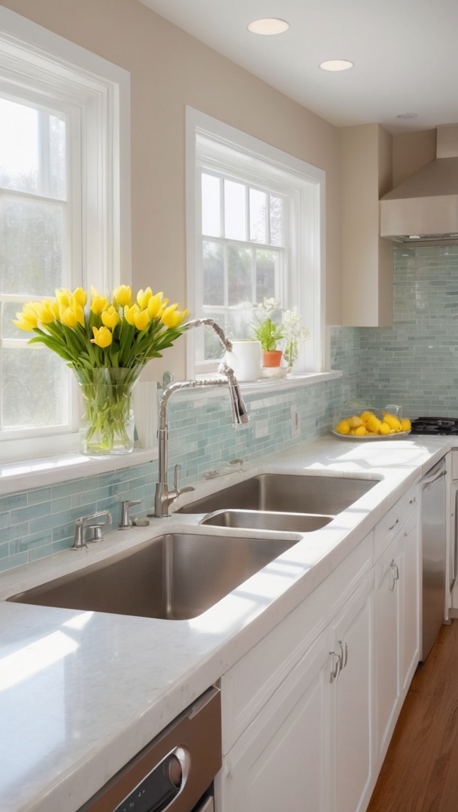
Silverpointe, a color curated for 2024, epitomizes contemporary elegance. Its muted silver-gray tone adds a touch of refinement and versatility, making it an ideal choice for kitchen spaces. Here are a few compelling reasons why you should consider Silverpointe for your culinary abode:
- Neutral Elegance: Silverpointe strikes the perfect balance between warmth and coolness. Its neutral undertones allow for easy pairing with a variety of styles and materials, ensuring that your kitchen exudes an inviting ambiance.
- Reflective Ambiance: The subtle reflective quality of Silverpointe creates an illusion of space, making it an excellent choice for kitchens of any size. The color bounces light around the room, enhancing natural or artificial illumination, and giving your culinary space an airy feel.
- Timeless Appeal: Unlike trendy colors that may quickly go out of style, Silverpointe offers a timeless appeal. This classic hue ensures that your kitchen remains chic and sophisticated for years to come, providing a backdrop for evolving design elements.
- Easy Pairing: Silverpointe’s versatility extends to its compatibility with various materials and finishes. Whether you have stainless steel appliances, wooden cabinets, or marble countertops, this color seamlessly integrates, offering a cohesive and polished look.
- Mood Enhancement: Colors play a crucial role in influencing moods. Silverpointe, with its calming and serene characteristics, creates a tranquil atmosphere in your kitchen. It becomes a canvas for your culinary adventures, turning your cooking space into a haven for both creativity and relaxation.
Now that you’ve chosen Silverpointe as your go-to kitchen color, here are some tips to help you make the most out of this sleek and sophisticated palette.
5 Tips to Match Colors with Silverpointe :
1. Accentuate with Contrasting Colors
Enhance the allure of Silverpointe by incorporating contrasting colors. Darker hues, such as deep navy or charcoal, can be used for accents like cabinet handles or kitchen accessories. This creates a striking visual contrast and adds depth to your culinary space.
2. Integrate Natural Elements
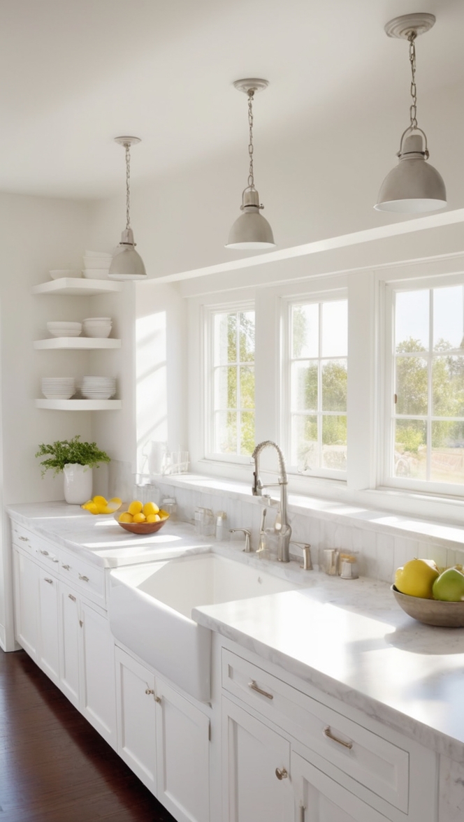
Bring the outdoors inside by integrating natural elements. Earthy tones like sage green or warm terracotta complement Silverpointe beautifully. Consider adding potted plants, wooden elements, or stone textures to infuse a touch of nature into your kitchen.
3. Play with Textures
Silverpointe’s neutral backdrop provides an excellent canvas for experimenting with textures. Consider textured backsplashes, patterned tiles, or matte finishes to add visual interest. The interplay of different textures enhances the overall sophistication of your kitchen.
4. Opt for Monochromatic Harmony
Create a harmonious look by sticking to a monochromatic palette. Choose varying shades of silver and gray to maintain a cohesive and polished appearance. This monochromatic approach fosters a sense of continuity, making your kitchen visually appealing and well-coordinated.
5. Balance with Warm Lighting
Silverpointe pairs exceptionally well with warm lighting. Incorporate pendant lights with warm-toned bulbs or under-cabinet lighting to balance the coolness of the silver-gray hue. This not only enhances the overall ambiance but also brings out the richness of the color.
5 Hue Matching Options for Silverpointe :
To further elevate your kitchen’s aesthetic, consider these five hues that harmonize flawlessly with Silverpointe:
1. Navy Blue
Navy blue complements Silverpointe’s cool undertones, creating a sophisticated and classic color combination. Use navy for accent pieces like barstools, pendant lights, or dishware to add a touch of drama and depth to your kitchen.
2. Blush Pink
For a soft and romantic ambiance, pair Silverpointe with blush pink. This unexpected combination adds warmth and femininity to the space. Introduce blush through kitchen accessories, curtains, or even a subtle accent wall for a modern and chic look.
3. Olive Green
Olive green provides a rich and earthy contrast to Silverpointe. This combination brings a touch of nature indoors, creating a serene and balanced atmosphere. Consider incorporating olive green through kitchen textiles, such as rugs or seat cushions.
4. Charcoal Gray
For a monochromatic approach, charcoal gray seamlessly blends with Silverpointe. Use charcoal for cabinetry, countertops, or accent walls to maintain a cohesive color scheme. The interplay of these two shades adds depth and sophistication to your kitchen.
5. Terracotta
Inject warmth and a hint of rustic charm by pairing Silverpointe with terracotta. This warm, earthy hue complements the coolness of Silverpointe, creating a balanced and inviting kitchen. Consider terracotta-colored pots, vases, or backsplash tiles.
5 Alternative Colors from Sherwin Williams and
Benjamin Moore :
If Silverpointe isn’t readily available or you’re exploring alternative options, consider these five hues from Sherwin Williams and Benjamin Moore that capture the essence of sleek sophistication:
1. Sherwin Williams – Repose Gray (SW 7015)
Repose Gray is a versatile, warm gray with slight undertones of beige. This neutral shade complements Silverpointe, providing a harmonious backdrop for your kitchen. Its timeless appeal makes it an excellent alternative for achieving a sophisticated look.
2. Benjamin Moore – Classic Gray (OC-23)
Classic Gray is a light and airy neutral with warm undertones. This Benjamin Moore shade pairs seamlessly with Silverpointe, creating a soft and inviting atmosphere. Use Classic Gray for walls or cabinetry to achieve a cohesive and elegant design.
3. Sherwin Williams – Agreeable Gray (SW 7029)
Agreeable Gray is a warm greige (gray-beige) that works well with Silverpointe. This Sherwin Williams color adds warmth to your kitchen while maintaining a sophisticated and modern aesthetic. It’s a versatile choice for walls, cabinets, or accents.
4. Benjamin Moore – Edgecomb Gray (HC-173)
Edgecomb Gray is a warm, greige hue that complements Silverpointe’s cool tones. This Benjamin Moore color adds a touch of warmth and versatility to your kitchen, making it an excellent alternative for achieving a sleek and sophisticated look.
5. Sherwin Williams – Mindful Gray (SW 7016)
Mindful Gray is a mid-toned gray with warm undertones, making it a perfect companion for Silverpointe. This Sherwin Williams color creates a balanced and inviting atmosphere in your kitchen, offering a timeless and sophisticated design.
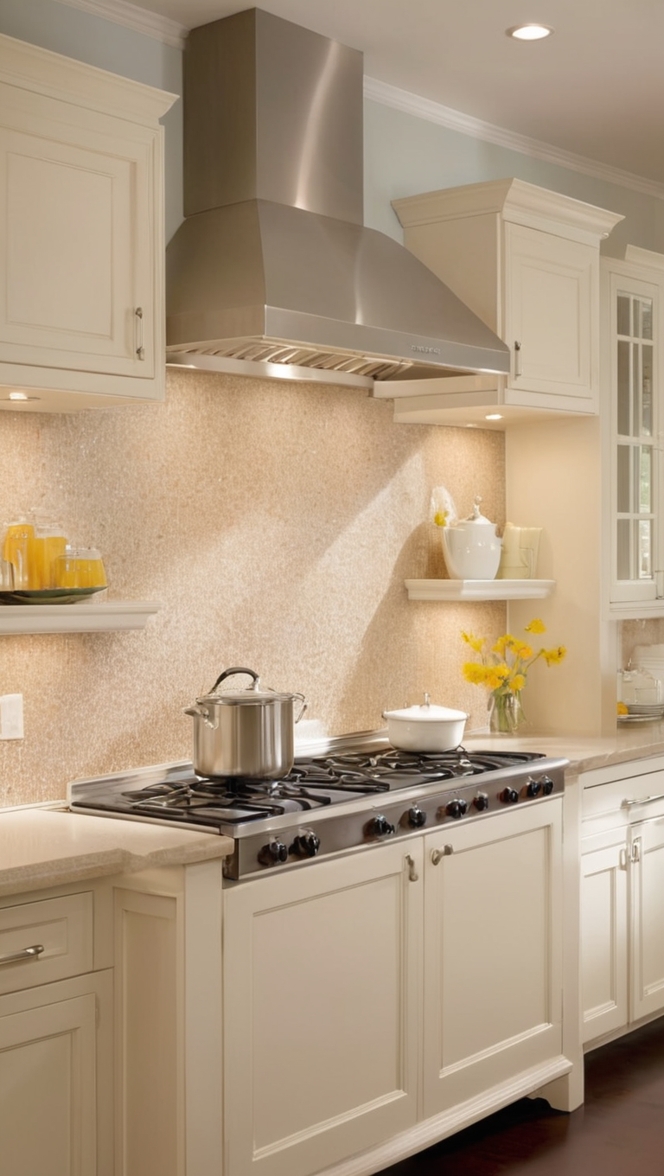
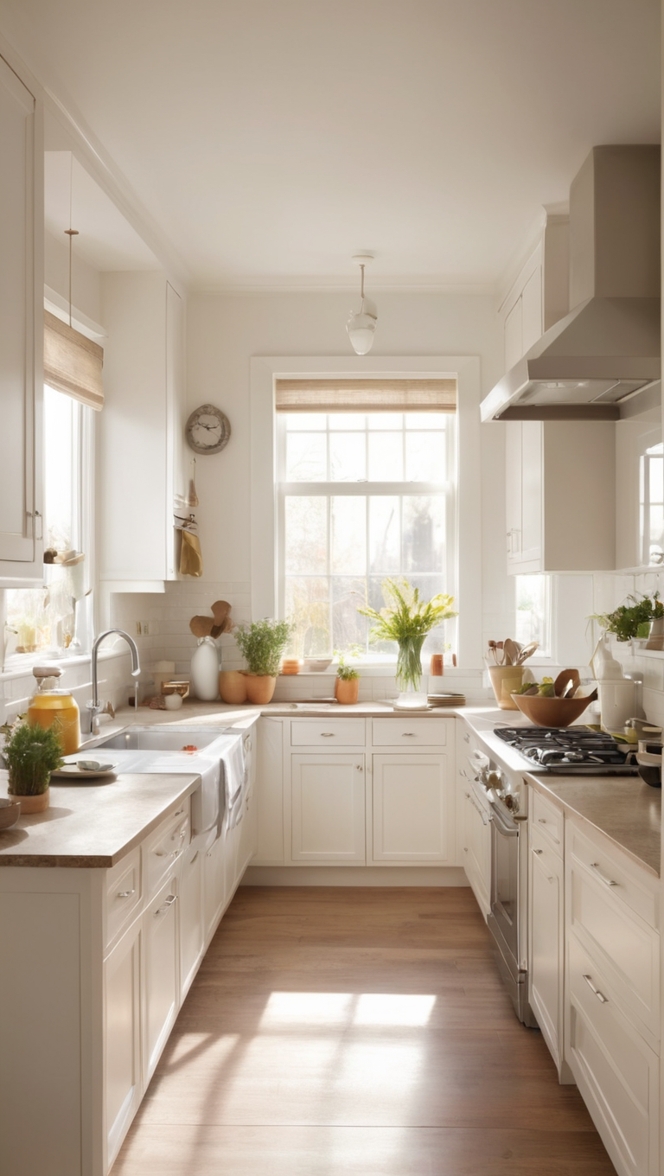
Other Rooms to Use Silverpointe :
Extend the elegance of Silverpointe beyond the kitchen by incorporating it into other rooms of your home:
Living Room
Create a cohesive flow by using Silverpointe in your living room. Whether on the walls, furniture, or as accent pieces, this color adds a touch of sophistication and modernity to your shared living spaces.
Bedroom
Transform your bedroom into a serene retreat with Silverpointe. Use it as the main wall color or incorporate it into your bedding, curtains, or furniture for a calming and stylish sanctuary.
Home Office
Foster a productive and sophisticated work environment by incorporating Silverpointe into your home office. The neutral backdrop helps create a focused atmosphere, while the sleek aesthetic enhances the overall professional appeal.
Bathroom
Elevate your bathroom’s design with Silverpointe. Whether used on walls, cabinets, or as accent tiles, this color adds a touch of luxury and sophistication to your bathing haven.
Dining Room
Carry the sleek sophistication into your dining room with Silverpointe. Whether through dining chairs, table linens, or accent walls, this color creates a refined and inviting atmosphere for shared meals and gatherings.
Conclusion :
In the quest for a sophisticated and modern kitchen, Silverpointe emerges as a frontrunner in 2024’s paint palettes. Its timeless appeal, neutral elegance, and versatility make it a perfect choice for elevating your culinary space. By implementing the provided tips for color matching and exploring alternative hues from Sherwin Williams and Benjamin Moore, you can ensure a harmonious and refined design.
Extend the sleek sophistication of Silverpointe beyond the kitchen, incorporating it into other rooms of your home for a cohesive and stylish aesthetic. With its reflective ambiance, easy pairing capabilities, and mood-enhancing qualities, Silverpointe stands as a testament to the transformative power of color in interior design.
Whether you’re creating a calming retreat in the bedroom, fostering productivity in the home office, or enhancing shared living spaces, Silverpointe proves to be a versatile and timeless choice. Embrace the allure of Silverpointe, and watch as your culinary and living spaces are elevated to new heights of sophistication and style.