Choosing the right color for your kitchen can transform it from a simple cooking space into a sophisticated and inviting area. One such color that radiates elegance and cleanliness is Paperwhite. In this article, we will explore why Paperwhite is an excellent choice for your kitchen and provide tips, hue matching suggestions, and alternative color options to help you create a cohesive and stylish look.
Why Paperwhite Paint?
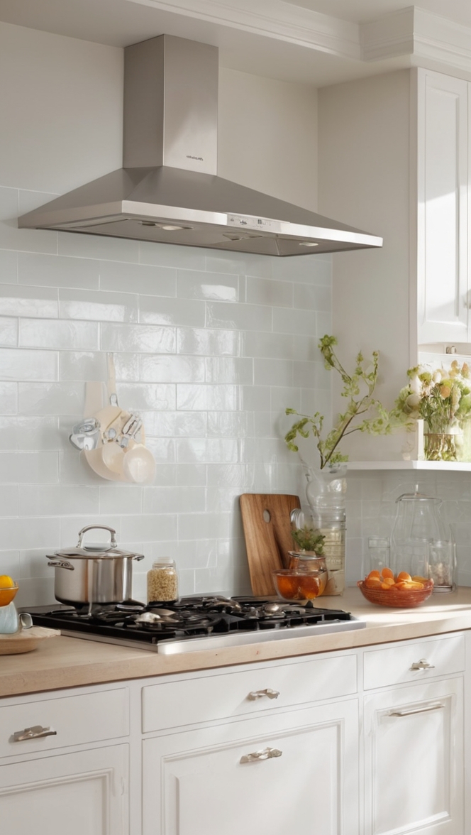
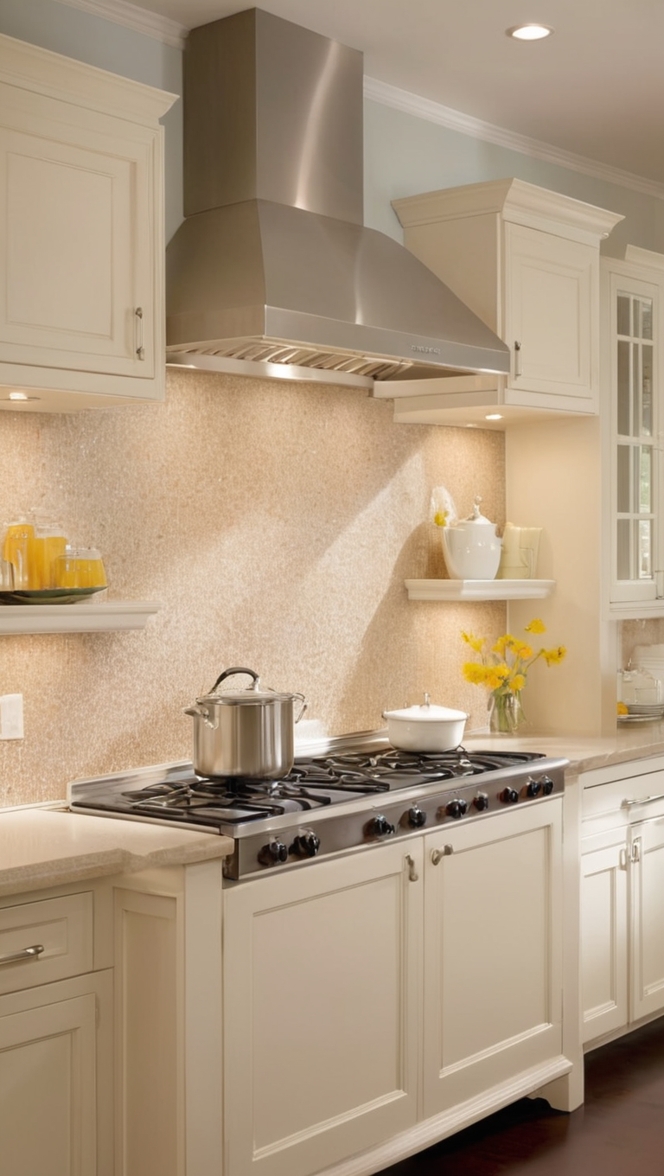
Paperwhite, a subtle off-white shade, offers a timeless and crisp aesthetic that effortlessly elevates your kitchen’s ambiance. Here are some reasons why this paint color is an excellent choice:
- Timeless Elegance: Paperwhite exudes timeless elegance, making it a perfect choice for those looking to create a classic and sophisticated kitchen. Its neutral undertones allow for versatility in design, ensuring that your kitchen remains stylish for years to come.
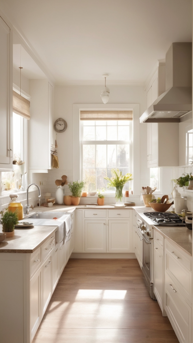
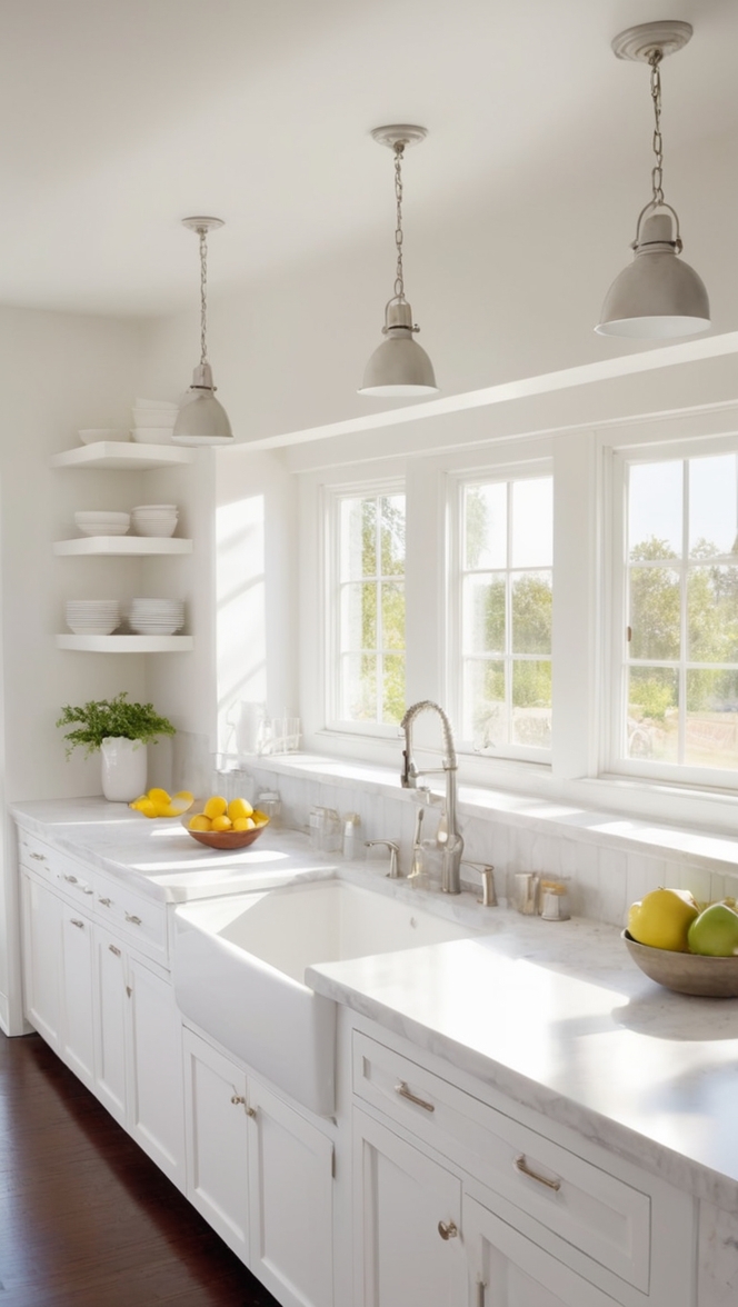
- Reflects Light: The light and airy nature of Paperwhite helps to reflect natural and artificial light, making your kitchen appear brighter and more spacious. This is especially beneficial for smaller kitchens, creating an illusion of openness.
- Easy to Pair: Paperwhite’s neutral tone makes it incredibly easy to pair with a variety of accent colors, materials, and textures. Whether you prefer a modern, traditional, or eclectic kitchen style, Paperwhite serves as an excellent backdrop for your creativity.
- Versatility: Paperwhite seamlessly blends with both warm and cool tones, allowing you to experiment with a wide range of color schemes. This versatility ensures that you can adapt your kitchen’s design to your personal taste and preferences.
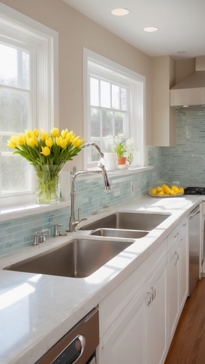
- Crisp and Clean Appearance: The name itself suggests the outcome – Paperwhite provides a clean and crisp appearance, giving your kitchen a fresh and inviting look. This makes it an ideal choice for those who prioritize cleanliness and a polished atmosphere in their cooking space.
5 Tips to Match Colors with Paperwhite :
- Contrast with Bold Colors: Introduce depth and character by pairing Paperwhite with bold accent colors like navy blue, emerald green, or rich burgundy. This creates a striking contrast, making your kitchen visually appealing.
- Neutral Companions: To achieve a harmonious and serene look, pair Paperwhite with neutral colors such as soft grays, beige, or muted earth tones. This combination maintains the overall tranquility of the space while providing a subtle contrast.
- Metallic Accents: Incorporate metallic finishes such as stainless steel, brass, or copper to add a touch of glamour to your kitchen. These metallic elements complement Paperwhite’s clean aesthetic, creating a balanced and sophisticated atmosphere.
- Natural Elements: Bring in natural elements like wooden textures, greenery, or stone accents to add warmth and a connection to the outdoors. These natural elements enhance the overall aesthetic and complement Paperwhite’s neutral palette.
- Colorful Kitchen Accessories: Infuse pops of color through kitchen accessories like utensils, dishware, and small appliances. This allows you to experiment with different hues without committing to a permanent color scheme.
5 Hue Matching Suggestions :
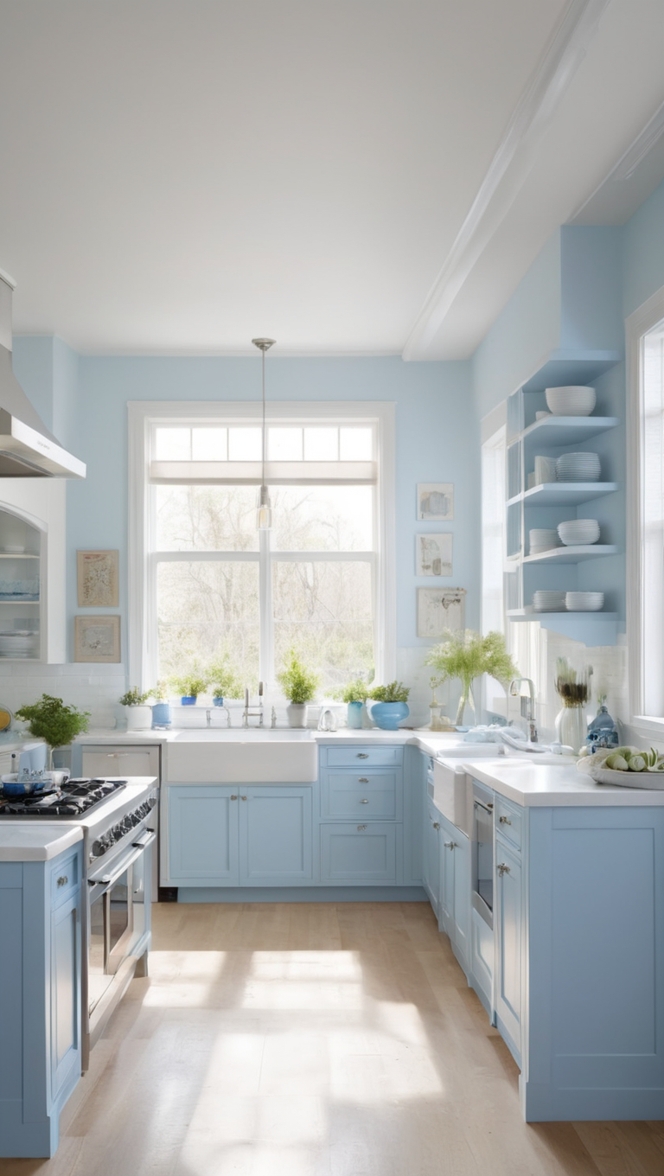
- Classic Blue: Pair Paperwhite with Classic Blue, a timeless and calming hue. This combination creates a balanced and serene atmosphere in your kitchen.
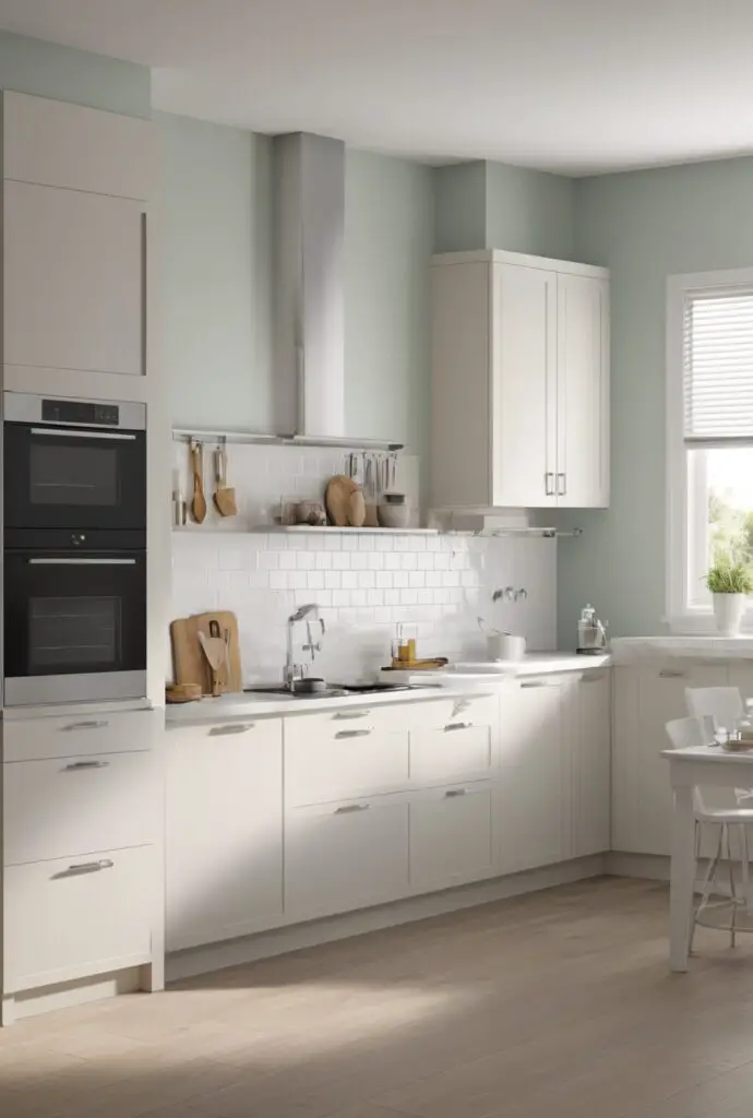
- Sage Green: Embrace a refreshing and nature-inspired feel by combining Paperwhite with Sage Green. This combination brings a sense of tranquility and freshness to your cooking space.
- Coral Pink: Add a touch of vibrancy and playfulness to your kitchen by pairing Paperwhite with Coral Pink. This combination is perfect for those who want to infuse energy into their culinary haven.
- Charcoal Gray: For a sophisticated and modern look, pair Paperwhite with Charcoal Gray. This combination creates a sleek and polished ambiance in your kitchen.
- Terracotta: Achieve a warm and inviting atmosphere by combining Paperwhite with Terracotta. This earthy hue adds a touch of coziness to your cooking space.
5 Alternative Color Options from Sherwin Williams
and Benjamin Moore :
- Sherwin Williams – Alabaster (SW 7008): A warm white with subtle undertones, Alabaster pairs beautifully with Paperwhite, creating a sophisticated and cohesive look.
- Sherwin Williams – Sea Salt (SW 6204): If you prefer a hint of color, Sea Salt complements Paperwhite with its soothing green-gray tones, creating a serene and balanced kitchen.
- Benjamin Moore – Simply White (OC-117): A crisp and clean white, Simply White pairs seamlessly with Paperwhite, allowing for a timeless and elegant kitchen design.
- Benjamin Moore – Revere Pewter (HC-172): For those seeking a versatile and warm neutral, Revere Pewter pairs well with Paperwhite, creating a modern and inviting kitchen space.
- Sherwin Williams – Agreeable Gray (SW 7029): A warm gray with subtle undertones, Agreeable Gray complements Paperwhite, offering a neutral and contemporary color palette.
Other Rooms to Use Paperwhite :
While Paperwhite is an exceptional choice for kitchens, its versatility allows it to enhance the aesthetic of various other rooms in your home. Consider using Paperwhite in:
- Living Room: Create a serene and inviting living room by painting the walls in Paperwhite. This neutral backdrop allows you to experiment with different furniture styles and accent colors.
- Bedroom: Achieve a peaceful and calming atmosphere in your bedroom with Paperwhite walls. This clean and elegant backdrop provides the perfect canvas for creating a restful sanctuary.
- Bathroom: Transform your bathroom into a spa-like retreat by incorporating Paperwhite. This color choice evokes a sense of cleanliness and sophistication, making your bathroom a serene space.
- Home Office: Foster a focused and productive environment in your home office by using Paperwhite on the walls. The neutral tone promotes concentration and allows for personalized decor and accessories.
- Dining Room: Enhance the dining experience by painting your dining room in Paperwhite. This neutral backdrop sets the stage for various dining table styles and allows your tableware and decor to take center stage.
Conclusion :
In conclusion, Paperwhite paint is a versatile and elegant choice for your kitchen, offering timeless appeal, light reflection, and ease of pairing with various colors and materials. By following the tips provided, exploring hue matching options, and considering alternative colors from Sherwin Williams and Benjamin Moore, you can create a cohesive and stylish kitchen design. Additionally, the versatility of Paperwhite extends beyond the kitchen, making it a suitable choice for other rooms in your home. Elevate your living spaces with the crisp and clean elegance of Paperwhite, and enjoy a timeless and sophisticated atmosphere throughout your home.