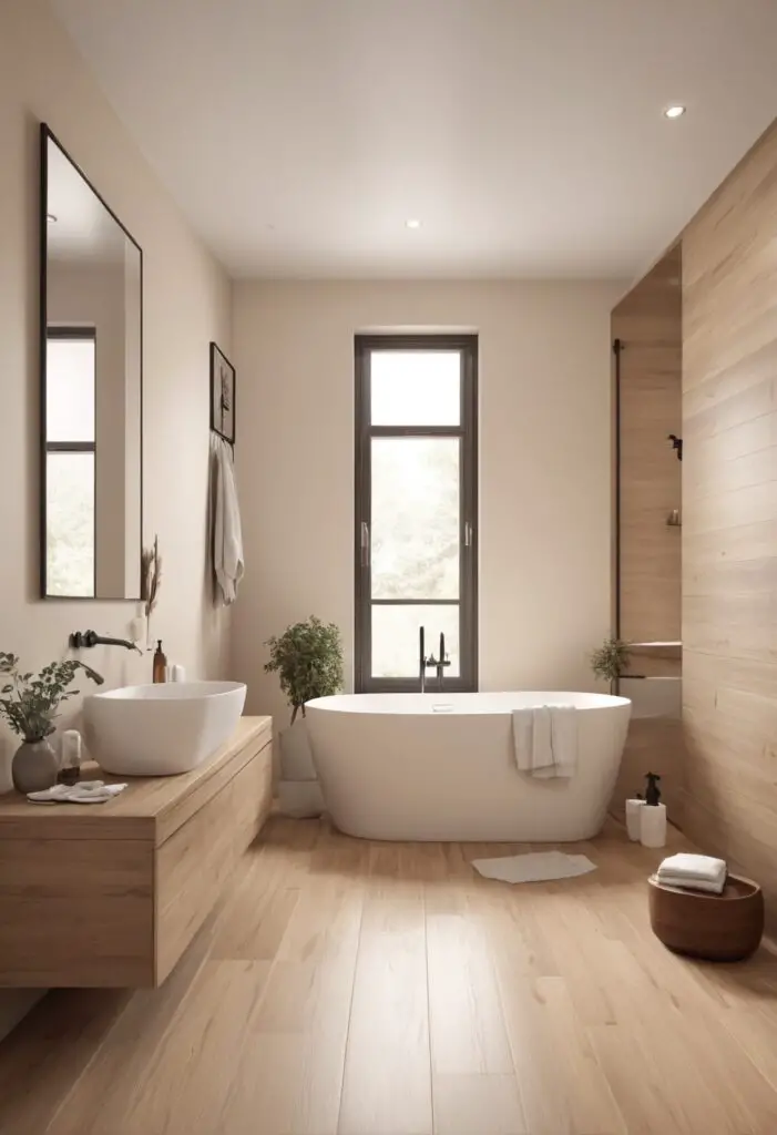
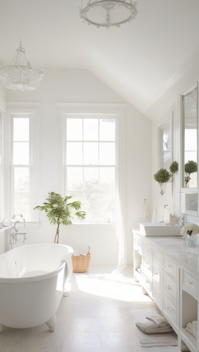
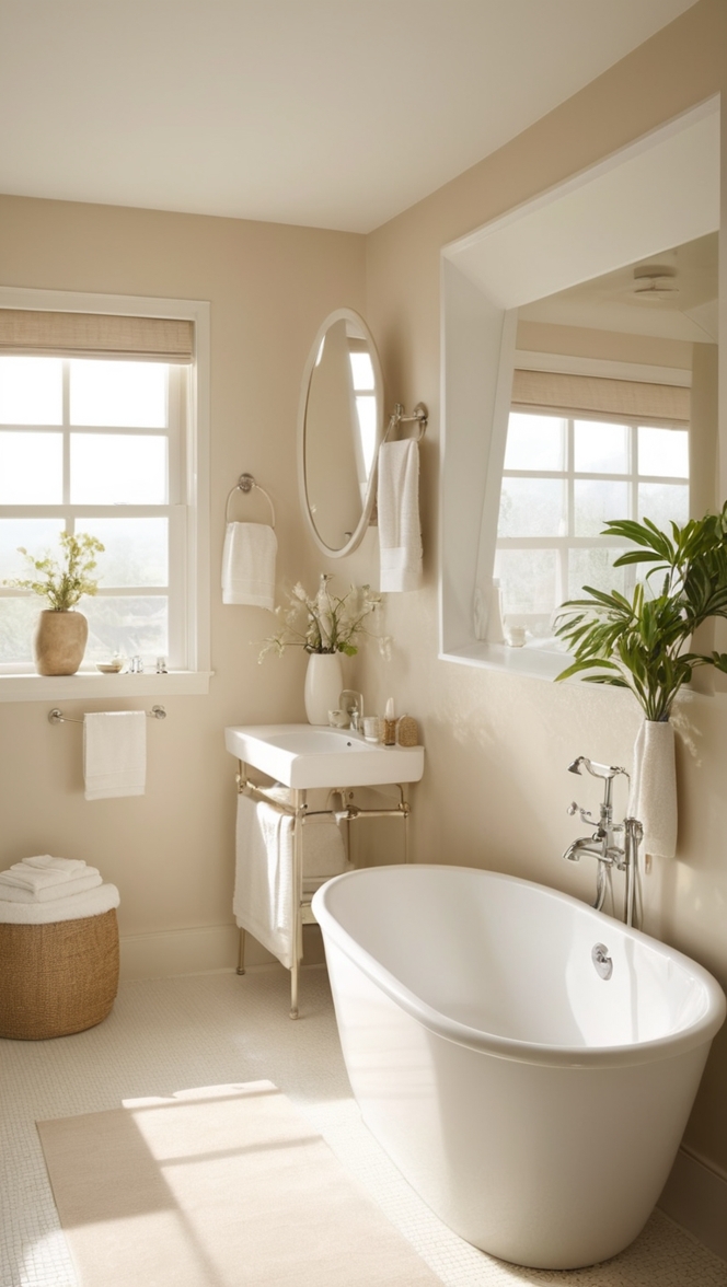
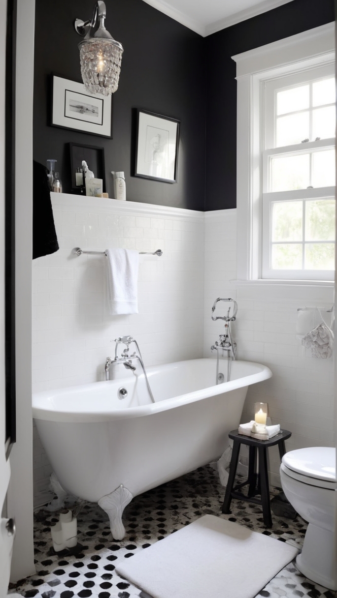
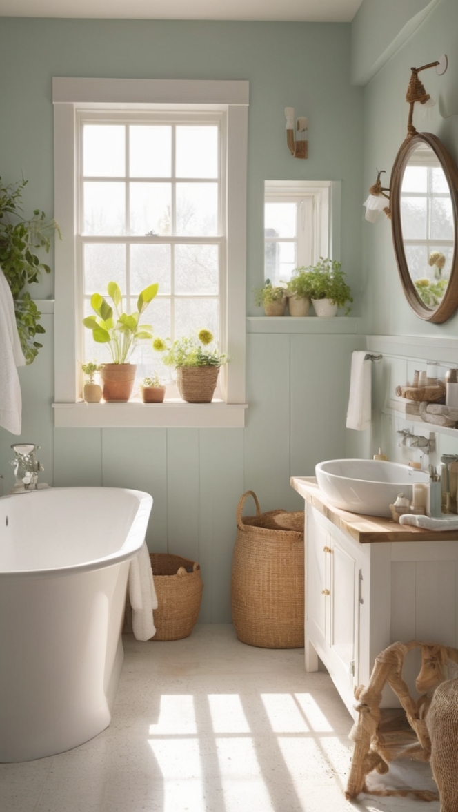
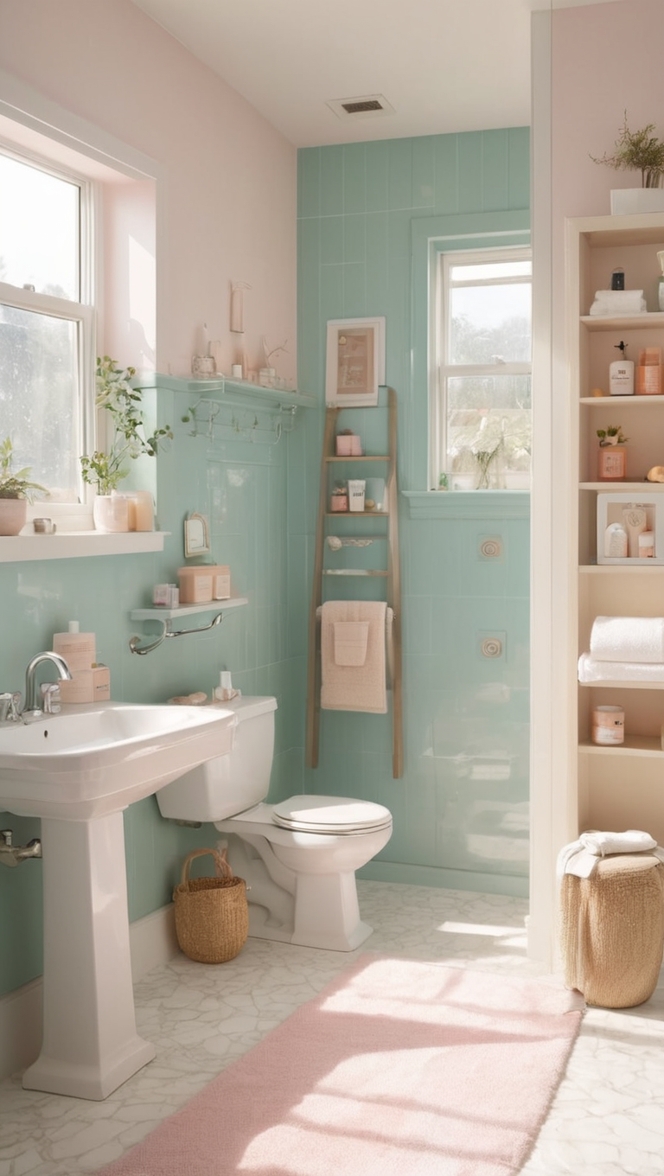
In the realm of interior design, paint color is the cornerstone upon which the aesthetic appeal of a space is built. Every year brings forth new trends and color palettes, shaping the choices homeowners make when revamping their living spaces. In 2024, one such color that has captured the attention of designers and homeowners alike is “Choice Cream.” This subtle yet sophisticated hue offers a contemporary twist on traditional neutrals, making it an ideal choice for modernizing your bathroom.
5 Tips to Match Choice Cream Paint with Your Bathroom:
- Consider Lighting: Before diving into painting your bathroom “Choice Cream,” assess the lighting conditions. Natural light enhances the warmth of this color, while artificial lighting can sometimes cast shadows that alter its appearance. Opt for warm LED bulbs to maintain the color’s integrity.
- Pair with Contrasting Accents: To create visual interest, complement the softness of “Choice Cream” with accents in contrasting hues. Deep navy blues, charcoal grays, or even metallic finishes like brass or copper can add depth and sophistication to your bathroom design.
- Experiment with Texture: Introduce various textures to prevent the space from feeling flat. Matte finishes on cabinetry or tiles juxtaposed with glossy surfaces can create a dynamic interplay of light and shadow, enhancing the overall ambiance of the bathroom.
- Test Before Committing: Always test paint samples in your bathroom before committing to a full paint job. Colors can appear differently under various lighting conditions and against different materials. Testing will ensure that “Choice Cream” complements your existing fixtures and furnishings harmoniously.
- Accessorize Thoughtfully: Once the walls are painted, tie the look together with carefully curated accessories. Towels, rugs, and artwork in complementary colors can enhance the cohesive feel of the space while allowing “Choice Cream” to remain the focal point.
5 Hue Matching Suggestions for Choice Cream Paint:
- Slate Gray: For a sophisticated and modern look, pair “Choice Cream” with slate gray accents. This combination exudes elegance and creates a calming atmosphere, perfect for unwinding after a long day.
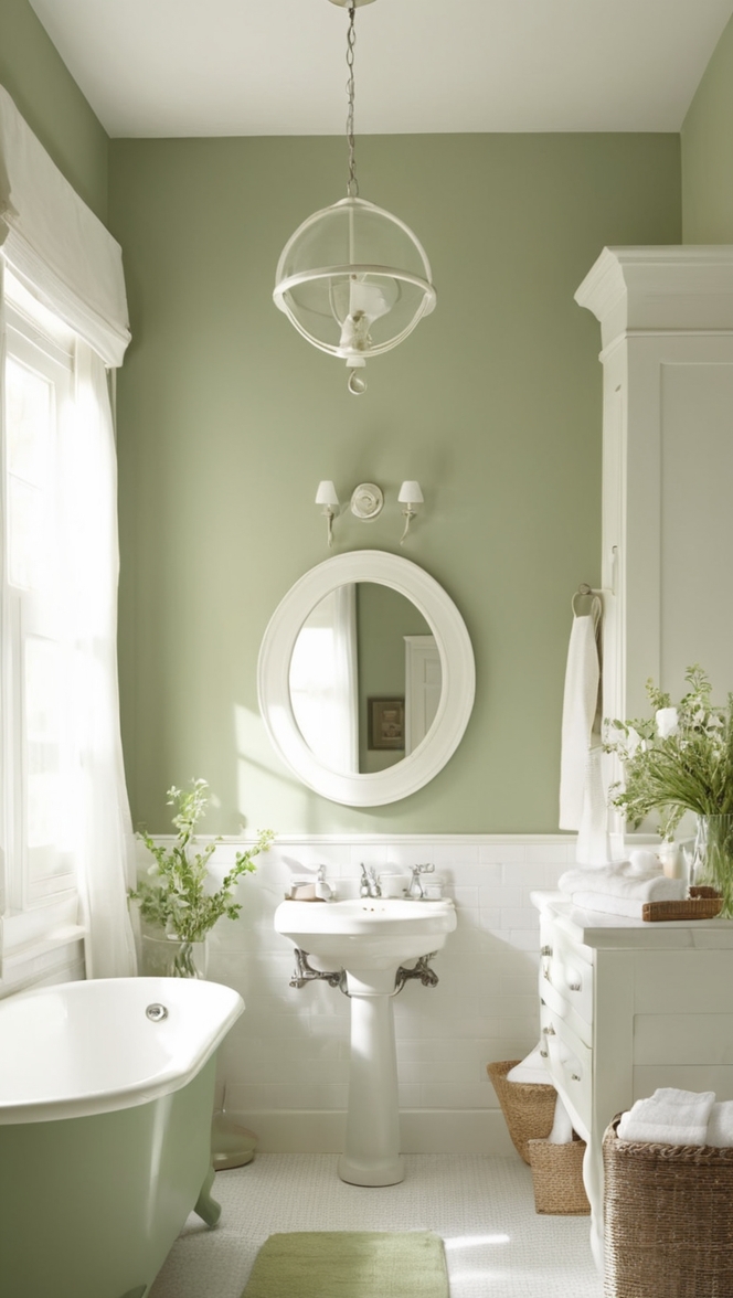
- Soft Sage Green: Bring a touch of nature into your bathroom by incorporating soft sage green elements alongside “Choice Cream” walls. This pairing evokes a sense of serenity and freshness, reminiscent of a spa-like retreat.
- Blush Pink: For a subtle hint of femininity and warmth, consider adding blush pink accessories or textiles to your “Choice Cream” bathroom. This delicate combination adds a soft and inviting feel to the space.
- Rich Navy Blue: Create a striking contrast by incorporating rich navy blue accents against “Choice Cream” walls. This bold pairing adds depth and drama to the bathroom while maintaining a modern and sophisticated aesthetic.
- Warm Terracotta: Infuse your bathroom with earthy charm by introducing warm terracotta tones alongside “Choice Cream” paint. This pairing creates a cozy and inviting atmosphere, reminiscent of rustic retreats.
5 Alternative Colors from Sherwin Williams and Benjamin Moore:
- Sherwin Williams “Alabaster” (SW 7008): If “Choice Cream” isn’t quite the right fit for your bathroom, consider Sherwin Williams’ “Alabaster.” This soft, warm white pairs beautifully with a variety of color schemes and provides a timeless backdrop for any design aesthetic.
- Benjamin Moore “Revere Pewter” (HC-172): For those seeking a versatile neutral with a hint of warmth, Benjamin Moore’s “Revere Pewter” is an excellent choice. This classic greige works well in bathrooms of all sizes and styles, providing a sophisticated backdrop for any decor.
- Sherwin Williams “Sea Salt” (SW 6204): Embrace tranquility with Sherwin Williams’ “Sea Salt,” a soothing blue-green hue that adds a touch of coastal charm to any bathroom. This refreshing color pairs beautifully with “Choice Cream” for a serene and inviting look.
- Benjamin Moore “Hale Navy” (HC-154): Make a bold statement with Benjamin Moore’s “Hale Navy,” a rich and luxurious hue that adds depth and drama to your bathroom. Pair it with “Choice Cream” for a striking contrast that exudes modern elegance.
- Sherwin Williams “Accessible Beige” (SW 7036): For a timeless and understated look, consider Sherwin Williams’ “Accessible Beige.” This warm neutral provides a versatile backdrop for any bathroom decor and pairs beautifully with “Choice Cream” for a cohesive and inviting space.
Other Rooms to Use Choice Cream:
Living Room: In the living room, “Choice Cream” can serve as a versatile backdrop for both bold and neutral furnishings. Pair it with vibrant accent colors for a lively feel or with muted tones for a more relaxed ambiance.
Kitchen: In the kitchen, “Choice Cream” can brighten up the space and create an inviting atmosphere. Pair it with crisp white cabinets for a classic look or with warm wood tones for a more rustic feel.
Bedroom: In the bedroom, “Choice Cream” can promote a sense of calm and relaxation, making it the perfect choice for walls or bedding. Pair it with soft pastels for a serene feel or with deep jewel tones for a more dramatic look.
Conclusion:
In conclusion, “Choice Cream” is a versatile and sophisticated paint color that can elevate any room in your home, particularly the bathroom. Its subtle warmth adds depth and character to the space, while its neutrality allows for endless styling possibilities. By following the tips provided and exploring complementary hues and alternative color options, you can create a modern and inviting bathroom that reflects your personal style and enhances your daily routine. So why wait? Embrace the timeless elegance of “Choice Cream” and transform your bathroom into a sanctuary of style and relaxation.

