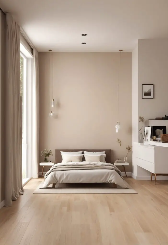
In the realm of interior design, the color of your walls serves as the canvas upon which the rest of your decor unfolds. With the dawn of 2024, a resurgence in timeless elegance is witnessed, with a modern twist. One color that encapsulates this essence impeccably is “Choice Cream”. This subtle yet sophisticated hue breathes life into any space, particularly modern bedrooms. Let’s delve into why “Choice Cream” is the quintessential paint color for contemporary sleeping quarters.
Why Choice Cream Paint?
“Choice Cream” embodies understated sophistication, making it the perfect backdrop for a modern bedroom. Its soft, warm tones create a cozy and inviting ambiance, conducive to relaxation and rejuvenation. Unlike stark whites or bold hues, “Choice Cream” strikes a delicate balance, offering a serene environment without overpowering the space.
Furthermore, its versatility knows no bounds. “Choice Cream” pairs seamlessly with a myriad of decor styles, from minimalist to eclectic. Whether you opt for sleek, contemporary furnishings or vintage-inspired accents, this timeless hue serves as the ideal complement, tying the room together effortlessly.
In addition to its aesthetic appeal, “Choice Cream” boasts practical benefits as well. Its neutral undertones make it an excellent choice for small bedrooms, as it visually expands the space, creating an illusion of airiness and openness. Moreover, its soothing qualities promote a sense of tranquility, fostering better sleep quality—a crucial aspect of any bedroom design.
Tips to Match Color with Choice Cream:
- Contrast with Bold Accents: Offset the softness of “Choice Cream” by incorporating bold accents in deep navy, emerald green, or rich burgundy. These contrasting hues create visual interest and prevent the room from feeling too monotonous.
- Embrace Natural Elements: Enhance the warmth of “Choice Cream” by incorporating natural elements such as wood, rattan, or stone. These textures add depth to the space while complementing the earthy undertones of the paint color.
- Layer with Textiles: Introduce layers of texture through textiles such as plush rugs, cozy throws, and tactile cushions. Opt for neutral tones like beige, taupe, or soft gray to maintain cohesion while adding visual and tactile interest.
- Play with Metallic Accents: Elevate the elegance of “Choice Cream” by incorporating metallic accents in gold, brass, or copper. These reflective surfaces add a touch of glamour and sophistication, enhancing the overall aesthetic of the room.
- Balance with White: Create a fresh and airy feel by pairing “Choice Cream” with crisp white accents. From bedding and curtains to furniture and decor accessories, white elements provide contrast while amplifying the lightness of the space.
Hue Matching with Choice Cream:
- Soft Gray: For a harmonious and serene look, pair “Choice Cream” with soft gray accents. This subtle combination exudes understated elegance and creates a cohesive color palette.
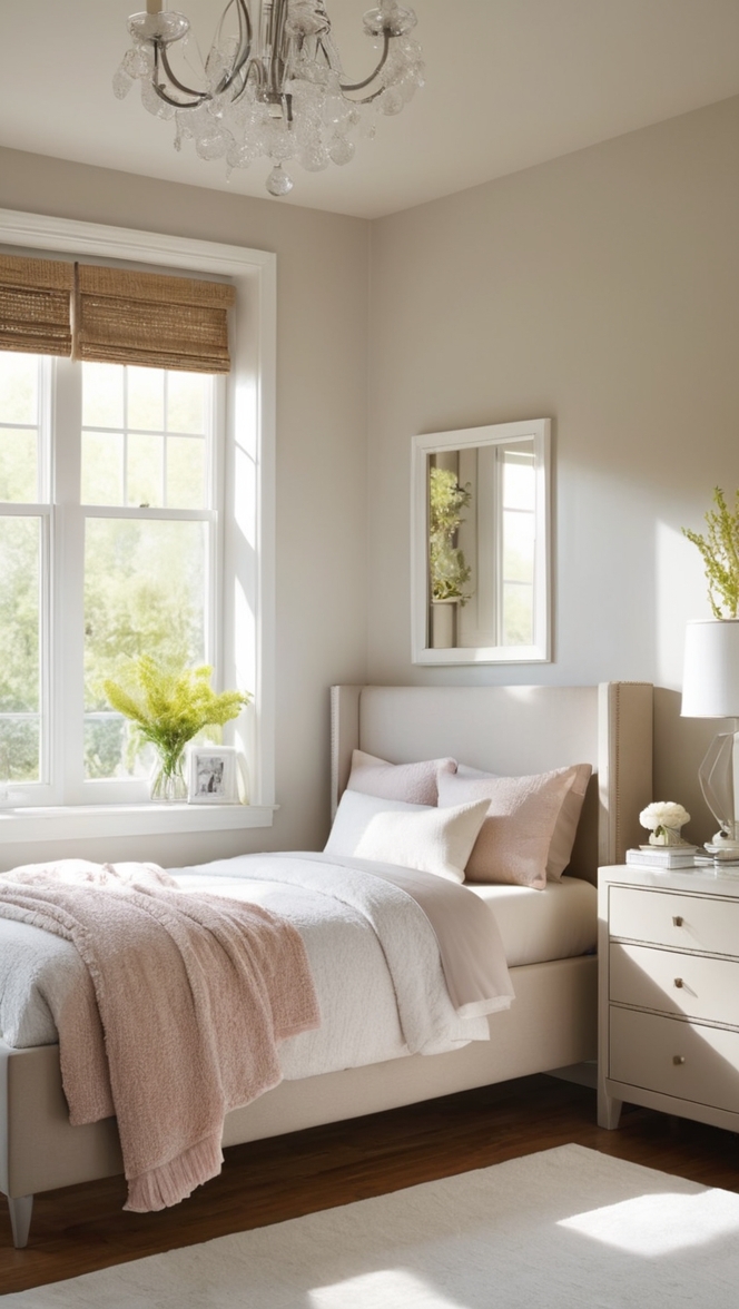
- Blush Pink: Infuse a hint of romance and femininity by combining “Choice Cream” with blush pink accents. This delicate pairing adds a soft and ethereal vibe to the bedroom, perfect for creating a serene retreat.
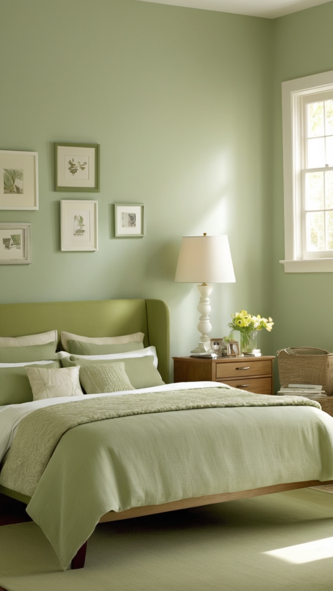
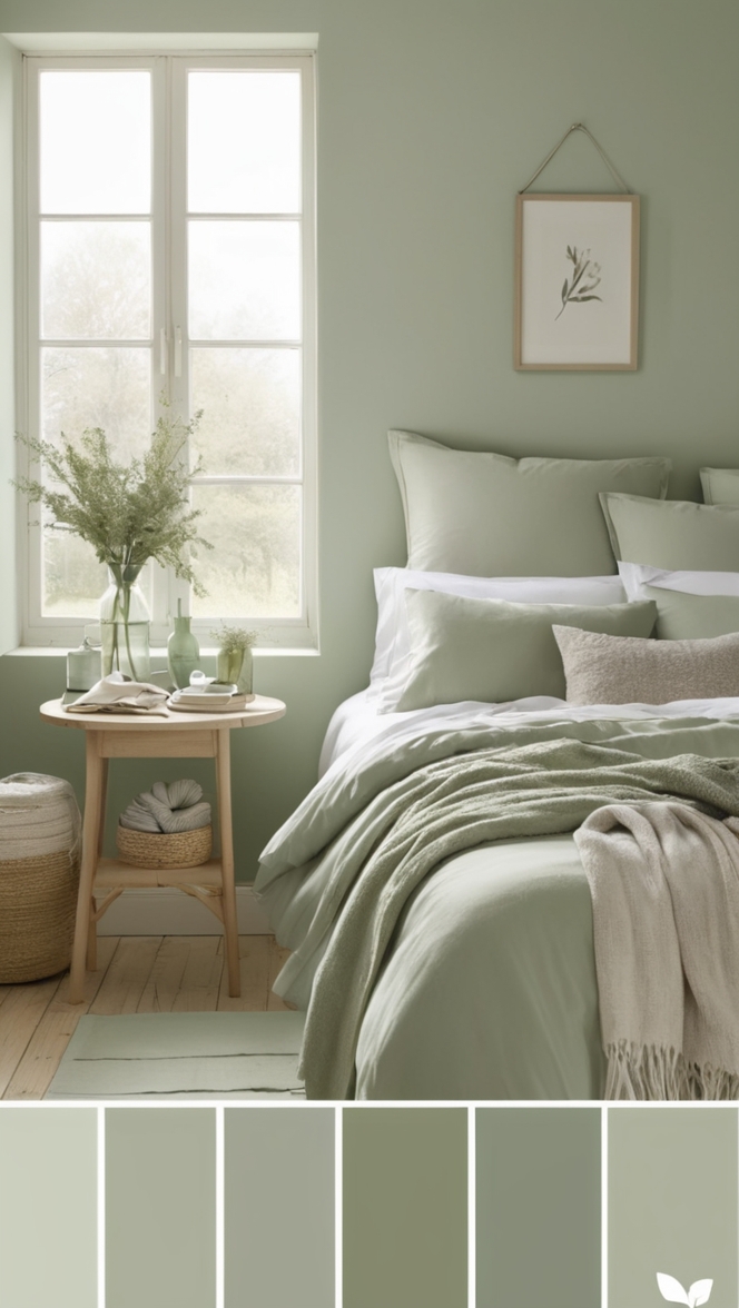
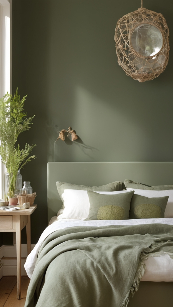
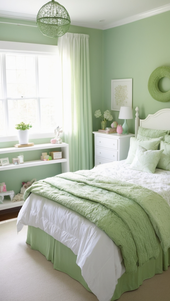
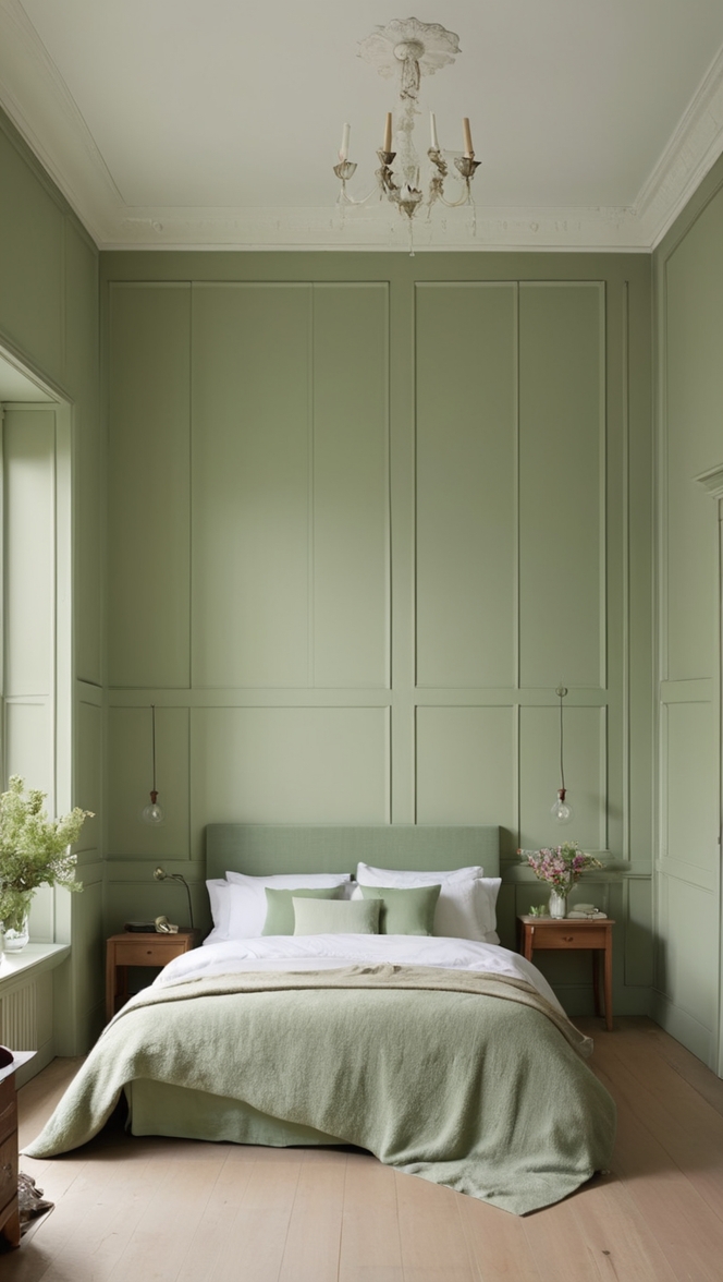
- Sage Green: Embrace the tranquility of nature by incorporating sage green accents alongside “Choice Cream”. This refreshing combination evokes a sense of serenity and balance, ideal for promoting relaxation and well-being.
- Muted Blue: Achieve a timeless and sophisticated look by pairing “Choice Cream” with muted blue accents. This classic combination exudes elegance and tranquility, creating a calming atmosphere conducive to restful sleep.
- Warm Taupe: Enhance the warmth of “Choice Cream” by complementing it with warm taupe accents. This earthy pairing creates a cozy and inviting ambiance, perfect for creating a snug retreat from the outside world.
Alternative Colors from Sherwin Williams and Benjamin Moore:
- Sherwin Williams: Accessible Beige: A versatile and timeless hue, Accessible Beige pairs beautifully with “Choice Cream”. Its warm undertones complement the softness of “Choice Cream”, creating a cohesive and inviting color palette.
- Benjamin Moore: Revere Pewter: A popular greige shade, Revere Pewter offers a sophisticated backdrop for “Choice Cream”. Its neutral undertones blend seamlessly with the warmth of “Choice Cream”, creating a harmonious and timeless look.
Other Rooms to Use Choice Cream:
Living Room: Create a cozy and inviting living room by painting the walls in “Choice Cream”. Pair with plush sofas and armchairs in neutral tones for a sophisticated yet comfortable gathering space.
Dining Room: Set the stage for memorable meals by adorning the dining room walls with “Choice Cream”. Pair with a rustic wooden dining table and upholstered chairs for a warm and inviting ambiance.
Home Office: Foster creativity and productivity in your home office by incorporating “Choice Cream” into the decor. Pair with sleek white furniture and metallic accents for a modern and inspiring workspace.
Conclusion:
In the realm of interior design, the choice of paint color holds significant sway over the ambiance and aesthetic of a space. “Choice Cream” emerges as a frontrunner for modern bedrooms in 2024, thanks to its timeless elegance and versatility. Whether paired with bold accents for a contemporary look or soft pastels for a romantic vibe, “Choice Cream” lends itself to endless design possibilities. With its ability to create a serene and inviting atmosphere, this subtle yet sophisticated hue truly redefines elegance in the modern home.