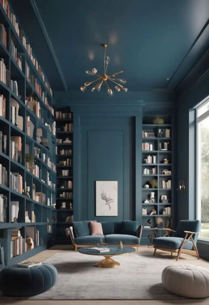
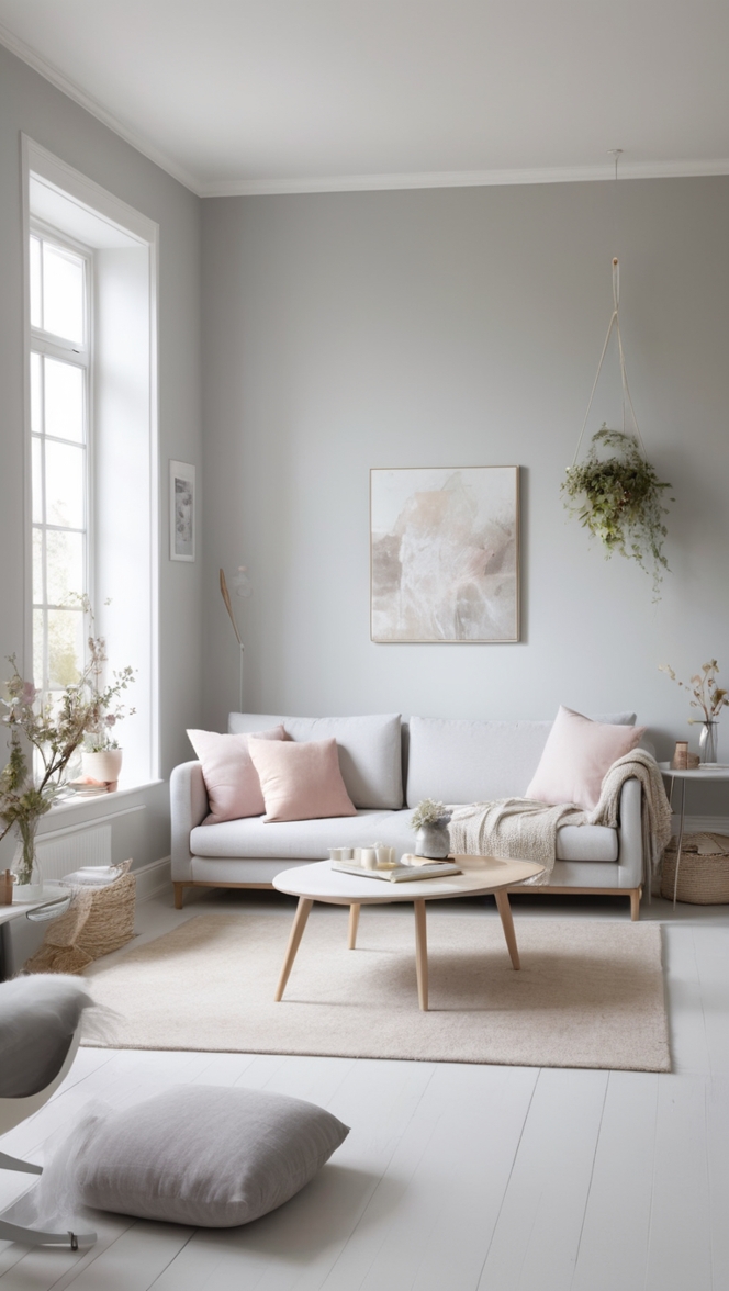
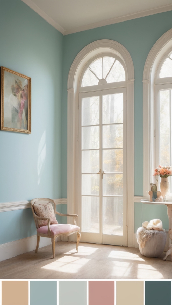
In the ever-evolving landscape of interior design, selecting the perfect paint color can set the tone for a space, invoking emotions and creating an ambiance that resonates with its purpose. For modern libraries seeking to embrace serenity while maintaining a contemporary edge, “Tranquility Blue” emerges as the quintessential choice for 2024. This captivating hue encapsulates the essence of calmness, sophistication, and intellectual exploration, making it an ideal companion for the sanctuary of knowledge that is a library.
Why Recommend Tranquility Blue?
- Calming Aura: Tranquility Blue casts a serene atmosphere, fostering an environment conducive to deep focus and relaxation. The soft undertones of this shade gently envelop the room, creating a sense of tranquility that encourages patrons to immerse themselves in the world of literature.
- Modern Elegance: Embracing a contemporary aesthetic, Tranquility Blue infuses a touch of elegance into the library space. Its clean and minimalist appeal complements modern architecture and furnishings, elevating the overall ambiance with a timeless sophistication.
- Enhanced Concentration: Studies have shown that certain colors can affect cognitive function, and blue is renowned for its ability to enhance concentration and productivity. By enveloping the library in Tranquility Blue, patrons can experience heightened focus, allowing for deeper engagement with their reading materials.
- Versatile Pairing: Tranquility Blue serves as a versatile backdrop that harmonizes effortlessly with various design elements. Whether paired with sleek metallic accents for a contemporary vibe or juxtaposed with natural wood textures for a rustic charm, this adaptable hue lends itself to endless design possibilities.
- Evoke Inspiration: Libraries are not merely repositories of books but also sanctuaries of inspiration. Tranquility Blue evokes a sense of introspection and creativity, empowering visitors to explore new ideas and embark on intellectual journeys with a refreshed perspective.
Tips to Match Color:
- Natural Light Enhancement: Utilize ample natural light to enhance the soothing qualities of Tranquility Blue. Opt for large windows or strategically placed skylights to invite sunlight into the space, accentuating the calming ambiance.
- Complementary Accents: Incorporate furnishings and décor accessories in neutral tones such as white, beige, or light gray to complement the tranquil blue backdrop. This balance ensures visual harmony while allowing the color to remain the focal point.
- Texture Contrast: Introduce textural contrast to add visual interest to the library. Consider incorporating plush area rugs, velvet upholstery, or metallic accents to create depth and dimension against the smooth backdrop of Tranquility Blue.
- Artistic Expression: Showcase artwork or wall decor that complements the color palette of Tranquility Blue. Select pieces with hints of complementary colors or opt for monochromatic artworks to maintain a cohesive aesthetic within the space.
- Lighting Ambiance: Experiment with lighting fixtures to enhance the ambiance of the library. Soft, warm lighting creates a cozy atmosphere perfect for reading, while adjustable fixtures offer flexibility to adapt to different activities and moods.
Hue Matching:
- Coastal Blue: Capture the essence of the seaside with hues reminiscent of tranquil ocean waters. Coastal blues, ranging from pale cerulean to deep navy, complement Tranquility Blue beautifully, infusing the library with a sense of coastal charm.
- Slate Gray: For a sophisticated contrast, consider pairing Tranquility Blue with shades of slate gray. The cool undertones of gray create a modern backdrop that allows the serene blue hue to pop, resulting in a visually striking yet harmonious combination.
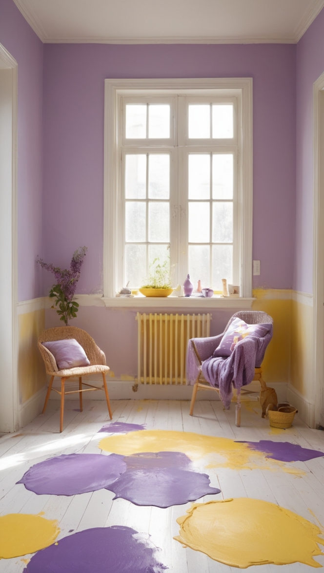
- Soft Lavender: Infuse a hint of whimsy and femininity by incorporating soft lavender accents alongside Tranquility Blue. This delicate pairing evokes a sense of tranquility and grace, adding a touch of romance to the modern library setting.
- Earthy Taupe: Embrace earthy warmth by introducing taupe elements into the design scheme. The neutral undertones of taupe provide a grounding effect, balancing the coolness of Tranquility Blue and imparting a sense of comfort and stability to the space.
- Muted Olive: Explore unconventional pairings by combining Tranquility Blue with muted olive tones. The subtle green hues of olive add depth and richness to the color palette, infusing the library with a harmonious blend of natural tranquility and modern sophistication.
Alternative Colors from Sherwin Williams and Benjamin Moore:
- Sherwin Williams – “Sea Salt”: This soft, muted green-blue hue offers a refreshing alternative to Tranquility Blue, evoking a sense of coastal serenity and natural tranquility.
- Benjamin Moore – “Gray Owl”: A versatile shade of gray with subtle blue undertones, Gray Owl provides a sophisticated backdrop that pairs seamlessly with Tranquility Blue, creating a timeless and elegant aesthetic.
- Sherwin Williams – “Silver Strand”: Blending subtle blue and gray undertones, Silver Strand exudes a tranquil yet sophisticated vibe, making it an excellent choice for modern libraries seeking a calming ambiance with a contemporary edge.
- Benjamin Moore – “Beacon Gray”: With its soft, understated elegance, Beacon Gray complements Tranquility Blue beautifully, creating a cohesive color scheme that exudes sophistication and refinement.
- Sherwin Williams – “Repose Gray”: This versatile greige shade strikes the perfect balance between gray and beige, offering a neutral backdrop that harmonizes effortlessly with Tranquility Blue, creating a serene and inviting atmosphere.
Other Rooms to Use Tranquility Blue:
Reading Nooks
Transform cozy reading nooks into havens of tranquility by adorning the walls with Tranquility Blue. Pair with plush armchairs, soft throws, and ambient lighting to create a serene retreat perfect for curling up with a good book.
Home Offices
Promote productivity and focus in home offices by incorporating Tranquility Blue as the primary wall color. Pair with sleek, modern furnishings and ergonomic workspace solutions to create a harmonious environment conducive to both work and creativity.
Bedrooms
Create a soothing sanctuary in bedrooms by enveloping the space in Tranquility Blue. Pair with crisp white linens, natural wood accents, and soft textiles to evoke a sense of serenity and relaxation, ensuring restful nights and rejuvenating mornings.
Meditation Spaces
Foster a sense of peace and tranquility in meditation spaces by embracing the calming hue of Tranquility Blue. Combine with minimalist decor, floor cushions, and soothing aromatherapy to create a serene oasis conducive to mindfulness and inner peace.
Spa Bathrooms
Transform bathrooms into luxurious retreats by incorporating Tranquility Blue as the primary color scheme. Pair with sleek marble countertops, plush towels, and soft candlelight to evoke a sense of spa-like tranquility, offering a rejuvenating escape from the stresses of daily life.
Conclusion:
In the pursuit of creating modern libraries that inspire and captivate, the choice of paint color plays a pivotal role in shaping the ambiance and experience of the space. Tranquility Blue emerges as a timeless and versatile hue that embodies serenity, sophistication, and intellectual exploration. By embracing this captivating color, libraries can evoke a sense of calmness, enhance concentration, and foster creativity, creating sanctuaries of knowledge that resonate with patrons for years to come. Whether adorning the walls of libraries, reading nooks, home offices
, or meditation spaces, Tranquility Blue invites individuals to dive into a world of tranquility and embark on enriching intellectual journeys with renewed vigor and inspiration.

