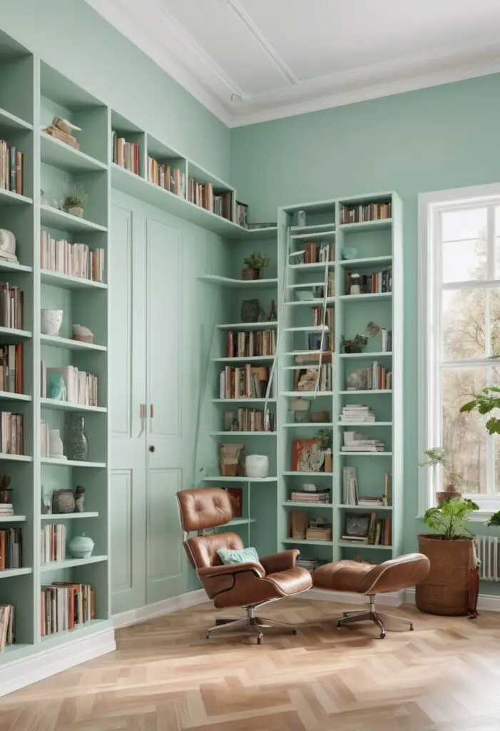
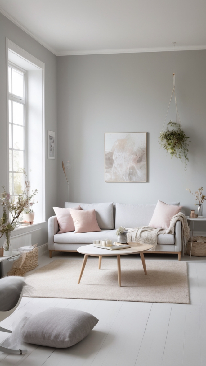
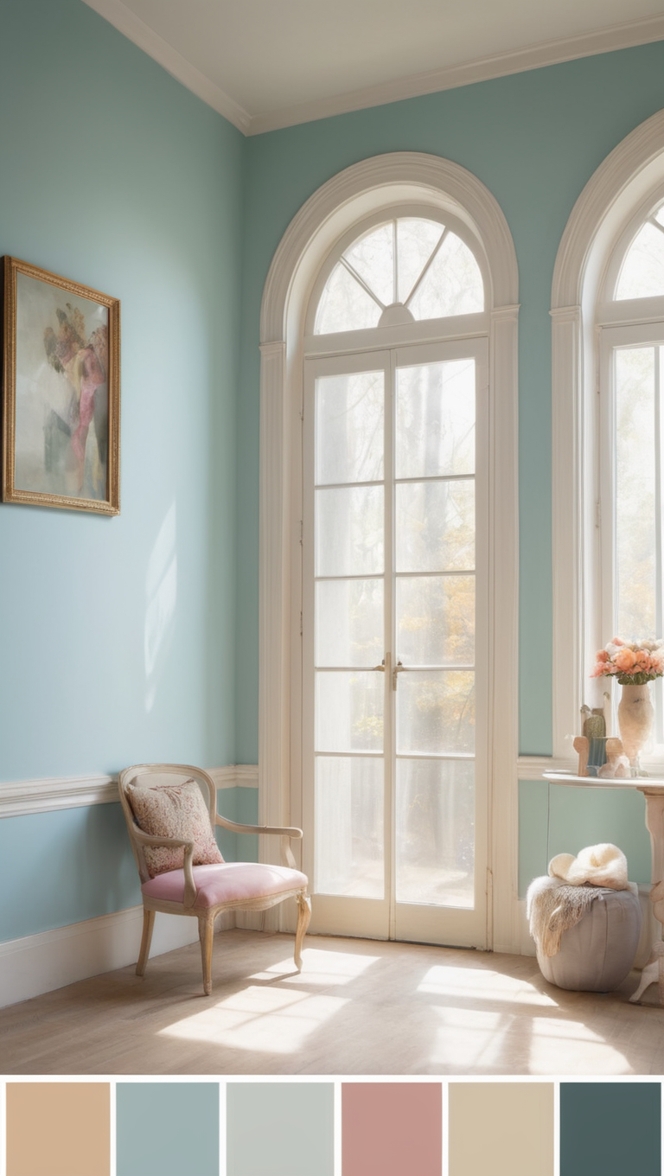
In the realm of interior design, selecting the perfect paint color can transform a space from mundane to magnificent. For 2024, the color Retro Mint has emerged as a refreshing choice, offering a blend of nostalgia and contemporary appeal that suits various interior styles, particularly when creating a timeless library.
Why Choose Retro Mint Paint?
Retro Mint, as the name suggests, combines elements of vintage charm with a modern twist. This subtle yet vibrant shade of green evokes a sense of tranquility and sophistication, making it ideal for spaces meant for relaxation and intellectual pursuits, such as a library. Here are several compelling reasons why Retro Mint paint is a stellar choice for your home library:
- Versatility: Retro Mint is a versatile color that complements a wide range of interior styles, from traditional to modern and everything in between. Its soothing green tones can be paired with both warm and cool color palettes, allowing for flexibility in decor choices.
- Timelessness: Unlike trendy colors that may quickly go out of style, Retro Mint possesses a timeless quality. Its classic appeal ensures that your library will remain stylish and inviting for years to come, making it a worthwhile investment in your home’s aesthetic.
- Mood Enhancement: Green shades like Retro Mint are known for their ability to promote a sense of calm and relaxation. In a library setting, where concentration and contemplation are paramount, this soothing color can create an environment conducive to reading, studying, or simply unwinding with a good book.
- Light Reflective: Retro Mint has a light reflective quality that can brighten up a space without being overpowering. This is particularly beneficial in smaller libraries or rooms with limited natural light, as it helps create a more open and airy atmosphere.
- Pairing Potential: From rich woods and leathers to crisp whites and metallic accents, Retro Mint pairs exceptionally well with a variety of materials and textures. This versatility allows you to personalize your library space according to your taste while maintaining a cohesive and inviting ambiance.
Tips to Match Retro Mint Paint:
When incorporating Retro Mint into your library design, consider the following tips to enhance its impact and create a harmonious space:
- Natural Elements: Introduce natural elements such as wooden bookshelves, rattan furniture, or indoor plants to complement Retro Mint’s organic feel.
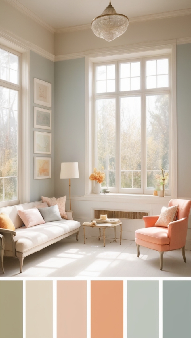
- Accent Colors: Use complementary colors like soft beige, warm taupe, or even deep navy as accents to add depth and visual interest to your library.
- Lighting Choices: Opt for warm lighting fixtures, such as brass or bronze lamps, to enhance the warmth of Retro Mint and create a cozy reading nook.
- Textured Fabrics: Incorporate textured fabrics like velvet or linen in neutral tones to add tactile richness to the room while maintaining the soothing ambiance of Retro Mint.
- Art and Décor: Display artwork or decorative items in contrasting colors or metallic finishes to create focal points that draw the eye and add personality to the space.
Hue Matching with Retro Mint:
If Retro Mint isn’t quite the right fit for your library, consider these alternative hues that offer a similar vibe:
- Sherwin Williams Alternative: Aloe SW 6464 – This soft green hue from Sherwin Williams offers a slightly cooler undertone while still maintaining a calming presence.
- Benjamin Moore Alternative: Palladian Blue HC-144 – Though technically a blue, Palladian Blue has hints of green that can achieve a similar tranquil effect in your library.
- Sherwin Williams Alternative: Watery SW 6478 – Another option from Sherwin Williams, Watery offers a more subdued green that leans towards aqua, perfect for a coastal-inspired library.
- Benjamin Moore Alternative: Misty Gray 2124-60 – For those preferring a more neutral approach, Misty Gray provides a serene backdrop that complements various decor styles.
- Sherwin Williams Alternative: Sea Salt SW 6204 – This popular Sherwin Williams color combines green, gray, and blue tones, creating a versatile shade that adapts well to different lighting conditions.
Other Rooms to Use Retro Mint:
While Retro Mint excels in a library setting, its soothing qualities can enhance other rooms in your home as well:
Living Room
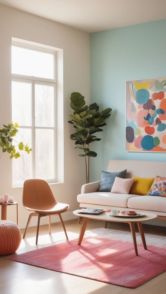
In the living room, use Retro Mint as an accent wall color paired with neutral furnishings and metallic accents for a contemporary yet cozy atmosphere.
Bedroom
In the bedroom, apply Retro Mint to the walls to create a serene retreat conducive to relaxation and restful sleep. Pair with soft bedding and natural wood furniture for a harmonious look.
Home Office
In a home office, Retro Mint can foster productivity and creativity. Combine with dark wood furniture and bright, airy accents to balance concentration with inspiration.
Kitchen
In the kitchen, use Retro Mint for cabinets or an accent wall, complemented by white countertops and stainless steel appliances for a fresh, modern feel.
Bathroom
In the bathroom, Retro Mint can create a spa-like ambiance when paired with marble or ceramic tiles, adding a touch of luxury to your daily routine.
Conclusion:
Choosing Retro Mint paint for your 2024 library renovation is a decision that combines aesthetic appeal with practical benefits. Its timeless nature, calming effect, and versatility make it an excellent choice for creating a welcoming and inspiring space dedicated to reading and reflection. Whether you opt for Retro Mint itself or one of its complementary alternatives, integrating this refreshing color into your library design is sure to elevate both the style and functionality of your home. Embrace Retro Mint and transform your library into a haven of tranquility and intellectual pursuit, where every book becomes even more captivating amidst its serene backdrop.

