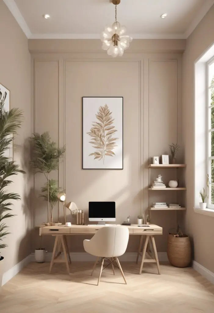
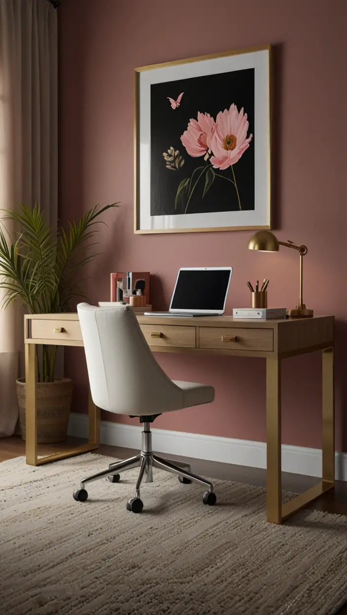
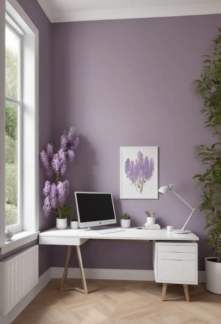
In the fast-paced world of today, where stress seems to be an inevitable part of daily life, creating serene environments becomes crucial, especially in spaces like offices where people spend a significant portion of their time. The choice of paint color plays a pivotal role in setting the ambiance of a room, and for modern offices seeking tranquility amidst productivity, Crème emerges as an ideal option.
Why Crème?
Crème, with its subtle warmth and timeless elegance, offers a perfect blend of neutrality and softness, making it an excellent choice for modern office spaces. Here’s why:
- Promotes Calmness: The soothing tones of Crème evoke a sense of tranquility, helping to create a calm and peaceful atmosphere. In a bustling office environment, this can be particularly beneficial in reducing stress and promoting a focused mindset among employees.
- Enhances Natural Light: Crème has the ability to reflect natural light, making the space feel brighter and more spacious. This not only contributes to a more inviting ambiance but also reduces the need for artificial lighting, thereby improving energy efficiency.
- Versatile and Timeless: Crème serves as a versatile backdrop that complements a wide range of interior styles and furnishings. Its timeless appeal ensures that the office space remains relevant and aesthetically pleasing for years to come, eliminating the need for frequent repaints or renovations.
- Boosts Creativity and Productivity: Studies have shown that softer, neutral colors like Crème can enhance creativity and productivity in work environments. By creating a serene backdrop, Crème allows employees to focus their attention on tasks without distractions, thereby improving overall performance.
- Easy to Coordinate: Whether paired with bold accent colors for a modern contrast or combined with other neutral tones for a harmonious palette, Crème effortlessly coordinates with various design elements, allowing for endless possibilities in office decor.
Tips to Match Crème Paint Color:
Here are five tips to effectively match Crème paint color with other elements in your office design:
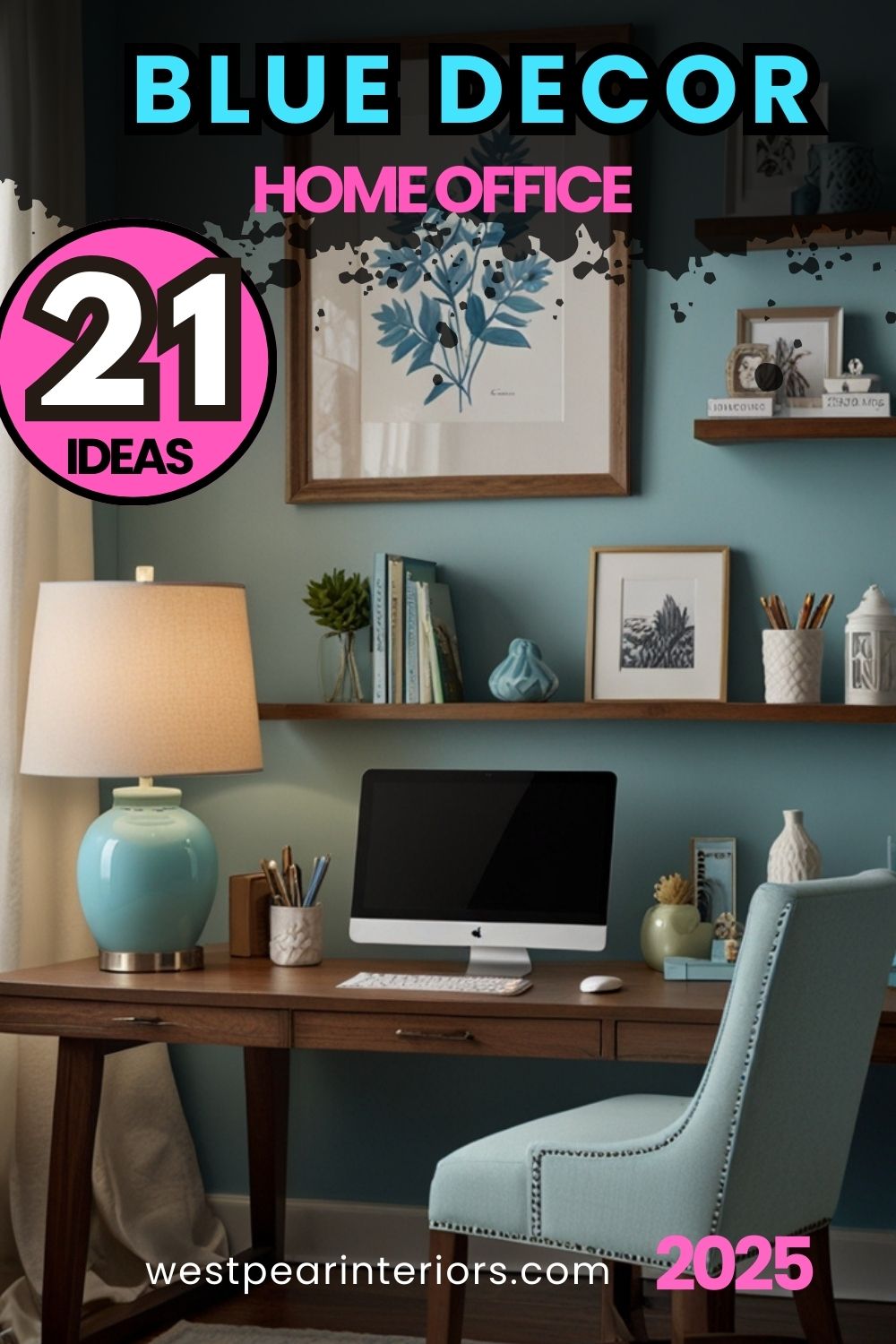
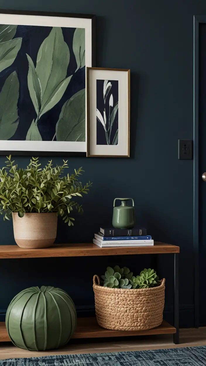
- Contrast with Bold Accents: Pair Crème walls with bold accent colors such as navy blue, emerald green, or mustard yellow to create a striking visual contrast and add depth to the space.
- Complement with Natural Textures: Incorporate natural textures like wood, stone, or woven materials in furniture and decor to complement the warmth of Crème and create a harmonious, organic look.
- Balance with Neutral Furnishings: Choose furniture pieces in neutral tones such as beige, taupe, or charcoal to maintain a cohesive color scheme and prevent the space from feeling overwhelming.
- Layer with Soft Fabrics: Introduce soft fabrics like linen curtains, plush rugs, and upholstered seating in subtle hues to enhance the cozy ambiance of the office and add texture to the design.
- Accessorize with Metallic Accents: Add touches of metallic finishes like brass, copper, or chrome through light fixtures, hardware, and decor accessories to infuse a hint of glamour and sophistication into the space.
Hue Matching for Crème:
My Lovely Spring Paint for 2025
Ready for a Spring Makeover? Explore the Freshest 2025 Paint Trends!
White Sage/Green SW Pistachio green Soft blue Honeysweet/Orange Pink Sugar Sage Tint BMAs an Amazon Associate, I may earn a commission from qualifying purchases at no extra cost to you.
When selecting complementary hues to pair with Crème, consider the following options:
- Soft Sage Green: Create a serene and nature-inspired ambiance by pairing Crème with soft sage green accents for a refreshing and calming effect.
- Dusty Rose: Infuse a subtle hint of warmth and femininity into the office space by combining Crème with accents in dusty rose or blush pink tones.
- Slate Gray: Achieve a modern and sophisticated look by pairing Crème with accents in slate gray, charcoal, or graphite for a sleek and monochromatic color scheme.
- Sky Blue: Add a pop of color and visual interest to the office environment by incorporating accents in sky blue or powder blue hues for a refreshing and uplifting atmosphere.
- Warm Terracotta: Create a cozy and inviting atmosphere by pairing Crème with accents in warm terracotta or burnt orange tones for a rustic yet contemporary look.
Alternative Colors from Sherwin Williams and Benjamin Moore:
If Crème isn’t the perfect fit for your office, consider these alternative paint colors from Sherwin Williams and Benjamin Moore:
Sherwin Williams:
- Alabaster (SW 7008): A timeless off-white shade with subtle warmth that complements various design styles and enhances natural light.
- Agreeable Gray (SW 7029): A versatile greige (gray-beige) hue that pairs beautifully with Crème and creates a modern yet inviting atmosphere.
- Sea Salt (SW 6204): A soft, muted green-blue shade that brings a sense of tranquility and serenity to the office space, perfect for promoting relaxation and focus.
My fAV Spring DECOR for 2025
Discover Spring’s Best 2025 Decor Combinations – Perfect for Any Room!
Oversized Indoor Plants White Curved Sofas Rugs BOH Brown Cream Moroccan Hype Boho Rug Outdoor Patio Furniture Sets Topfinel Pillow CoversAs an Amazon Associate, I may earn a commission from qualifying purchases at no extra cost to you.
Benjamin Moore:
- Simply White (OC-117): A crisp and clean white hue that serves as a classic backdrop for any office design, offering a timeless and sophisticated look.
- Revere Pewter (HC-172): A popular greige shade that strikes the perfect balance between gray and beige, creating a warm and inviting atmosphere with understated elegance.
- Tranquility (AF-490): A soft, muted blue-gray shade that exudes a sense of calmness and serenity, ideal for creating a tranquil and productive work environment.
Other Rooms to Use Crème Color:
While Crème is an excellent choice for modern office spaces, its versatility allows it to be used in various other rooms as well:
Conference Rooms:
Create a professional yet inviting atmosphere in conference rooms by painting the walls in Crème, paired with sleek modern furniture and subtle pops of color for a sophisticated look.
Reception Areas:
Welcome clients and guests into the office with a warm and inviting reception area painted in Crème, complemented by comfortable seating, stylish decor, and branded accents for a memorable first impression.
Break Rooms:
Promote relaxation and camaraderie among employees in break rooms painted in Crème, furnished with cozy seating, vibrant artwork, and amenities like coffee stations or snack bars for a rejuvenating retreat within the office.
Conclusion:
In today’s fast-paced work environment, creating a serene atmosphere in the office is essential for promoting productivity, creativity, and well-being among employees. Crème emerges as an ideal paint color choice for modern offices seeking to balance tranquility with sophistication. Its calming presence, versatility, and timeless appeal make it a perfect backdrop for enhancing focus, fostering collaboration, and inspiring innovation. Whether used on its own or paired with complementary hues and textures, Crème sets the stage for a harmonious and inviting workspace that supports success and growth. Consider incorporating Crème into your office design to cultivate a serene atmosphere that empowers your team to thrive.

