Discover the secrets to crafting a harmonious color scheme for your shared home office. Elevate productivity and style effortlessly.
To create a cohesive color scheme for a shared home office space, start by selecting a primary color that will be the base of the design. Choose a color that offers a neutral backdrop, such as light grey, beige, or pale blue. Then, incorporate accent colors to add depth and interest to the space. Consider using contrasting hues or complementary colors to create visual appeal.
Make sure to coordinate furniture and accessories with the chosen color palette. Opt for pieces that complement the primary color and enhance the overall look of the room. Use decorative accents like throw pillows, curtains, and artwork to tie the color scheme together.
When selecting paint colors, test samples on the walls to see how they look in different lighting conditions. Ensure that the colors flow seamlessly from one room to another if the office is part of a larger living space.
To further enhance the harmony of the color scheme, consider using a primer paint to prepare the walls for the new color. This will ensure a smooth and even finish, allowing the chosen colors to shine.
By following these steps and paying attention to the details, you can create a cohesive color scheme for your shared home office space that reflects your personal style and promotes a productive work environment.
Determining the best color scheme for a shared home office space is crucial for creating a cohesive and harmonious work environment. Here are some key points to consider when selecting colors for a home office:
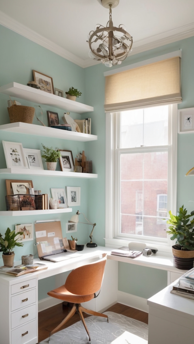
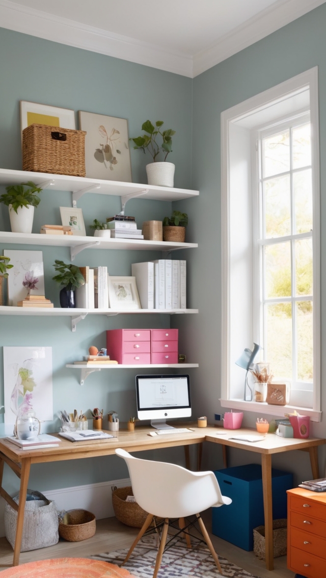
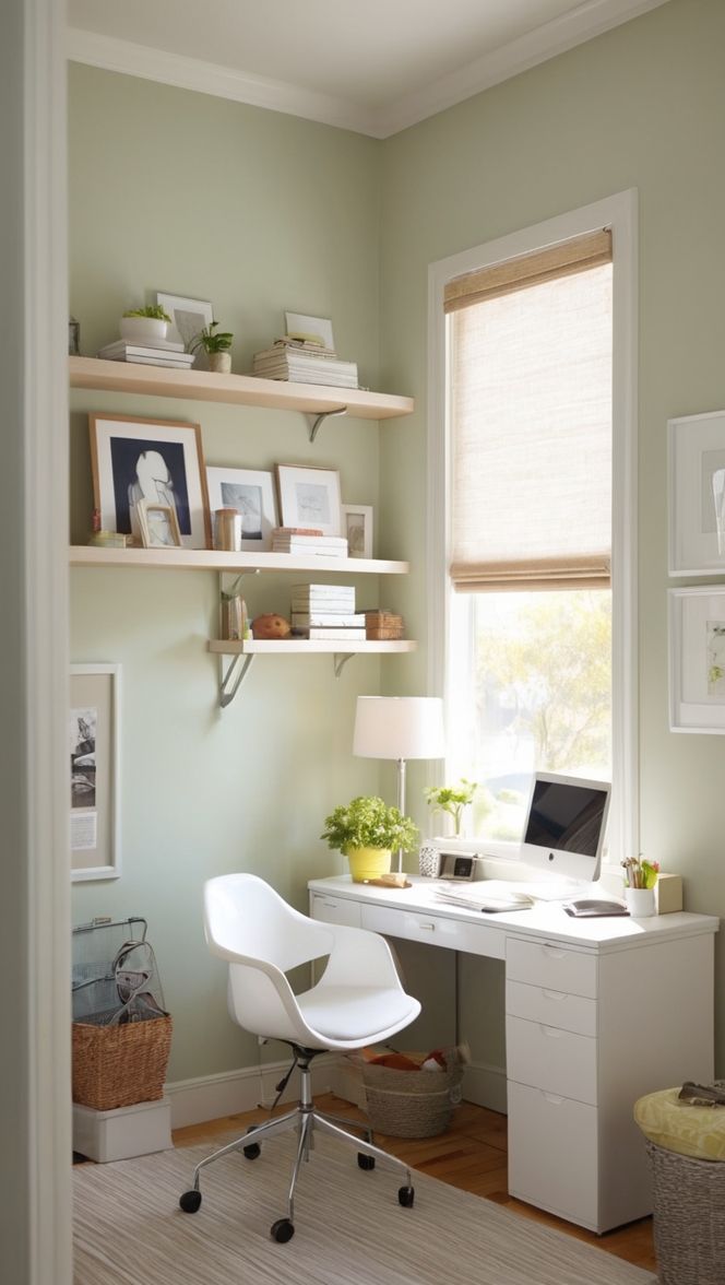
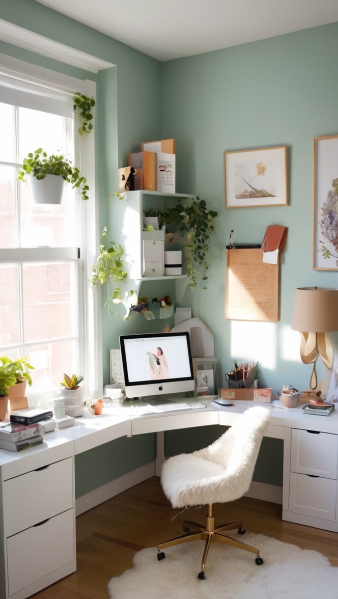
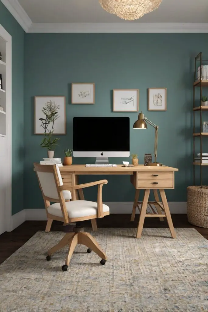
– **Functionality**: Consider the primary function of the space. For a home office, colors should promote productivity and focus. Blues and greens are known for their calming and concentration-boosting properties, making them ideal choices for a shared workspace.
– **Personal Preferences**: Take into account the preferences of all individuals using the space. While it’s essential to choose colors that enhance productivity, it’s also important to consider everyone’s taste to ensure a welcoming and comfortable environment.
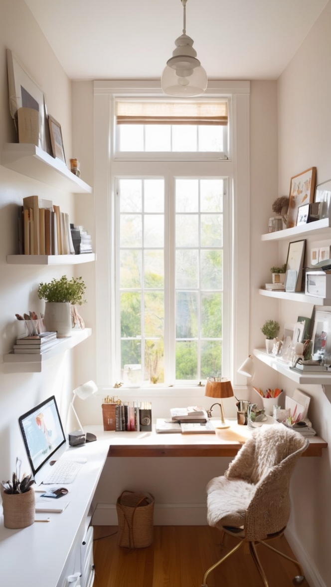
– **Lighting**: The amount of natural light in the room can influence how colors appear. In a shared home office, opt for light, neutral colors if the space lacks natural light to create a brighter and more spacious feel.
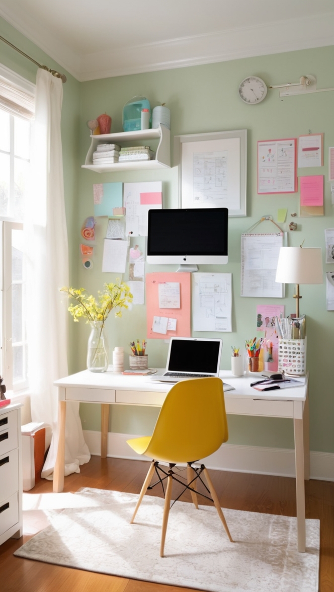
– **Color Psychology**: Different colors evoke different emotions and moods. For example, warm tones like red and yellow can be energizing but may be too stimulating for a shared workspace. Cool tones like blue and gray are calming and conducive to focus.
– **Balance**: Balance bold, vibrant colors with more neutral tones to avoid overwhelming the space. Using a neutral base can provide a calm backdrop while allowing pops of color to add interest without being distracting.
– **Accents and Accessories**: Incorporate accent colors through accessories like rugs, curtains, artwork, and decorative items. This allows for flexibility in changing color schemes without repainting walls.
– **Visual Flow**: Ensure that colors flow seamlessly throughout the shared home office space. Use a consistent color palette to create a cohesive look and tie different areas of the room together.
In a shared home office, using varying color hues can add depth and visual interest to the space while still maintaining a cohesive look. Consider the following tips to incorporate different color hues effectively:
– **Color Families**: Stick to a specific color family (e.g., shades of blue or green) to ensure that different hues blend harmoniously.
– **Gradation**: Create a sense of cohesion by using different shades and tints of the same color. This approach adds dimension without introducing clashing colors.
– **Contrast**: Use contrasting hues strategically to highlight specific areas or elements in the shared home office. For example, pairing a light hue with a darker shade can create a visually appealing contrast.
– **Color Wheel**: Familiarize yourself with the color wheel to understand how different hues work together. Complementary colors (opposite each other on the color wheel) can create a dynamic color scheme, while analogous colors (next to each other on the wheel) offer a harmonious blend.
To ensure that colors in a shared home office complement each other, follow these guidelines:
– **Undertones**: Consider the undertones of each color to ensure they harmonize. For example, if the walls have warm undertones, select furniture and decor with complementary warm tones to maintain consistency.
– **Sample Testing**: Before committing to a color scheme, test paint samples on the wall to see how various colors interact with each other in different lighting conditions.
– **Texture**: Introduce texture through furniture, textiles, and accessories to add depth to the color scheme. Textured elements can also help create visual interest and break up solid blocks of color.
To incorporate multiple colors into a shared home office space effectively, follow these tips:
– **Color Blocking**: Divide the room into color blocks and assign different colors to specific areas or zones. This approach can help define separate workstations or functional areas within the shared space.
– **Color Accents**: Use a neutral base color for walls and larger furniture pieces, then add pops of color through accents like throw pillows, artwork, and desk accessories. This allows for easy color updates or changes in the future.
– **Color Ratios**: Maintain a balance of colors in the space by following a consistent ratio. For example, use a dominant color for 60% of the room, a secondary color for 30%, and accent colors for 10% to create visual harmony.
– **Layering**: Layer colors to create depth and dimension. Pair lighter and darker hues to add contrast and visual interest while maintaining a cohesive color scheme.
Coordinating furniture and decor with a chosen color scheme in a shared home office can enhance the overall aesthetic and functionality of the space. Here are some strategies to achieve coordination:
– **Color Matching**: Select furniture and decor items that complement the color scheme of the room. Choose pieces in colors that harmonize with the wall paint and other design elements in the space.
– **Tone-on-Tone**: Opt for furniture and decor in similar tones as the wall color for a cohesive look. This monochromatic approach can create a visually unified space while still allowing for texture and contrast.
– **Contrast and Balance**: Introduce contrasting elements to prevent a monotonous color scheme. For example, pair a light-colored desk with a darker accent chair to create visual interest and balance.
– **Statement Pieces**: Use bold, colorful furniture or decor pieces as focal points in the room. These statement pieces can add personality to the shared home office while anchoring the color scheme.
When selecting paint alternatives for creating a cohesive color scheme in a shared home office, consider the following options:
– **Wall Decals**: Use removable wall decals in various colors and patterns to add visual interest without the permanence of paint. This allows for easy updates or changes to the color scheme.
– **Wallpaper**: Choose wallpaper in a coordinating color or pattern to create a focal wall in the shared home office. Wallpaper can add texture and depth to the space while incorporating multiple colors seamlessly.
In conclusion, creating a cohesive color scheme for a shared home office space involves careful consideration of functionality, personal preferences, lighting, color psychology, balance, accents, and coordination. By following these guidelines and tips, you can design a workspace that is visually appealing, harmonious, and conducive to productivity.
**Key Takeaways**
– Consider functionality, personal preferences, lighting, and color psychology when selecting colors for a shared home office.
– Use a neutral base color with pops of accent colors to maintain balance and visual interest in the space.
– Incorporate varying color hues within the same color family to create depth and cohesion.
– Ensure that colors complement each other by considering undertones, sample testing, and introducing texture.
– To incorporate multiple colors effectively, use color blocking, accents, ratios, and layering techniques.
– Coordinate furniture and decor with the chosen color scheme through color matching, tone-on-tone design, contrast, and statement pieces.
– Explore paint alternatives like wall decals and wallpaper to add color and visual interest to the shared home office.