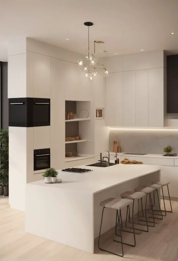
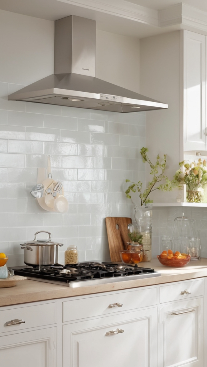
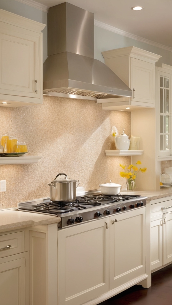
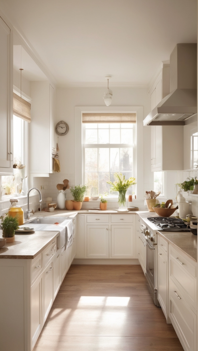
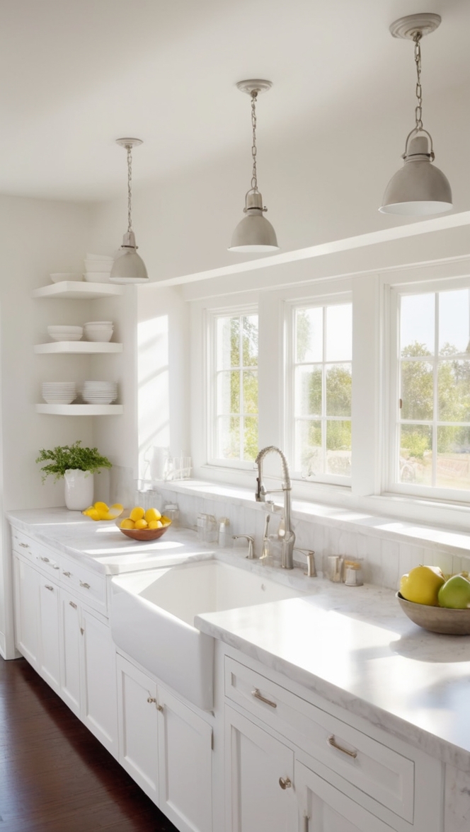
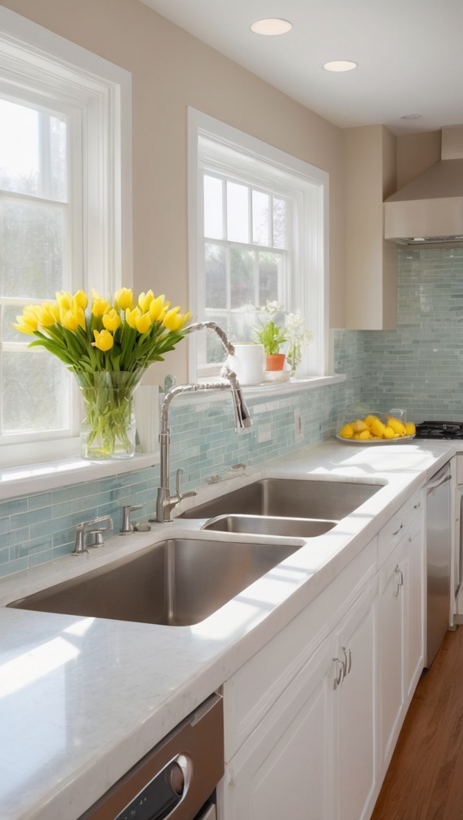
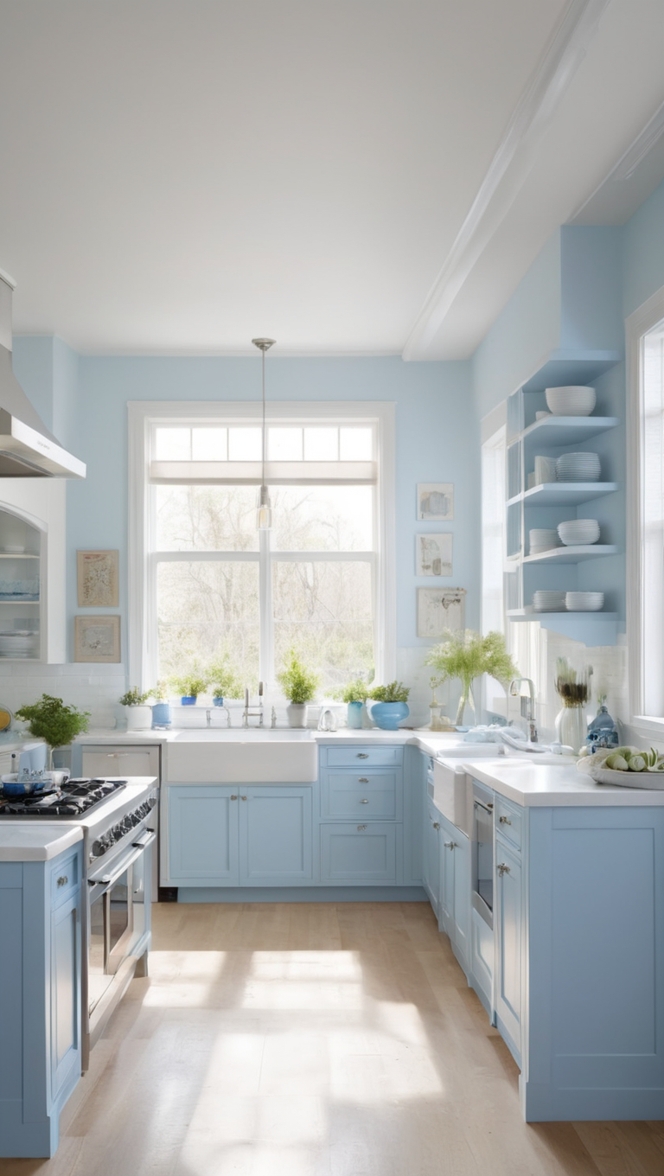
In the ever-evolving landscape of interior design, staying ahead of the curve is essential to creating a space that feels both timeless and on-trend. One of the most impactful ways to refresh your kitchen and infuse it with contemporary chic is through the choice of paint color. Enter Vanillin, a hue that effortlessly marries sophistication with modernity, making it the perfect choice for your 2024 kitchen makeover.
Why Vanillin?
Vanillin, a soft, creamy shade reminiscent of vanilla bean, offers a myriad of benefits that elevate it above traditional paint colors. Here’s why Vanillin should be your top pick for transforming your kitchen:
- Versatility: Vanillin’s neutral undertones make it incredibly versatile, allowing it to seamlessly complement a variety of design styles, from minimalist to farmhouse chic.
- Light-Reflective Properties: The subtle sheen of Vanillin paint helps bounce light around the room, making even the smallest of kitchens feel bright and airy.
- Timelessness: While trends come and go, Vanillin’s timeless appeal ensures that your kitchen won’t feel dated in a few years’ time. It serves as a blank canvas for evolving your decor as your tastes change.
- Warmth Without Overwhelm: Unlike stark white, Vanillin brings warmth to your kitchen without overwhelming the space, creating a welcoming atmosphere for cooking and gathering.
- Easy to Pair: Whether you’re opting for bold accent colors or sticking to a monochromatic palette, Vanillin effortlessly pairs with a wide range of hues, making it a foolproof choice for any design scheme.
Tips for Matching Vanillin with Your Kitchen Design:
Achieving a cohesive look in your kitchen involves more than just selecting the right paint color. Here are five tips for seamlessly integrating Vanillin into your design:
- Consider Natural Light: If your kitchen receives ample natural light, Vanillin will enhance its brightness. However, in a dimly lit space, pairing Vanillin with strategic lighting fixtures will prevent it from feeling dull.
- Balance Warmth and Cool Tones: To prevent your kitchen from feeling too sterile, incorporate elements of warmth, such as wooden accents or brass hardware, alongside cooler tones like stainless steel appliances.
- Texture is Key: Introduce texture through materials like marble countertops, rattan barstools, or subway tile backsplashes to add visual interest and depth to your kitchen design.
- Embrace Contrasting Colors: While Vanillin shines as the primary color, don’t shy away from incorporating contrasting hues for added dimension. Consider navy blue cabinetry or emerald green accents to create a striking yet harmonious look.
- Accessorize Thoughtfully: Use accessories such as artwork, kitchen linens, and decorative accents to inject personality into your space while tying together the color scheme.
Hue Matching with Vanillin:
Pairing Vanillin with complementary hues can enhance its visual impact and create a cohesive color palette throughout your kitchen. Here are five hues that harmonize beautifully with Vanillin:
- Sage Green: Soft and soothing, sage green adds a touch of nature-inspired tranquility to your kitchen, creating a serene atmosphere that complements Vanillin’s warmth.
- Soft Gray: For a sophisticated yet understated look, pair Vanillin with soft gray accents. This combination exudes elegance and lends a contemporary edge to your kitchen design.
- Blush Pink: Incorporating blush pink accents infuses your kitchen with a subtle hint of romance and whimsy, creating a charming and inviting space.
- Navy Blue: To create a striking contrast, introduce navy blue elements such as cabinetry or barstools. This bold pairing adds depth and drama to your kitchen while maintaining a sense of balance.
- Mustard Yellow: For a pop of color that energizes your space, consider mustard yellow accessories or pendant lighting. This vibrant hue adds warmth and personality to your kitchen design.
Alternative Colors from Sherwin Williams and Benjamin Moore:
If Vanillin isn’t quite the right fit for your kitchen, consider these alternative paint colors from Sherwin Williams and Benjamin Moore:
- Sherwin Williams Alternative: Alabaster (SW 7008): A timeless off-white hue, Alabaster offers a fresh and clean aesthetic that brightens any space while maintaining a sense of warmth and sophistication.
- Benjamin Moore Alternative: Simply White (OC-117): Crisp and clean, Simply White is a classic choice that complements both modern and traditional kitchen designs, creating a timeless backdrop for your culinary adventures.
- Sherwin Williams Alternative: Repose Gray (SW 7015): With its subtle undertones of taupe and beige, Repose Gray adds depth and dimension to your kitchen, creating a cozy and inviting atmosphere that’s perfect for entertaining.
- Benjamin Moore Alternative: Revere Pewter (HC-172): A versatile greige hue, Revere Pewter strikes the perfect balance between gray and beige, lending your kitchen a sophisticated yet understated elegance.
- Sherwin Williams Alternative: Agreeable Gray (SW 7029): Soft and subtle, Agreeable Gray is a warm greige that complements a wide range of design styles, from contemporary to traditional, creating a timeless and inviting space for cooking and gathering.
Other Rooms to Use Vanillin:
While Vanillin shines as a kitchen paint color, its versatility extends to other areas of your home as well. Consider using Vanillin in the following rooms:
- Living Room: Create a cozy and inviting living room by painting the walls in Vanillin and layering with plush textiles and warm accents for a relaxed yet sophisticated vibe.
- Bedroom: Transform your bedroom into a serene sanctuary by incorporating Vanillin on the walls, bedding, and furnishings, evoking a sense of tranquility and relaxation.
- Home Office: Foster creativity and productivity in your home office with Vanillin walls, paired with sleek modern furniture and pops of vibrant color for an inspiring and energizing workspace.
- Bathroom: Bring spa-like serenity to your bathroom with Vanillin walls, accessorized with natural materials like wood and stone, creating a tranquil retreat for self-care and relaxation.
Conclusion:
In the realm of interior design, choosing the perfect paint color can make all the difference in transforming a space from mundane to magnificent. With its timeless appeal, versatility, and ability to enhance any design scheme, Vanillin emerges as the ultimate choice for your 2024 kitchen makeover. By following these tips for matching color, exploring complementary hues, and considering alternative options from Sherwin Williams and Benjamin Moore, you can create a kitchen that exudes contemporary chic and serves as the heart of your home for years to come. So why wait? Elevate your kitchen design with Vanillin paint and embrace the effortless elegance it brings to your culinary haven.

