Ready to transform your kitchen with the perfect paint colors that highlight your natural light? Discover how to choose the ideal shades in this guide.
Choosing Paint Colors That Complement Your Kitchen’s Natural Light
Selecting the right paint colors for your kitchen that work well with the natural light can greatly enhance the overall look and feel of the space. As a routine with an interior designer, consider using lighter shades of paint to amplify the brightness and openness of the room. It’s essential to match the color of the walls with the tone of the natural light to create a cohesive and harmonious atmosphere. Additionally, organizing a color palette with variations of hues can add depth and interest to the kitchen’s design. Pay attention to the undertones of the paint colors to ensure they complement the natural light effectively.
How to choose paint colors that complement my kitchen’s natural light?
Selecting the right paint colors for your kitchen can significantly impact the overall aesthetics and atmosphere of the space, especially when considering the natural light conditions within the room. When choosing paint colors that complement your kitchen’s natural light, it is essential to pay attention to **the intensity and direction of light**, **the color temperature**, and **the existing elements in the kitchen**. Here are some tips to guide you in making the best choice:
– **Observe the Natural Light**: Start by observing how natural light interacts with your kitchen throughout the day. Note the areas where light is the brightest and where shadows are cast. This will help you understand the **lighting patterns** and make an informed decision on the paint colors.
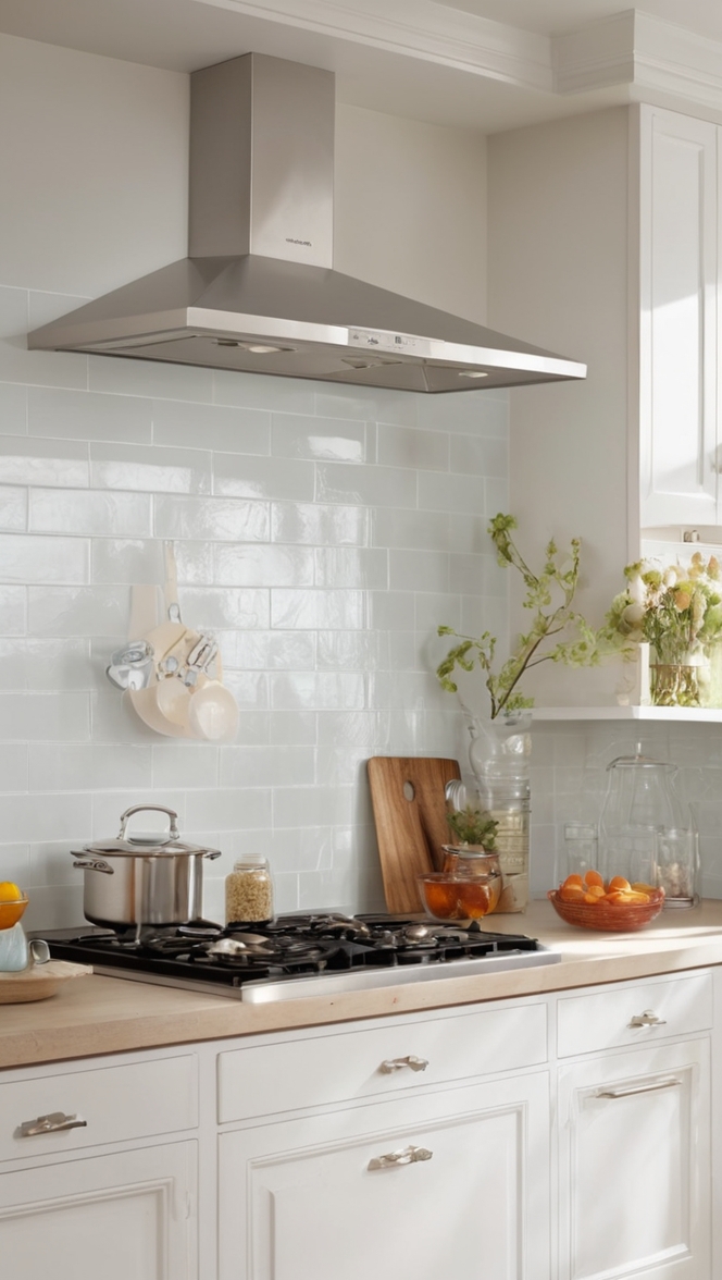
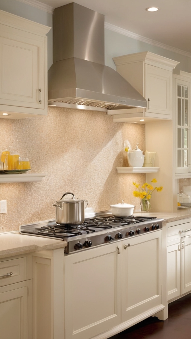
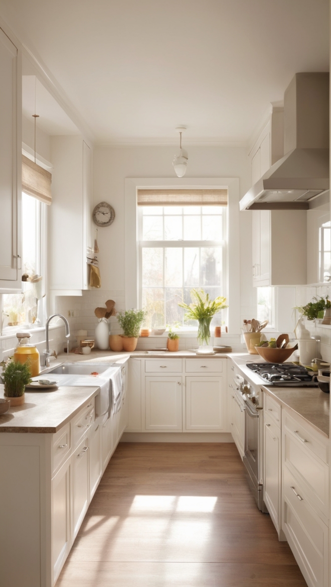
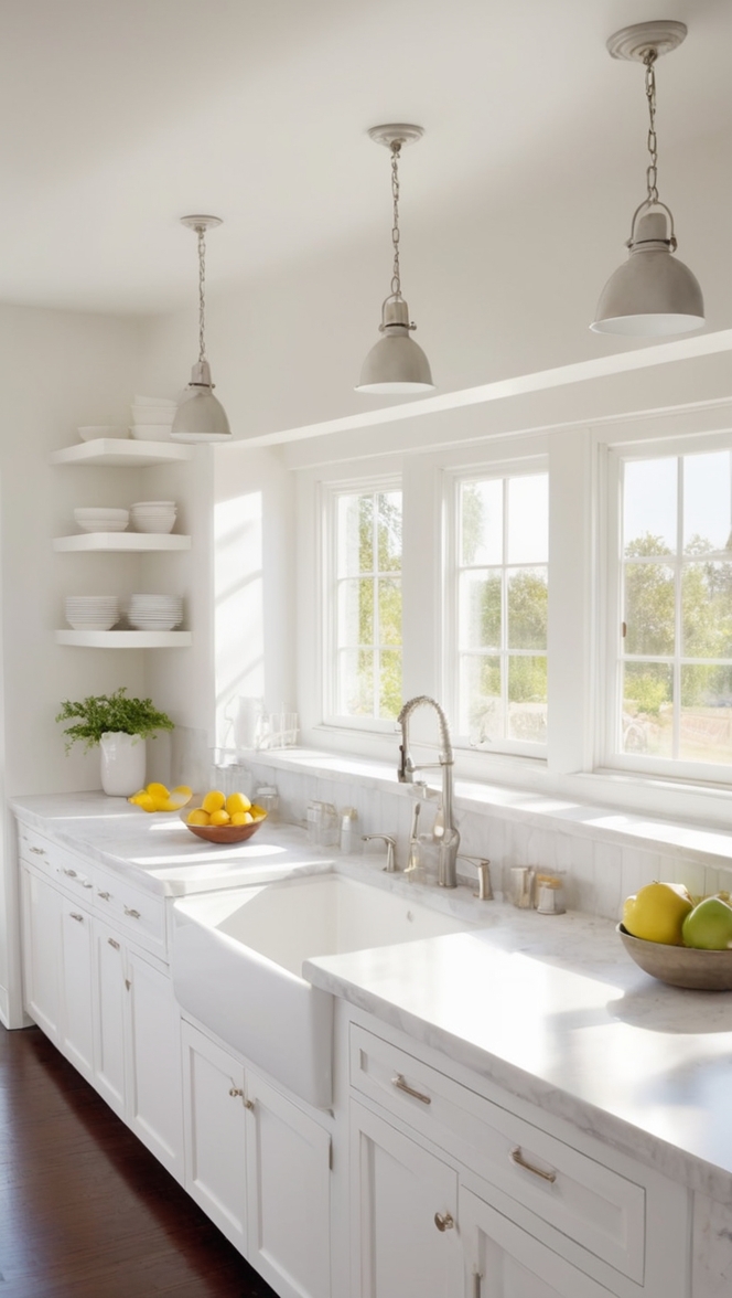
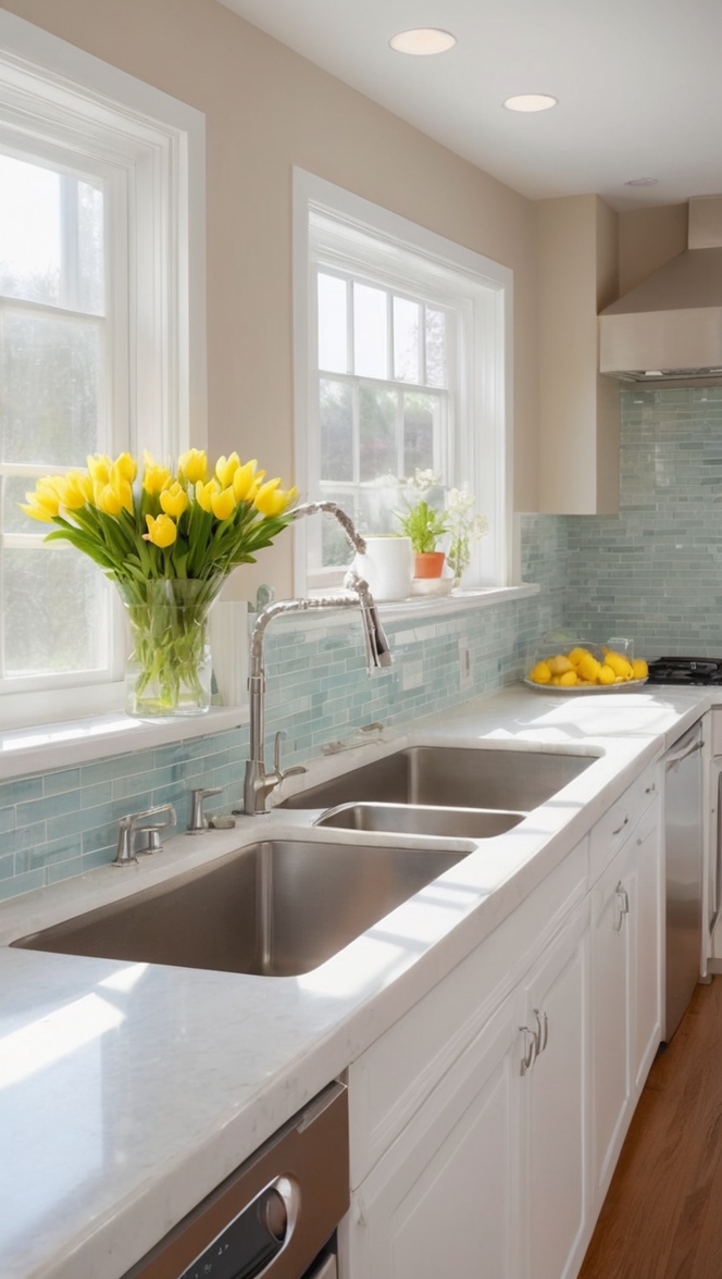
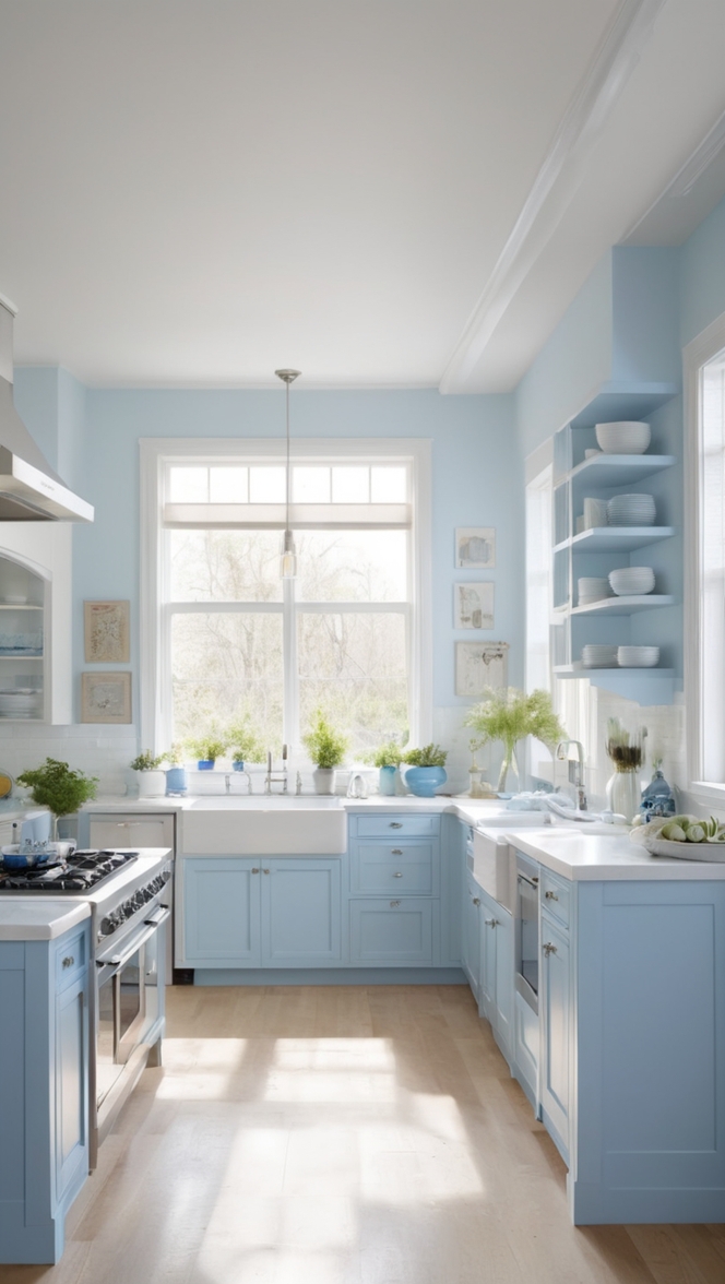
– **Consider the Color Temperature**: Natural light can vary in color temperature, ranging from warm sunlight to cool daylight. For kitchens with abundant natural light, **light colors** such as soft whites, pastels, or light grays can enhance the brightness and airiness of the space. These hues reflect light and create a **sense of openness**.
– **Harmonize with Surroundings**: Take into account the **existing elements** in your kitchen, such as cabinets, countertops, and flooring. Choose paint colors that complement these components to create a cohesive look. **Neutral tones** like beige, taupe, or greige can serve as a versatile backdrop for various styles.
– **Test Sample Colors**: Before committing to a paint color, it is advisable to **test samples** on your walls. Observing how different shades appear under different lighting conditions can help you make a confident decision. Consider conducting the **test in various spots** to account for the changing light throughout the day.
– **Embrace Contrasts**: If you prefer bolder choices, consider incorporating **contrasting colors** in your kitchen. Darker hues can add depth and drama to the space, especially in areas with limited natural light. Pairing a dark accent wall with lighter surroundings can create a striking visual impact.
– **Consult a Color Wheel**: Familiarize yourself with the basic principles of **color theory** to understand how different hues interact with each other. Complementary colors, adjacent colors, or triadic color schemes can help you create a visually pleasing palette that works well with your kitchen’s natural light.
– **Seek Professional Advice**: If you feel overwhelmed by the choices or need expert guidance, consider **consulting a professional color consultant**. They can offer personalized recommendations based on your kitchen’s layout, natural light conditions, and your design preferences.
With these strategies in mind, you can confidently select paint colors that enhance your kitchen’s natural light and create a harmonious space.
Can I use light colors in a kitchen with ample natural light?
In a kitchen with abundant natural light, using light colors can be an excellent choice to **amplify the brightness** and **create a refreshing ambiance**. Light colors reflect light more effectively than dark shades, making the space feel larger and more airy. Here are some reasons why light colors work well in a kitchen with ample natural light:
– **Enhanced Brightness**: Light colors such as **whites, creams, and pastels** have high **light-reflective properties**, bouncing natural light across the room and maximizing the perceived brightness. This effect can make the space appear more expansive and welcoming, especially during daylight hours.
– **Airy Atmosphere**: Light colors have a **clean and crisp** appearance that contributes to an airy atmosphere in the kitchen. The soft tones create a sense of openness and tranquility, making the room feel more **relaxing** and **inviting**.
– **Versatile Design**: Light colors serve as a versatile canvas for various design styles and accents. They **complement** a wide range of **decorative elements**, including furniture, accessories, and artwork. Light-toned walls can act as a neutral backdrop for bold or colorful decor pieces to stand out.
– **Easy Maintenance**: Light-colored walls are often **easier to maintain** and keep clean, as they tend to **conceal dust and dirt** better than dark colors. Regular maintenance, such as wiping down walls or touch-up painting, is less noticeable on light-colored surfaces.
– **Temperature Regulation**: Light colors can help **mitigate heat absorption** in sunny kitchen spaces, especially in regions with warm climates. Light hues reflect light and heat, reducing the need for excessive air conditioning and creating a more comfortable environment.
– **Timelessness**: Light colors have a **timeless appeal** and can adapt to changing design trends over the years. Choosing a classic white or light gray for your kitchen walls can ensure that the space remains **stylish** and **relevant** despite evolving design preferences.
When considering light colors for a kitchen with ample natural light, focus on creating a **harmonious balance** between the color scheme and the luminosity of the space. Experimenting with different shades and undertones can help you achieve a **cohesive and visually pleasing** result.
What is the best way to determine the right paint color for a kitchen with varying natural light levels?
Choosing a paint color for a kitchen with **varying natural light levels** can be challenging, as different areas of the room may experience **contrasting lighting conditions** throughout the day. To determine the right paint color that harmonizes with these light variations, consider the following strategies:
– **Assess Light Intensity**: Start by identifying the areas in your kitchen that receive **direct sunlight** and those that are **shaded** or **dimly lit**. Understanding these variations in light intensity can help you select paint colors that **balance** the overall brightness in different sections.
– **Use Gradations of Color**: To accommodate varying light levels, you can opt for **gradations** of a particular color. For instance, you can choose a **lighter shade** for areas with ample natural light and a **slightly darker** version of the same color for spaces with limited light. This approach maintains a **consistent color palette** while adjusting to the lighting conditions.
– **Consider Neutral Tones**: Neutral colors such as beige, taupe, or soft grays are versatile choices for kitchens with varying natural light. These hues are **less affected** by light changes and can adapt to different lighting environments without appearing stark or out of place.
– **Blend Warm and Cool Tones**: If your kitchen experiences **both warm and cool light** at different times of the day, consider blending **warm and cool-toned colors** in the space. This balanced approach can create a **harmonious** and **dynamic** atmosphere that complements various light temperatures.
– **Create Focal Points**: To draw attention away from the light differentials, consider incorporating **focal points** or **accent walls** in the kitchen. Bold colors or patterns can serve as **visual anchors** that unify the space and divert focus from the lighting variations.
– **Utilize Natural Materials**: Introducing **natural materials** such as wood, stone, or metal accents can help **soften** the impact of variable natural light in the kitchen. These elements add **texture** and **warmth** to the space, creating a **cozy** and **inviting** environment regardless of the light levels.
– **Adapt with Lighting Fixtures**: In areas where natural light is insufficient, **strategically place lighting fixtures** to **enhance** the illumination and **highlight** the paint colors. **Under-cabinet lighting**, **pendant lights**, or **sconces** can **compensate** for the lack of natural light and **accentuate** the chosen paint hues effectively.
By considering these approaches and **embracing** the natural light variations in your kitchen, you can select a paint color that **adapts** to different lighting conditions and **creates a cohesive** and **balanced** design scheme.
How can I make dark paint colors work in a kitchen with limited natural light?
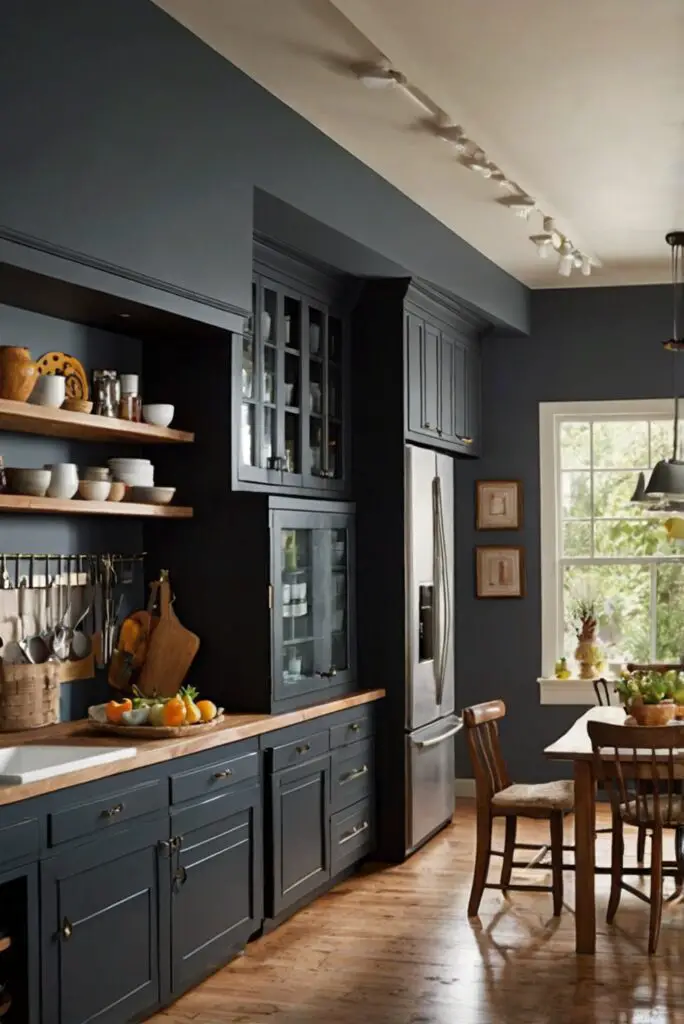
While **light colors** are often preferred for spaces with **limited natural light**, dark paint colors can be used effectively in kitchens to create a **dramatic** and **cozy** atmosphere. When working with dark hues in a kitchen with insufficient natural light, consider the following strategies to make them work:
– **Enhance Lighting**: In a kitchen with limited natural light, **artificial lighting** plays a crucial role in **illuminating** the space and **highlighting** the dark paint colors. Incorporate **task lighting**, **ambient lighting**, and **accent lighting** fixtures to **brighten up** the room and **showcase** the richness of the dark hues.
– **Create Contrast**: Pairing dark paint colors with **lighter elements** can create a **striking contrast** that adds **dimension** and **visual interest** to the kitchen. Consider installing **white cabinets**, **light-colored countertops**, or **metallic accents** to balance the dark walls and **prevent** the space from feeling too heavy.
– **Strategic Placement**: When using dark paint colors in a kitchen, consider applying them to **accent walls** or **specific areas** rather than covering all walls. Focusing the dark hues in **defined zones** can **emphasize** architectural features or **create focal points** without overwhelming the space.
– **Reflective Surfaces**: Introduce **reflective** and **shiny surfaces** such as **mirrors**, **glass**, or **metallic finishes** to amplify the light in the kitchen and **make dark colors** appear more **luminous**. These surfaces can **bounce light** around the room and **enhance the overall brightness**.
– **Choose Warm Tones**: Dark paint colors with **warm undertones**, such as deep browns, rich oranges, or velvety reds, can **create a cozy ambiance** in a kitchen with limited natural light. Warm hues add **depth** and **intimacy** to the space, making it feel **welcoming** and **comfortable**.
– **Balance with Light Accents**: Incorporating **light-colored accents**, such as **rugs**, **textiles**, or **decorative pieces**, can **offset** the darkness of the walls and **add contrast** to the overall design. Light accents provide **visual relief** and **balance** to the room, creating a **dynamic** and **harmonious** composition.
– **Consider Matte Finishes**: Opting for **matte** or **low-sheen finishes** for dark paint colors can help **mitigate glare** and **create a soft** and **subdued look** in the kitchen. Matte surfaces absorb light rather than reflecting it, **emphasizing** the depth and **sophistication** of the dark hues.
By implementing these strategies and **thoughtfully** integrating dark paint colors into your kitchen design, you can **transform** the space into a **luxurious** and **distinctive** environment, even with limited natural light.
Can I add accent colors to my kitchen to complement the natural light?
Incorporating **accent colors** into your kitchen design can **enhance** the visual appeal of the space and **complement** the natural light conditions. Accent colors serve as **bold statements**, **subtle touches**, or **highlight features** that **elevate** the overall design scheme. When selecting accent colors to work harmoniously with your kitchen’s natural light, consider the following tips:
– **Coordinate with Neutrals**: When choosing accent colors, consider how they **coordinate** with the **neutral base** of your kitchen. Neutrals such as **white**, **beige**, or **gray** serve as **foundational tones** that allow accent colors to **pop** and **shine**. Select accent hues that **complement** the neutrals rather than clash with them.
– **Reflect Natural Elements**: Draw inspiration from **natural elements** found in your kitchen, such as wood tones, stone finishes, or metal accents. Select accent colors that **echo** the **textures** and **colors** of these elements to create a **harmonious connection** with the natural light and the surrounding environment.
– **Bold vs. Subtle**: Determine whether you want your accent colors to make a **bold statement** or provide **subtle hints** of color. For kitchens with ample natural light, bold accent colors can **energize** the space and **add personality**. In contrast, subtle accent hues can **soften** the overall look and create a **calming** effect.
– **Create Visual Flow**: Use accent colors strategically to create **visual flow** and **cohesiveness** in the kitchen. Consider **repeating** accent colors in various elements such as **accessories**, **textiles**, or **artwork** to establish a **unifying theme** and **balance** the color distribution throughout the space.
– **Experiment with Patterns**: Incorporating **patterned accents** in your kitchen design can introduce **interest** and **dynamism** to the space. Consider using **geometric patterns**, **floral motifs**, or **abstract designs** in accent elements like **backsplashes**, **wallpapers**, or **fabrics** to infuse creativity and **personality** into the design.
– **Balance Warm and Cool Tones**: If your kitchen receives **varying light temperatures**, balance warm and cool accent colors to create a **unified** and **balanced** color palette. Warm tones such as **reds**, **oranges**, or **yellows** can add **vibrancy** and **energy**, while cool tones like **blues**, **greens**, or **purples** introduce a **calming** and **soothing** effect.
– **Consider Seasonal Changes**: If you enjoy changing up your decor with the seasons, opt for **versatile accent colors** that can **adapt** to different design schemes. Accessories such as **throw pillows**, **vases**, or **artwork** in interchangeable accent hues can **refresh** the look of your kitchen throughout the year.
By integrating these tips and **thoughtfully** incorporating accent colors into your kitchen design, you can **personalize** the space, highlight the natural light, and create a **dynamic** and **inviting** atmosphere that reflects your style preferences.
What paint alternatives can I consider for a kitchen with specific natural light conditions?
When choosing **paint alternatives** for a kitchen with **specific natural light conditions**, it is essential to **select** finishes or **products** that **complement** and **enhance** the lighting environment. Depending on whether your kitchen receives abundant natural light, limited light, or varying light levels, consider the following paint alternatives to suit your needs:
– **Glossy Finishes**: For kitchens with **ample natural light**, consider using **glossy** or **satin finishes** to **maximize light reflection** and **create a luminous** effect. These finishes are **easy to clean** and can add a **lustrous sheen** to the walls, enhancing the natural brightness of the space.
– **Matte Paints**: In kitchens with **limited natural light**, matte paints can help **reduce glare** and **create a soft** and **soothing ambiance**. Matte finishes **absorb light** rather than reflect it, making them ideal for spaces where direct sunlight is minimal. Matte paints are also **effective** at **concealing imperfections** on the walls.
– **Eggshell Finishes**: Eggshell finishes strike a **balance** between **matte** and **satin**, offering a subtle sheen that **enhances** the paint color without appearing too glossy. This versatile finish is suitable for kitchens with **moderate natural light** and provides **durability** and **washability** for high-traffic areas.
– **Chalkboard Paint**: For homeowners seeking **creative** and **functional** alternatives, chalkboard paint can add **character** and **interactive** elements to a kitchen. Chalkboard paint is available in various colors and can be used to create **accent walls**, **menu boards**, or **shopping lists** that are both **decorative** and **practical**.
– **Textured Paints**: Textured paints such as **granite**, **suede**, or **sandstone finishes** can introduce **depth** and **dimension** to kitchen walls, especially in areas with **uneven natural light**. These finishes create a **tactile** and **visually appealing** surface that adds **interest** and **sophistication** to the space.
– **Magnetic Paint**: Ideal for **family-friendly** kitchens, magnetic paint can transform walls into **functional** and **interactive** surfaces. This paint alternative allows you to hang photos, artwork, or notes using **magnetic** accessories, adding a **playful** and **practical** element to the space.
– **Metallic Finishes**: Metallic paints or finishes can bring a **modern** and **glamorous** touch to kitchen walls, reflecting light and creating a **shimmering** effect. Metallic finishes come in various shades such as **silver**, **gold**, or **copper**, adding **luxury** and **elegance** to the space.
– **Color-Changing Paints**: Innovative color-changing paints or **temperature-sensitive** coatings can provide a **dynamic** and **engaging** element to kitchen walls. These paints **shift shades** with temperature variations, creating an **ever-evolving** and **interactive** backdrop that responds to the natural light changes.
By exploring these paint alternatives and **tailoring** them to your kitchen’s specific natural light conditions, you can **customize** the space and **enhance** its aesthetic appeal while addressing your **functional** and **decorative** preferences.
How can I ensure the paint color I choose for my kitchen complements the overall decor of the room?
Coordinating the **paint color** with the **overall decor** of your kitchen is essential to **creating** a **harmonious** and **unified** design scheme. To ensure that the chosen paint color complements the **existing decor** elements, follow these strategies:
– **Consider the Existing Palette**: Evaluate the **colors** and **tones** of your **cabinets**, **countertops**, **flooring**, and **appliances** to understand the **dominant palette** in the kitchen. Choose a **paint color** that **harmonizes** with these existing elements rather than clashes with them.
– **Create a Mood Board**: Compile **swatches**, **samples**, **fabric**, and **inspirational images** on a **mood board** to visualize how different colors and textures **work together**. This tool can help you **compare** and **contrast** various options and determine which paint color best **complements** the **decor** of the room.
– **Take Inspiration**: Draw inspiration from **design styles**, **themes**, **patterns**, or **textures** already present in your kitchen. Whether you prefer a **modern**, **rustic**, **vintage**, or **eclectic** aesthetic, choose a paint color that **reflects** or **enhances** the **desired style** while maintaining **cohesiveness** with the existing decor.
– **Opt for Versatile Neutrals**: When in doubt, **neutral paint colors** such as **whites**, **grays**, or **beiges** can serve as a **safe** and **versatile** choice that **blends** seamlessly with various decor styles. Neutrals act as a **neutral backdrop** that allows other **decorative elements** to stand out.
– **Integrate