Want to transform your home office with the perfect window treatments? Discover the key to choosing the right color that boosts productivity and style.
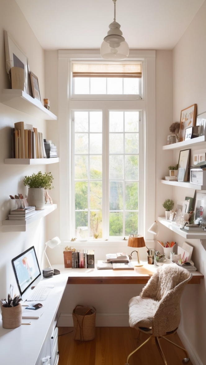
To choose the right color for home office window treatments, consider the overall decor of the space. Opt for colors that complement the existing hues in your home decorating scheme to create a cohesive look. Lighter shades can make the room feel more spacious and airy, while darker colors offer a more cozy and intimate atmosphere. If you’re unsure, consult with a home interior designer who can provide expert advice on color matching and interior design space planning. Think about using primer paint for walls before adding color to ensure a smooth finish. Explore different paint color options to find the perfect match for your home paint colors.
h3 style=”font-size:24px; font-weight:bold”>How do I choose the right color for my home office window treatments if I have neutral wall colors?
If your home office has neutral wall colors, such as whites, grays, or beige, you have a versatile backdrop that allows you to play with various window treatment colors. Here are some tips to help you choose the right color for your window treatments:
– **Contrast**: Consider adding a pop of color that contrasts with your neutral walls to create visual interest and make a statement in the room. For example, if you have white walls, deep blue or emerald green window treatments can add a sophisticated touch.
– **Warmth**: Opt for warm tones like golden yellows, terracotta, or burnt orange to infuse warmth into your workspace and create a cozy ambiance.
– **Neutrals**: Stick to neutral shades like taupe, soft grays, or cream for a harmonious and understated look that complements your existing wall colors seamlessly.
– **Textures**: If you prefer a monochromatic color scheme, consider adding texture to your window treatments. Textured fabrics in neutral hues can add depth and dimension to the space.
– **Accent Color**: If you have neutral walls but want to introduce a specific accent color, choose window treatments in that particular shade to tie the room together cohesively.
h3 style=”font-size:24px; font-weight:bold”>What is the best color option for home office window treatments to create a calming and focused work environment?
Creating a calm and focused work environment in your home office is essential for productivity. Opting for certain colors in your window treatments can help achieve this goal:
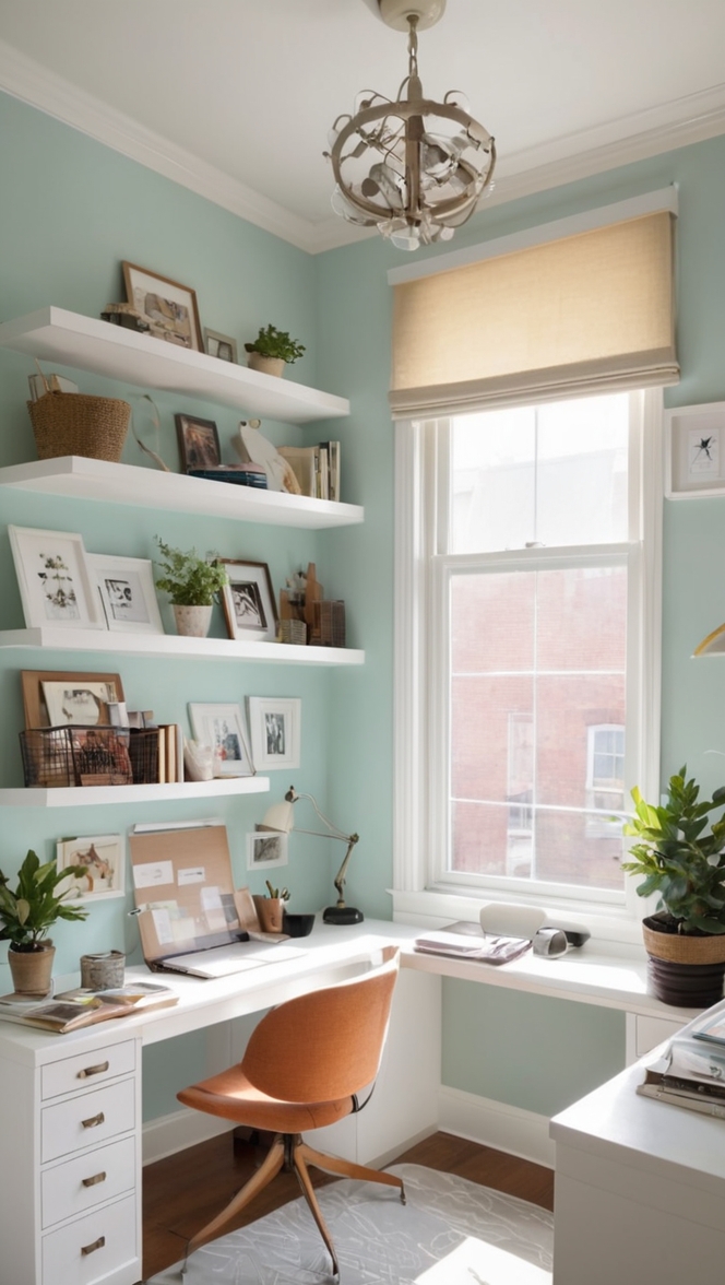
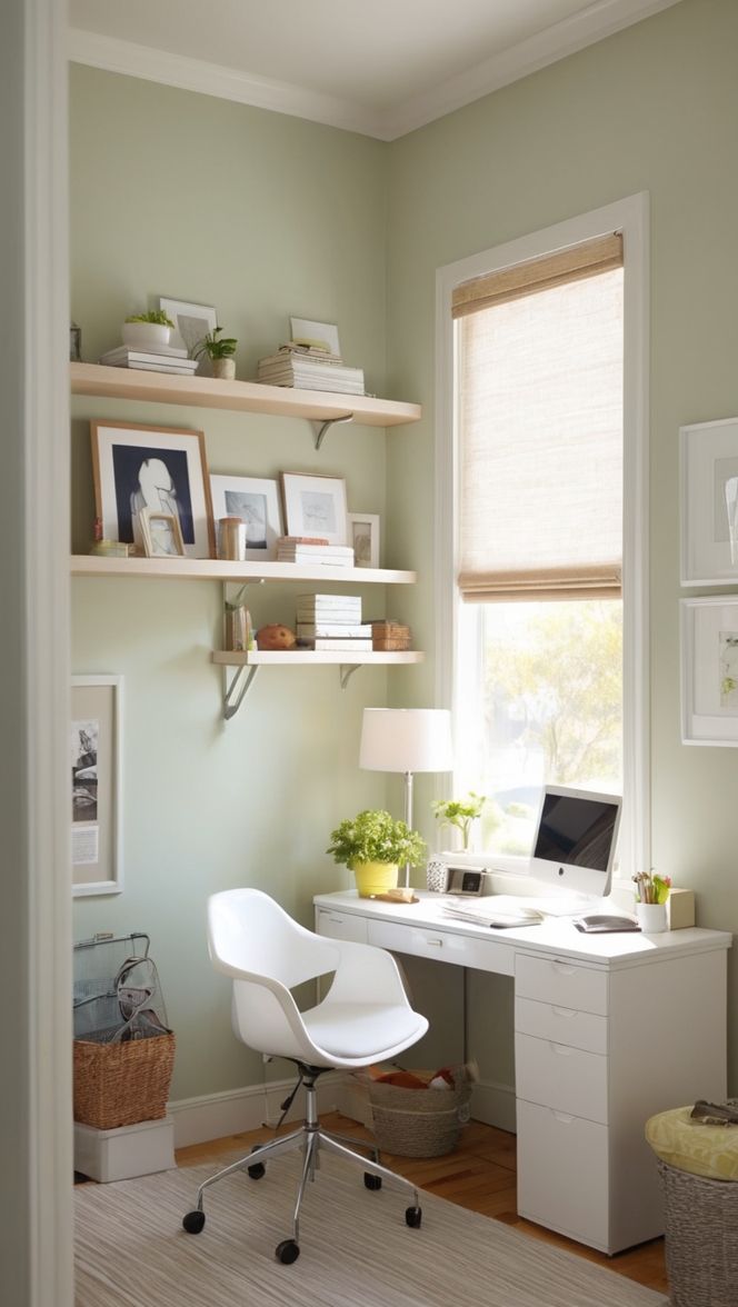
– **Blue**: Blue is known for its calming and soothing effects. Consider shades of soft blue, teal, or aqua for your window treatments to promote a sense of tranquility and concentration.
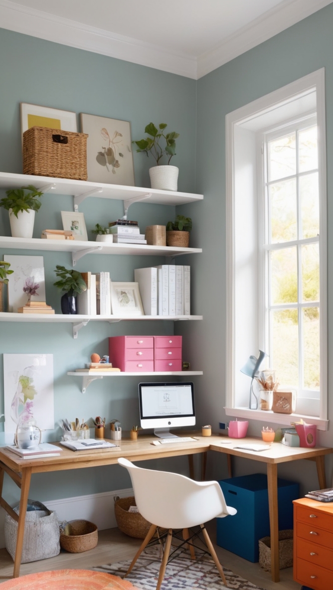
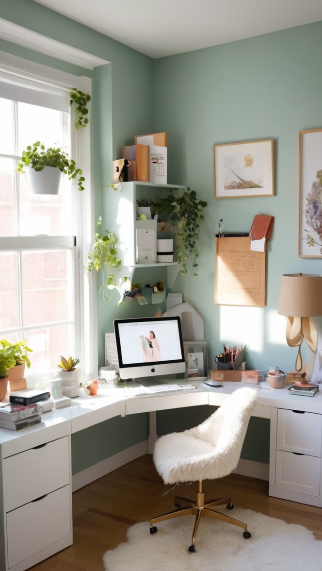
– **Green**: Green is associated with nature and has a refreshing quality. Soft greens or sage tones can bring a sense of balance and harmony to your workspace.
– **Neutral Greens**: Shades like olive green or mossy green can add a touch of serenity without overwhelming the space.
– **Soft Gray**: Light gray tones can create a sense of composure and sophistication in your home office, perfect for a focused work environment.
– **Lavender**: If you prefer a hint of color, lavender shades can induce a sense of calmness and creativity, ideal for a home office setting.
h3 style=”font-size:24px; font-weight:bold”>Can I mix and match different colors for my home office window treatments to add visual interest?
Mixing and matching different colors for your home office window treatments can indeed add visual interest and personality to the space. Some strategies to consider include:
– **Color Blocking**: Incorporate two or more solid-colored panels in complementary or contrasting hues to create a bold statement and break up a monotonous color scheme.
– **Patterns**: Experiment with patterns that combine multiple colors to inject energy and vibrancy into your home office. Stripes, geometric designs, or floral prints can all work well when balanced with the rest of the decor.
– **Tonal Variation**: Choose window treatments in varying shades of the same color to add depth and visual dimension to the room. This approach can create a cohesive look while still adding interest.
– **Color Accents**: Introduce pops of color through accessories like curtain ties, trimmings, or valances that complement your main window treatment color. This can tie the room together and create a cohesive color palette.
h3 style=”font-size:24px; font-weight:bold”>How do I ensure that the color of my window treatments complements the existing decor in my home office?
To ensure that the color of your window treatments complements the existing decor in your home office, follow these guidelines:
– **Color Swatches**: Take swatches of your wall paint, furniture upholstery, and other dominant colors in the room when shopping for window treatments. Match the swatches with potential curtain colors to see how they will work together.
– **Color Wheel**: Use a color wheel to identify complementary or analogous colors that will harmonize with the existing color palette of your home office. This method can help you find the perfect color scheme.
– **Dominant Color**: If your home office has a dominant color scheme, select window treatments in a complementary or contrasting shade to enhance the overall decor rather than overpowering it.
– **Sample Fabrics**: Request fabric samples of potential window treatments to see how they look in the room. Natural light and artificial lighting can affect how colors appear, so it’s essential to test them in the actual environment.
– **Consult a Professional**: If you’re unsure about color matching, consider consulting an interior designer or color specialist who can provide expert advice on choosing the right window treatment colors for your home office.
h3 style=”font-size:24px; font-weight:bold”>What colors should I avoid for home office window treatments if I want to maintain a professional atmosphere?
When aiming to maintain a professional atmosphere in your home office, certain colors should be used with caution or avoided:
– **Bright Neons**: Vibrant neon colors can be distracting and overwhelming in a workspace, so it’s best to steer clear of extremely bright hues.
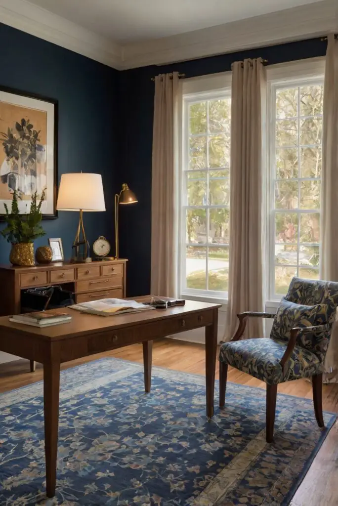
– **Overly Dark Shades**: Very dark colors like deep black or brown can create a somber and heavy atmosphere, which may not be conducive to productivity and focus.
– **Clashing Colors**: Avoid color combinations that clash or create visual discord. Opt for a balanced palette that promotes a sense of harmony and sophistication.
– **Extreme Contrast**: While contrast can be beneficial, extreme high-contrast color combinations can be jarring and may detract from a professional setting.
– **Unsuitable Tones**: Colors that evoke strong emotions or are too personal (e.g., hot pink, bright purple) should be avoided if you want to maintain a professional and neutral environment.
h3 style=”font-size:24px; font-weight:bold”>How can I incorporate color psychology when selecting window treatments for my home office?
Color psychology plays a significant role in influencing our emotions, moods, and productivity. When selecting window treatments for your home office, consider the following color psychology principles:
– **Warm Colors**: Reds, oranges, and yellows are considered warm colors that can evoke feelings of energy, warmth, and creativity. Use them in moderation to add a dynamic touch to your workspace.
– **Cool Colors**: Blues, greens, and purples are cool colors known for their calming and soothing effects. These hues can promote concentration and a sense of tranquility in your home office.
– **Neutrals**: White, gray, and beige are neutral colors that create a clean, minimalist look and can help reduce visual clutter, promoting focus and clarity.
– **Personal Preference**: Take into account your personal response to colors. If a particular color makes you feel inspired or motivated, incorporate it into your window treatments to enhance your work environment.
– **Lighting**: Consider how natural and artificial lighting can affect the perception of color. Bright, natural light can amplify color intensity, while warmer lighting may soften hues.
h3 style=”font-size:24px; font-weight:bold”>What are alternative color options for home office window treatments if I want to experiment with bold hues?
If you’re looking to experiment with bold hues for your home office window treatments, consider the following alternative color options:
– **Rich Jewel Tones**: Deep emerald greens, sapphire blues, and ruby reds can add a luxurious and sophisticated touch to your workspace.
– **Mustard Yellow**: A vibrant yet warm color, mustard yellow can inject energy and personality into your home office without being overpowering.
– **Burnt Orange**: This earthy and rich shade can create a cozy and inviting atmosphere, ideal for a comfortable and stylish work environment.
– **Dusty Pink**: A muted pink tone like dusty rose or blush can bring a soft and elegant feel to your space, adding a subtle pop of color.
– **Royal Purple**: Purple hues convey a sense of luxury and creativity. Shades like royal purple or lavender can inspire imagination and innovation in your home office.
h4 style=”font-size:20px; font-weight:bold”>Key Takeaways
– **Contrast with Neutrals**: Adding pops of color that contrast with neutral walls can create visual interest.
– **Calming Colors**: Opt for blues, greens, or soft grays to promote a calm and focused work environment.
– **Mix and Match**: Experiment with color blocking, patterns, and tonal variations for added visual appeal.
– **Ensure Complementarity**: Match window treatment colors with existing decor to create a cohesive look.
– **Avoiding Disruptive Colors**: Steer clear of bright neons, overly dark shades, and clashing colors for a professional atmosphere.
– **Color Psychology**: Incorporate warm, cool, or neutral colors based on their psychological effects on mood and productivity.
– **Bold Hue Options**: Explore rich jewel tones, mustard yellow, burnt orange, dusty pink, and royal purple for a daring color choice in your home office.