In this daily interior designer routine, discover how to choose the perfect color scheme for your living room. Elevate your space with the ideal hues!
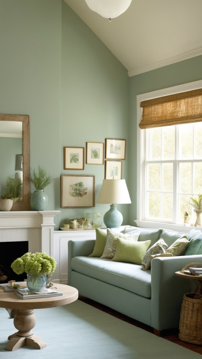
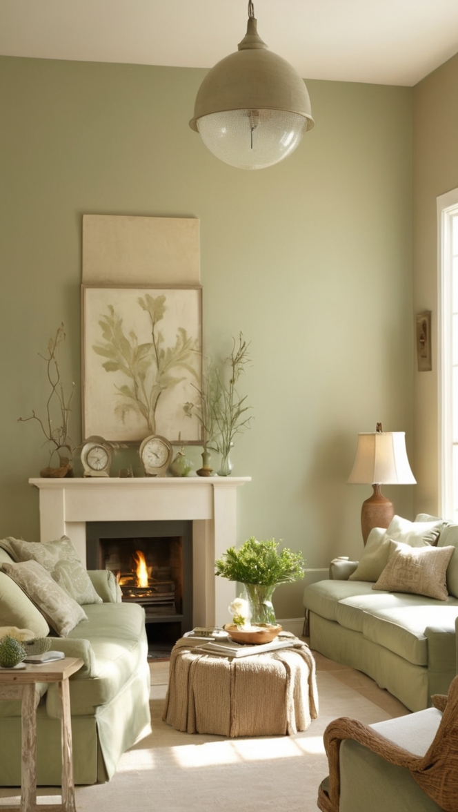
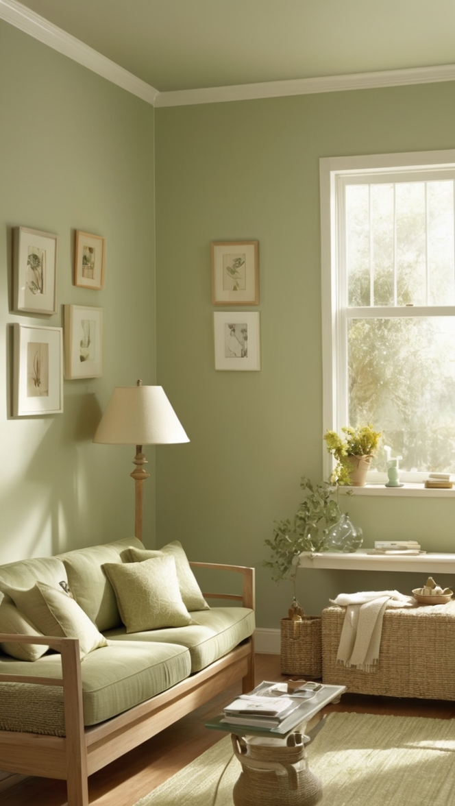
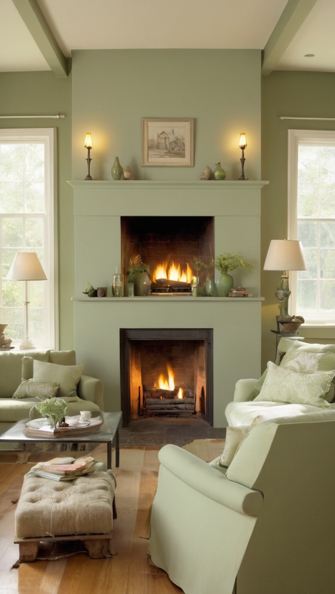
Choosing the perfect color scheme for your living room is a crucial aspect of home decorating. To start, consider the mood you want to create in the space. For a calming ambiance, opt for cool tones like blues and greens. For a cozy feel, warm hues such as earthy tones or rich browns can be ideal.
Think about the size of the room and the natural light it receives. Light colors can make a small room feel larger, while dark hues can add drama to a large space. Consider the existing furniture and decor in the room to ensure the color scheme complements the overall design.
When selecting colors, test paint samples on the walls to see how they look in different lighting conditions. It’s essential to choose colors that you love and feel comfortable living with. Remember to balance the colors throughout the room to create a cohesive look.
Additionally, always use high-quality paint to achieve the best results. Prime your walls before painting to ensure proper adhesion and color consistency. Consider consulting with a professional interior designer for expert advice on color matching and space planning.
By carefully selecting the right colors for your living room, you can create a space that reflects your personal style and enhances your home interior design.
How to determine the best color scheme for a small living room?
Determining the best color scheme for a small living room requires careful consideration to create an inviting and visually appealing space. The key to choosing the perfect color scheme lies in understanding the impact of colors on space perception and ambiance. Here are some important factors to consider:
– **Room Size**: In a small living room, light colors such as white, cream, or pastels can help create a sense of openness and airiness, making the room appear larger than it is.
– **Natural Lighting**: The amount of natural light in the room plays a crucial role in color selection. Natural light enhances the vibrancy of colors, so it is essential to choose colors that complement the natural light to create a harmonious space.
– **Furniture and Decor**: Consider the existing furniture and decor in the room when selecting a color scheme. Harmonizing the colors of the walls with the furniture can create a cohesive and well-coordinated look.
– **Personal Preference**: Your personal style and preferences should also guide your color choices. Opt for colors that resonate with you and create a space that reflects your personality.
– **Accent Colors**: Introducing accent colors through accessories like throw pillows, rugs, or artwork can add depth and interest to the room without overwhelming the space.
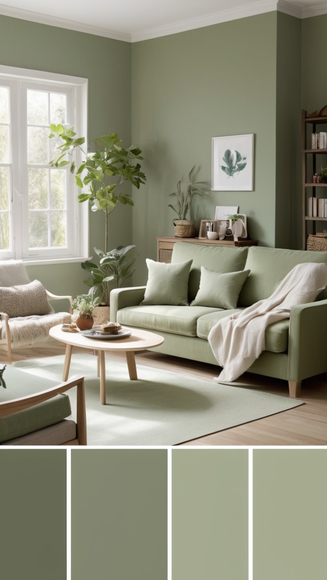
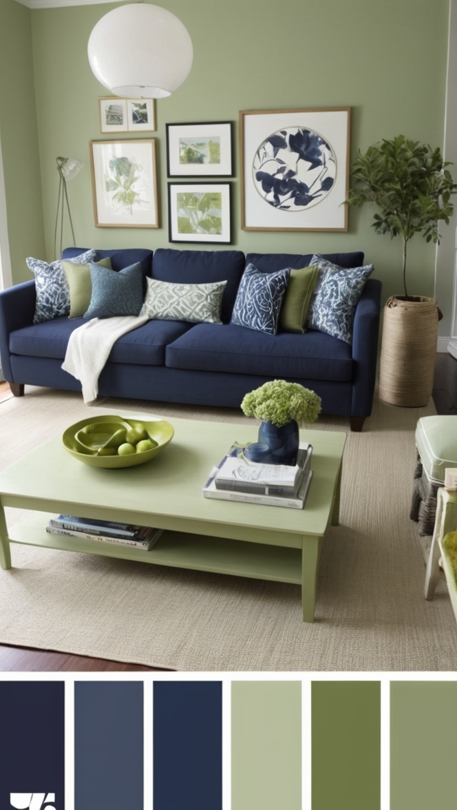
– **Warm vs. Cool Tones**: Understanding the difference between warm tones (reds, oranges, yellows) and cool tones (blues, greens, purples) can help in creating the desired atmosphere in your living room.
– **Sample Testing**: Before committing to a color scheme, test paint samples on your walls to observe how they look in different lighting conditions throughout the day.
What is the impact of natural lighting on choosing a color scheme for a living room?
Natural lighting significantly influences the way colors appear in a living room. The intensity and direction of natural light can alter the perception of colors, making it crucial to select the right color scheme. Here’s how natural lighting impacts color choices:
– **Color Intensity**: Natural light can intensify or mute the colors on your walls. Rooms with ample natural light are ideal for experimenting with bold and vibrant colors, while rooms with limited light may benefit from lighter shades.
– **Warmth or Coolness**: The quality of natural light can also affect the warmth or coolness of colors. Rooms with direct sunlight may enhance warm tones, creating a cozy atmosphere, while rooms with indirect light may showcase cool tones more prominently.
– **Reflection**: Natural light can enhance the reflective properties of certain colors. Lighter colors bounce light around the room, making it feel brighter and more spacious, while dark colors absorb light, creating a more intimate setting.
– **Time of Day**: Consider how natural light changes throughout the day when choosing colors. Colors may appear different in the morning, afternoon, and evening, so observe how they look in various lighting conditions before finalizing your decision.
Can I use bold colors in a living room color scheme, and how to balance them?
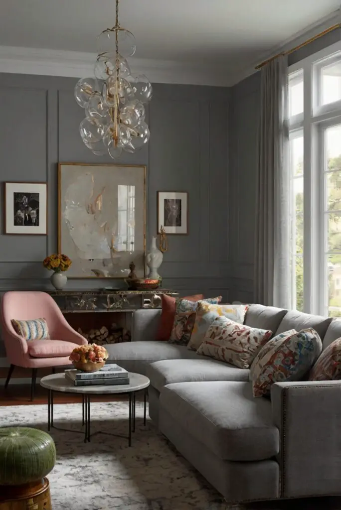
Bold colors can add flair and personality to a living room, but using them requires careful consideration to achieve balance and harmony. Here’s how you can incorporate bold colors while maintaining a cohesive color scheme:
– **Accent Walls**: Consider painting one wall in a bold color to create a focal point in the room without overwhelming the space. Pair the bold wall with neutral tones to balance the overall look.
– **Color Blocking**: Experiment with color blocking techniques by grouping bold colors together in specific areas of the room, such as on decorative elements or furniture pieces.
– **Use of Patterns**: Incorporate bold colors through patterns like geometric prints or stripes on accent pillows, rugs, or curtains. This allows you to introduce bold colors in smaller doses.
– **Tonal Variation**: Balance bold colors with varying tones of the same hue. Incorporating lighter and darker shades of a bold color can prevent it from dominating the room.
– **Accessorizing**: Use accessories like artwork, vases, or throw blankets in bold colors to infuse vibrancy into the space. These accents can be easily swapped out to change the color scheme as needed.
What are the benefits of using a neutral color scheme in a living room?
Neutral color schemes are versatile and timeless, offering a range of benefits for a living room design. Here are some advantages of using a neutral color palette:
– **Timelessness**: Neutral colors like white, beige, gray, and taupe are classic choices that never go out of style. They provide a timeless backdrop that can easily adapt to changing design trends.
– **Versatility**: Neutrals serve as a versatile base that allows you to introduce pops of color through accessories or furniture. They provide a neutral canvas for showcasing artwork and decorative elements.
– **Enhanced Lighting**: Neutrals reflect light effectively, brightening up the space and making it feel more open and airy. They can maximize the impact of natural and artificial lighting in the room.
– **Visual Calmness**: Neutral colors create a sense of calm and tranquility in a living room, making it a relaxing retreat for unwinding after a long day. They can help reduce visual clutter and promote a sense of balance.
– **Easy Coordination**: Neutrals are easy to coordinate with various colors, textures, and patterns. They provide a cohesive backdrop that allows you to mix and match different design elements seamlessly.
How to create a cohesive color scheme when combining multiple colors in a living room?
Creating a cohesive color scheme involves balancing multiple colors to achieve a harmonious and visually pleasing look in your living room. Here are some tips to help you combine multiple colors effectively:
– **Color Wheel**: Use a color wheel to identify complementary, analogous, or monochromatic color schemes that work well together. This can help you select colors that harmonize with each other.
– **Primary, Secondary, Accent Colors**: Choose a primary color as the dominant hue in the room, secondary colors to complement the primary color, and accent colors for pops of vibrancy.
– **Distribution of Colors**: Distribute colors evenly throughout the room to create a balanced look. Avoid concentrating one color in a single area, as it can create visual imbalance.
– **Texture and Finish**: Incorporate different textures and finishes to add depth and interest to the color scheme. Mixing matte, glossy, and textured surfaces can enhance the visual appeal of the room.
– **Layering Colors**: Layer colors through various elements like walls, furniture, accessories, and decor. This creates a cohesive flow and ties the color scheme together across different areas of the room.
– **Tonal Variation**: Include varying tones and shades of the chosen colors to add dimension and complexity to the color scheme. This prevents the scheme from appearing flat or monotonous.
What steps can I take to ensure the chosen color scheme complements the existing furniture and decor in my living room?
Harmonizing the chosen color scheme with existing furniture and decor is essential to create a cohesive and well-coordinated look in your living room. Here are steps you can take to ensure that the color scheme complements your existing elements:
– **Color Matching**: Identify the predominant colors in your furniture and decor pieces. Choose a color scheme that complements these existing colors rather than clashes with them.
– **Undertones**: Pay attention to the undertones of your furniture and decor. For example, if your furniture has warm undertones, opt for a color scheme with similar warm tones to create visual harmony.
– **Sample Swatches**: Collect fabric swatches, paint samples, and color samples of your existing furniture and decor. Use these samples to compare against potential wall colors to ensure they harmonize.
– **Balance of Neutrals**: Incorporate neutral colors that can bridge the gap between various color elements in the room. Neutrals help create a cohesive backdrop that ties the room together.
– **Consider Contrast**: If your furniture and decor are predominantly neutral, consider adding contrasting colors to create visual interest and prevent the space from feeling too monochromatic.
– **Layering Textures**: Introduce textures through rugs, throw pillows, curtains, and other decor elements to add depth and visual appeal to the room. Textures can tie different colors and materials together.
Why is it important to consider the mood or atmosphere you want to create in your living room when selecting a color scheme?
The mood and atmosphere of a living room are directly influenced by the colors used in the design. Choosing a color scheme that aligns with the desired ambiance can have a significant impact on the overall feel of the space. Here’s why it’s crucial to consider the mood when selecting a color scheme:
– **Emotional Response**: Colors evoke emotional responses and can influence mood. Warm colors like reds and oranges create a cozy and energizing atmosphere, while cool colors like blues and greens promote calmness and relaxation.
– **Personal Preference**: The color scheme of a room should reflect your personal style and preferences. Selecting colors that resonate with you can create a space where you feel comfortable and at ease.
– **Activity Zones**: Consider the function of the living room and the activities that take place in the space. Bright, invigorating colors may be suitable for entertaining areas, while softer, muted tones are ideal for relaxation zones.
– **Lighting Effects**: Different colors interact with light in unique ways. Consider how natural and artificial lighting in the room will affect the colors chosen and adjust the scheme accordingly to achieve the desired ambiance.
– **Psychological Impact**: Certain colors have psychological effects on individuals. For example, blue is known to lower blood pressure and induce calmness, making it a suitable choice for a tranquil living room environment.
– **Coherence and Unity**: A well-thought-out color scheme ensures coherence and unity in the design of the living room. Colors should work together harmoniously to create a cohesive and inviting space.
Key Takeaways
– **Room Size**: Light colors can make a small living room appear larger.
– **Natural Lighting**: Natural light affects color perception and ambiance.
– **Neutral Colors**: Timeless and versatile, neutrals can enhance lighting and provide a calm backdrop.
– **Combining Colors**: Use the color wheel, layering, and texture to create a cohesive color scheme.
– **Existing Decor**: Match colors with existing furniture and decor elements for a harmonious look.
– **Mood Consideration**: Choose colors that reflect the desired mood and atmosphere of the living room.