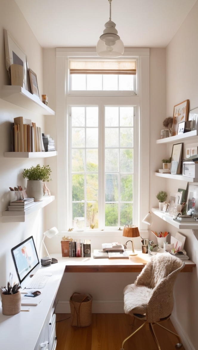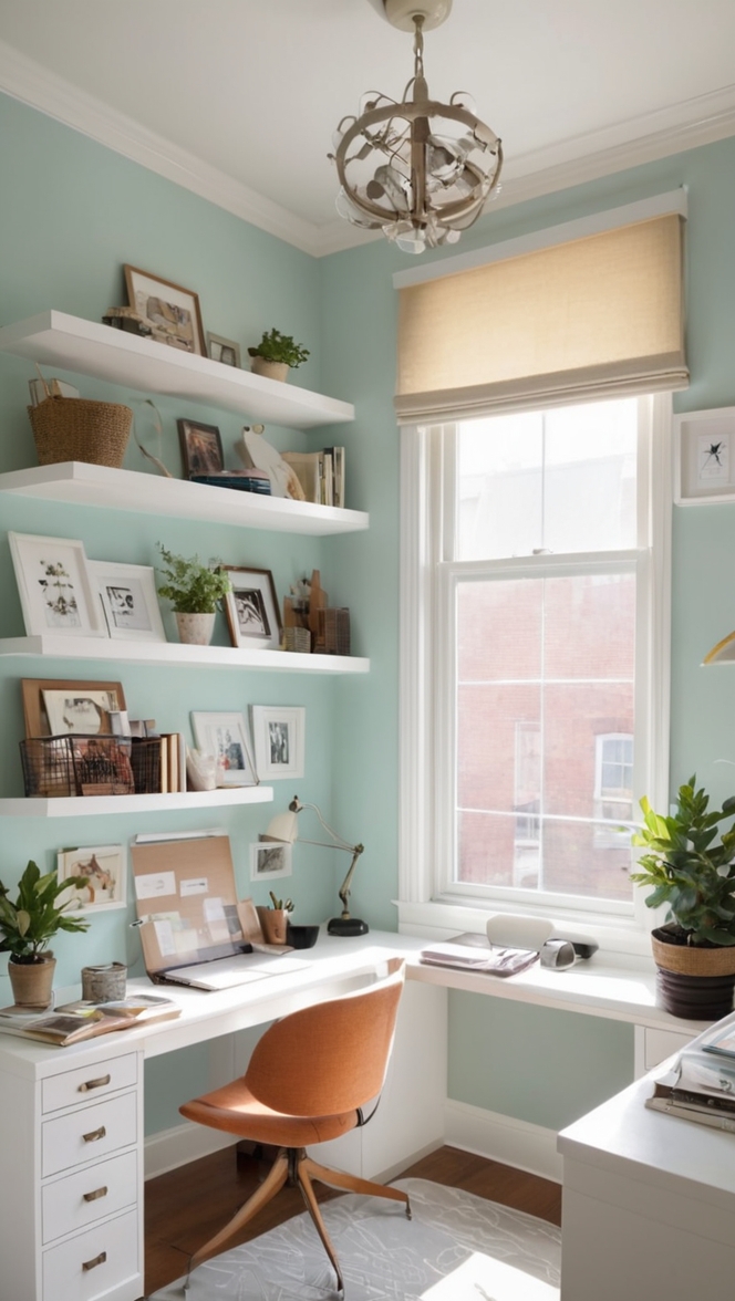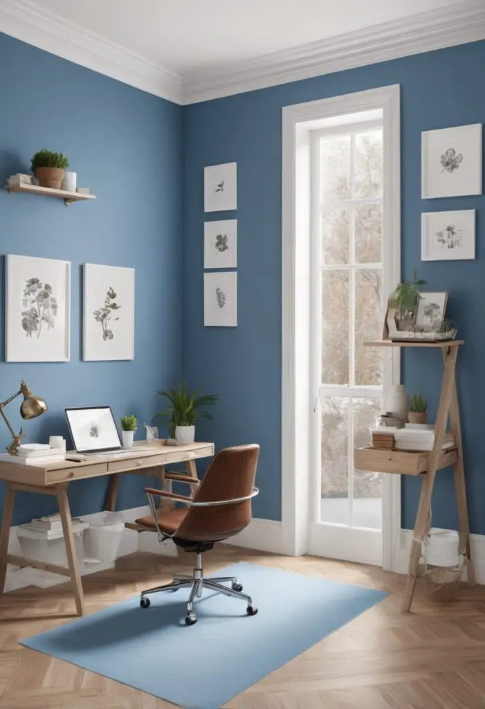
In our fast-paced world, finding moments of peace and serenity is essential for maintaining well-being, especially in the spaces where we spend a significant portion of our time, such as our workspaces. One way to infuse tranquility into your workspace is through the choice of paint color. For 2024, I recommend embracing the soothing hue of Blissful Blue.
Why Blissful Blue?
Blissful Blue is a versatile color that evokes feelings of calmness, clarity, and concentration. Its serene undertones create a harmonious atmosphere, ideal for enhancing productivity and creativity in your workspace. The gentle nature of this shade promotes a sense of relaxation, making it easier to focus on tasks without feeling overwhelmed by distractions.
5 Tips to Match Blissful Blue with Your Workspace:
- Consider Lighting: Before painting your workspace in Blissful Blue, assess the lighting conditions. Natural light complements this color beautifully, enhancing its calming effect. If your workspace lacks natural light, opt for soft, warm artificial lighting to prevent the color from appearing too cool or stark.
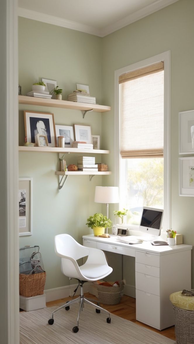
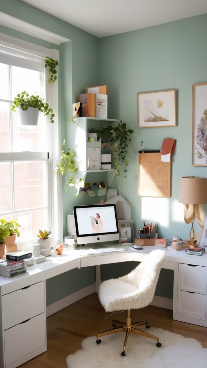
- Balance with Neutral Tones: To create visual balance and prevent the space from feeling too monotonous, pair Blissful Blue with neutral tones such as white, beige, or light gray. These complementary hues will help to highlight the beauty of the blue while maintaining a sense of sophistication.
- Accent with Natural Elements: Incorporating natural elements such as wood accents, indoor plants, or stone textures can add warmth and depth to your workspace. These elements harmonize effortlessly with Blissful Blue, creating a serene and inviting environment that promotes well-being.
- Experiment with Textures: Introduce various textures through furnishings, textiles, and accessories to add visual interest to your workspace. Textures like linen, velvet, or rattan complement the calming vibe of Blissful Blue, creating a multi-dimensional and cozy atmosphere.
- Personalize with Artwork: Infuse your personality into the space by incorporating artwork or decorative pieces that resonate with you. Whether it’s abstract paintings, motivational prints, or photographs of nature, these additions can enhance the overall ambiance of your workspace while adding a personal touch.
5 Hue Matching Options for Blissful Blue:
- Soft Gray: Pairing Blissful Blue with soft gray creates a sophisticated and timeless color scheme. The subtle contrast between these hues adds depth to the space while maintaining a serene atmosphere.
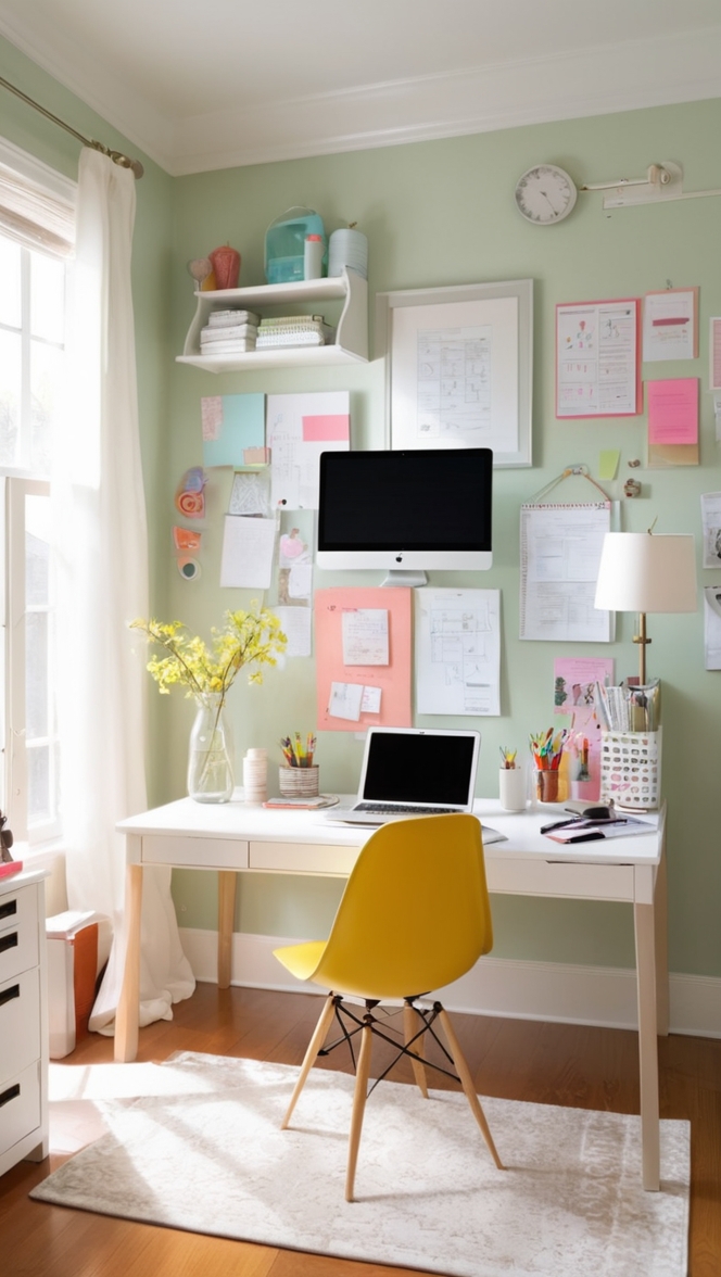
- Pale Yellow: For a cheerful and uplifting vibe, consider combining Blissful Blue with pale yellow accents. This combination infuses the workspace with a sense of optimism and energy, perfect for boosting mood and creativity.
- Mint Green: Incorporating touches of mint green alongside Blissful Blue creates a refreshing and invigorating ambiance. This pairing evokes the tranquility of nature, promoting a sense of balance and harmony within the workspace.
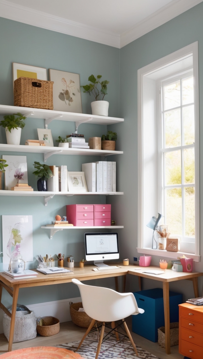
- Dusty Rose: For a touch of elegance and femininity, pair Blissful Blue with dusty rose accents. This delicate combination exudes a sense of refinement and sophistication, creating a serene yet stylish workspace.
- Taupe: Combining Blissful Blue with taupe accents offers a classic and understated color palette. The warm undertones of taupe complement the coolness of the blue, resulting in a cozy and inviting atmosphere that promotes focus and productivity.
5 Alternative Colors from Sherwin Williams and Benjamin Moore:
- Sherwin Williams – Raindrop: This soft and ethereal shade of blue-green is reminiscent of a clear sky after a refreshing rain shower. Its delicate hue creates a serene and uplifting ambiance, perfect for fostering creativity and inspiration in your workspace.
- Sherwin Williams – Sea Salt: With its subtle blend of blue, green, and gray undertones, Sea Salt exudes a tranquil and coastal-inspired vibe. This versatile color pairs beautifully with a variety of decor styles, adding a sense of calmness and sophistication to your workspace.
- Benjamin Moore – Quiet Moments: As its name suggests, Quiet Moments is a serene and contemplative shade of blue-gray. Its soothing undertones create a peaceful and tranquil atmosphere, ideal for promoting focus and concentration in your workspace.
- Benjamin Moore – Palladian Blue: Inspired by the soft hues of Venetian architecture, Palladian Blue radiates elegance and sophistication. Its timeless appeal makes it a perfect choice for creating a refined and serene workspace that exudes understated luxury.
- Benjamin Moore – Silver Lake: This subtle shade of blue-gray evokes the serenity of a misty lake on a tranquil morning. Its calming presence adds a sense of depth and tranquility to your workspace, encouraging a peaceful and productive environment.
Other Rooms to Use Blissful Blue:
Living Room: Infuse your living room with a sense of calmness and sophistication by incorporating Blissful Blue as an accent wall or through furnishings such as sofas, rugs, and throw pillows. Pair it with neutral tones and natural textures for a cohesive and inviting ambiance.
Bedroom: Create a peaceful and restful retreat in your bedroom by painting the walls in Blissful Blue. This soothing hue promotes relaxation and tranquility, setting the perfect tone for a good night’s sleep. Pair it with soft linens, plush textiles, and warm lighting for a cozy and serene atmosphere.
Conclusion:
Incorporating Blissful Blue into your workspace is a simple yet effective way to promote peace, productivity, and well-being. By following the tips for matching this serene hue with your workspace and exploring complementary colors and alternatives, you can create a harmonious environment that inspires creativity and focus. Whether you’re working from home or in a traditional office setting, embracing tranquility through color can transform your workspace into a sanctuary of productivity and peace.