
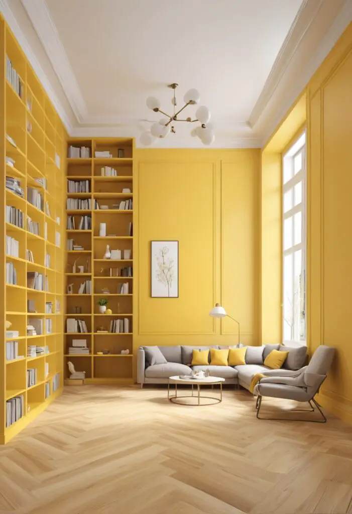
In the world of interior design, color holds an unparalleled power to transform spaces, evoke emotions, and set the tone for a room’s ambiance. Among the vast spectrum of hues, yellow stands out as a beacon of positivity, energy, and warmth. As we venture into 2024, the trend forecast for library designs embraces the vibrancy of lively yellow paint, inviting the radiance of sunshine into these sanctuaries of knowledge and imagination.
Why Choose Lively Yellow Paint?
- Elevates Mood: Yellow is synonymous with cheerfulness and optimism. Its sunny disposition can instantly uplift spirits and create an atmosphere conducive to creativity and productivity. In a library setting, where patrons seek inspiration and enlightenment, a splash of yellow can work wonders in fostering a welcoming and encouraging environment.
- Enhances Visibility: Libraries are spaces where reading, studying, and research take center stage. Yellow, being a bright and attention-grabbing color, can improve visibility and readability of texts, making it easier for visitors to engage with books and materials. This aspect is particularly beneficial in areas with limited natural light or during evening hours.
- Stimulates Thought: Studies have shown that yellow stimulates mental activity and promotes concentration. Incorporating this energetic hue into library designs can fuel intellectual curiosity and encourage deeper exploration of ideas and concepts. Whether patrons are delving into academic texts or immersing themselves in fiction, a yellow-infused environment can ignite their cognitive faculties.
- Adds Visual Interest: Yellow is inherently eye-catching, making it an excellent choice for adding visual interest and focal points within library interiors. Whether used as an accent wall, incorporated into furnishings, or featured in artwork and decor elements, lively yellow paint injects a dynamic flair that enlivens the space and captivates the imagination.
- Symbolizes Knowledge and Enlightenment: Throughout history, yellow has been associated with intellect, enlightenment, and the pursuit of knowledge. In many cultures, it symbolizes wisdom, learning, and the quest for truth. By incorporating yellow paint into library designs, designers can pay homage to these symbolic associations while creating an atmosphere that inspires intellectual growth and discovery.
5 Tips to Match Yellow Paint in Library Designs:
- Balance with Neutral Tones: To prevent overwhelming the space with too much yellow, balance it with neutral tones such as white, gray, or beige. This creates a harmonious backdrop that allows the lively yellow paint to shine without dominating the room.
- Consider Natural Light: When selecting the shade of yellow paint, consider the amount of natural light in the library. Opt for lighter shades in spaces with ample sunlight to prevent the room from feeling too dim, while deeper yellows can add richness and warmth to areas with less natural light.
- Coordinate with Furniture and Accessories: Coordinate the yellow paint with the library’s furniture and accessories to ensure a cohesive and unified look. Choose complementary colors for furnishings, such as wood tones, blues, or greens, to create visual balance and harmony within the space.
- Experiment with Texture and Finish: Explore different textures and finishes for the yellow paint to add depth and dimension to the room. Matte finishes create a soft, understated look, while glossy finishes can reflect light and create a luminous effect. Consider incorporating textured elements like wallpaper or faux finishes for added visual interest.
- Test Samples in the Space: Before committing to a particular shade of yellow paint, test samples in the library space to assess how they interact with the existing lighting and decor. Viewing the paint in its intended environment will help ensure that the chosen hue complements the overall aesthetic and ambiance of the room.
5 Hue Matching Options:
- Blue: Pairing yellow with blue creates a vibrant and complementary color scheme that evokes a sense of harmony and balance. Consider incorporating blue accents through furnishings, artwork, or decor accessories to create a visually striking contrast against the lively yellow walls.
- Green: Green and yellow are analogous colors that harmonize beautifully to create a natural and refreshing ambiance. Introduce touches of green through indoor plants, upholstery fabrics, or decorative elements to infuse the library with a tranquil and rejuvenating vibe.
- Orange: For a bold and energetic look, combine yellow with its close cousin, orange. This dynamic color pairing exudes warmth and vitality, making it ideal for libraries seeking to create a lively and engaging atmosphere. Use orange accents sparingly to add pops of color and visual excitement throughout the space.
- Purple: Yellow and purple form a striking complementary color combination that exudes sophistication and drama. Incorporate purple accents through textiles, rugs, or accent furniture to add depth and visual intrigue to the library’s design scheme. This pairing lends a sense of regality and elegance to the space.
- White: For a timeless and classic look, pair yellow with crisp white accents. White furnishings, trim, and decor accessories create a clean and airy backdrop that allows the lively yellow paint to take center stage. This minimalist approach enhances the brightness and vibrancy of the space while maintaining a sense of understated elegance.
5 Alternative Colors from Sherwin Williams and Benjamin Moore:
- Sherwin Williams “Lemon Verbena” (SW 7726): This soft and inviting yellow hue from Sherwin Williams adds a subtle warmth to library interiors, reminiscent of sun-drenched lemon groves. Its gentle undertones make it a versatile choice for a range of design styles, from traditional to contemporary.
- Sherwin Williams “Butter Up” (SW 6681): Butter Up by Sherwin Williams is a cheerful and optimistic yellow that infuses library spaces with a sunny disposition. Its creamy hue radiates warmth and comfort, creating an inviting atmosphere that encourages relaxation and contemplation.
- Benjamin Moore “Mellow Yellow” (2020-50): True to its name, Mellow Yellow by Benjamin Moore exudes a sense of tranquility and serenity. This soft, pastel yellow hue adds a subtle pop of color to library interiors while maintaining a sense of understated elegance and sophistication.
- Benjamin Moore “Sunshine” (2021-50): Sunshine by Benjamin Moore is a bold and vibrant yellow that injects energy and vitality into library designs. Its sunny disposition instantly uplifts spirits and creates a welcoming atmosphere that inspires creativity and exploration.
- Sherwin Williams “Cheerful” (SW 6904): Cheerful by Sherwin Williams is a radiant yellow hue that epitomizes joy and optimism. Its lively and energetic presence infuses library spaces with a sense of warmth and positivity, making it an ideal choice for fostering a stimulating and uplifting environment.
Other Rooms to Use Lively Yellow Paint:
Living Room: In the living room, lively yellow paint can create a cozy and inviting atmosphere, perfect for entertaining guests or relaxing with family. Pair yellow walls with plush sofas and accent chairs in complementary hues to create a welcoming and stylish space.
Kitchen: In the kitchen, yellow paint can add a dose of sunshine and cheerfulness to the heart of the home. Use yellow cabinets or backsplash tiles to infuse the space with warmth and character, creating a vibrant backdrop for culinary adventures.
Home Office: In a home office or study, yellow paint can stimulate creativity and productivity, making it easier to stay focused and inspired while working. Opt for a soft, muted shade of yellow to create a serene and calming environment conducive to
concentration and deep thinking.
Children’s Room: In a children’s room or playroom, yellow paint can foster a sense of joy and imagination, creating a playful and whimsical atmosphere. Pair yellow walls with colorful accents and fun decor elements to create a vibrant and stimulating space where little ones can learn and grow.
Conclusion:
Incorporating lively yellow paint into library designs offers a myriad of benefits, from uplifting moods and enhancing visibility to stimulating thought and symbolizing knowledge. By following these tips for matching yellow paint, exploring hue combinations, and considering alternative color options from Sherwin Williams and Benjamin Moore, designers can create inviting and inspiring library spaces that beckon visitors to bask in the warmth of sunshine indoors. Furthermore, the versatility of lively yellow paint extends beyond libraries, making it a delightful choice for infusing other rooms in the home with energy, optimism, and style. Whether adorning living rooms, kitchens, home offices, or children’s rooms, yellow paint brings a ray of sunshine into every corner of the home, brightening lives and lifting spirits along the way.


