Discover the perfect color combinations for your traditional living room with this daily interior designer routine. Elevate your space with timeless and elegant decore choices.
What Are the Best Color Combinations for a Traditional Living Room?
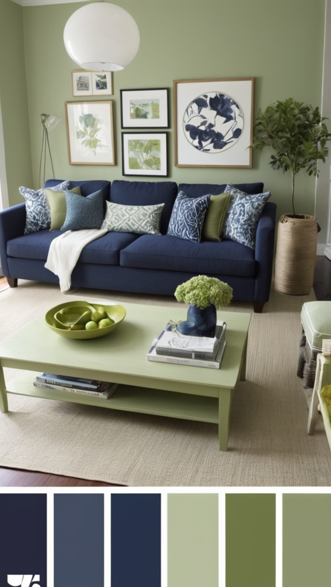
Neutral tones like beige, ivory, and taupe are excellent base colors for a traditional living room. Pairing these with rich shades like navy blue, forest green, or burgundy can create a classic and sophisticated look. Consider adding touches of gold or brass in decor pieces for an extra touch of elegance. To balance the color scheme, incorporate white or cream accents to keep the space light and airy. Mixing textures like velvet, silk, and leather can further enhance the traditional feel of the room.
When choosing colors for your traditional living room, it’s important to consider the size of the space and the amount of natural light it receives. Darker colors can make a room feel cozy but may also make it appear smaller, while lighter tones can open up the space. Experiment with different combinations and shades to find the perfect balance that suits your taste and complements your furniture and decor. Remember that the right color scheme can transform your living room into a welcoming and inviting space for you and your guests to enjoy.
How to choose the best color combinations for a traditional living room?
Choosing the best color combinations for a traditional living room involves considering various factors such as the room’s size, natural light exposure, existing furniture, and personal preferences. Here are some important points to keep in mind when selecting colors:
1. Identify the mood: Before choosing colors, consider the mood you want to create in the living room. Traditional rooms often aim for warmth, coziness, and a sense of sophistication.
2. Consider the room’s purpose: Think about how you use the living room. If it’s a space for relaxation, opt for calming colors. If it’s a room for social gatherings, consider warmer tones.
3. Coordinate with existing elements: Take into account the colors of your furniture, curtains, and flooring. Choose colors that complement or contrast nicely with these existing elements.
4. Use the color wheel: Understanding color harmony can help you create visually appealing combinations. Analogous colors (those next to each other on the color wheel) create a harmonious look, while complementary colors (opposites on the wheel) provide contrast.
5. Test samples: It’s essential to test paint samples in the actual room to see how they appear in different lights throughout the day before making a final decision.
6. Consider the room’s size: Light colors can make a small room feel more spacious, while dark colors can add intimacy to a large space.
7. Personal taste: Ultimately, choose colors that resonate with your personal style and preferences to ensure a space that feels comfortable and welcoming.
What are some classic color schemes for a traditional living room?
Classic color schemes for traditional living rooms often revolve around timeless hues that exude elegance and sophistication. Some popular choices include:
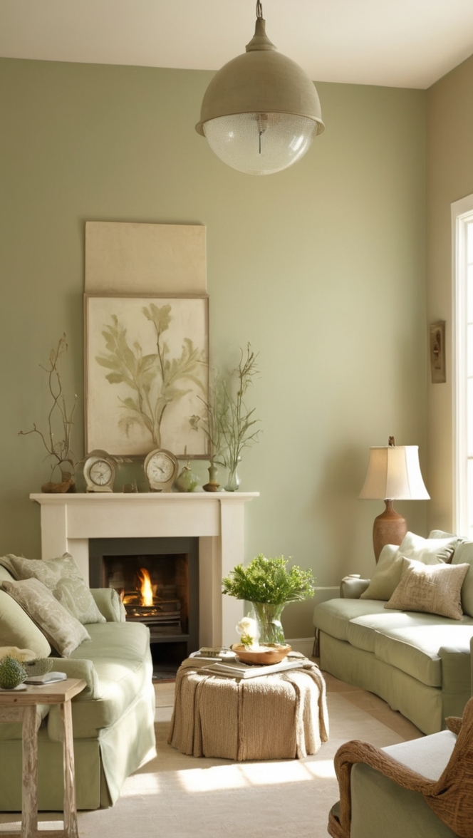
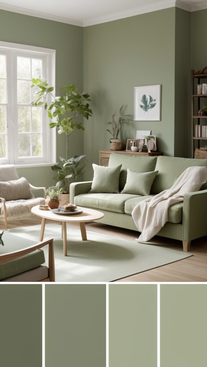
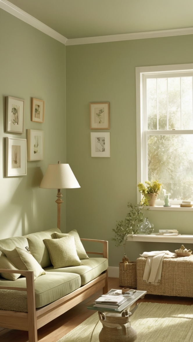
1. Neutrals with accents: A neutral base of creams, beiges, or soft grays can serve as a backdrop for richer accent colors like burgundy, navy, or forest green.
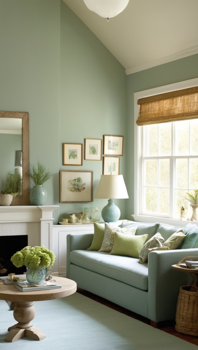
2. Elegant palettes: Classic pairings such as ivory and gold, navy and white, or sage green and taupe can create a refined and timeless look.
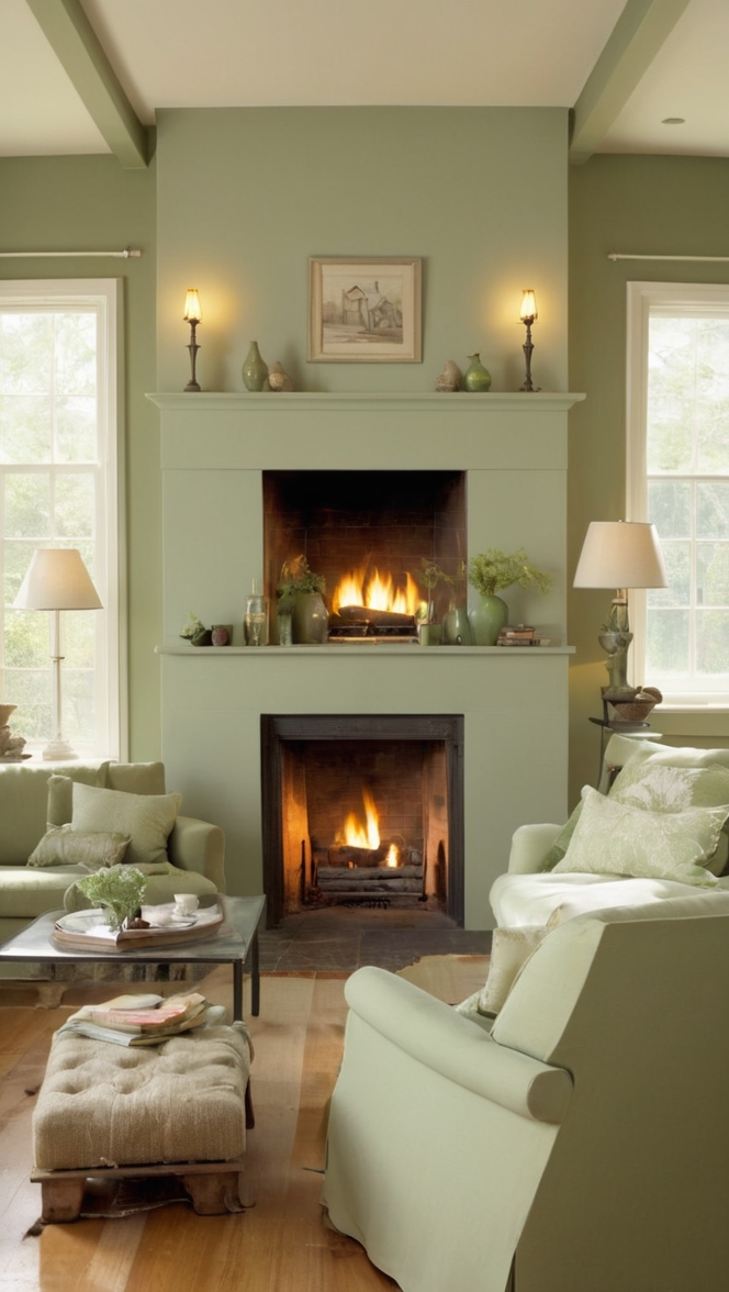
3. Warm earth tones: Colors inspired by nature, such as terracotta, deep browns, and olive greens, bring warmth and depth to a traditional living room.
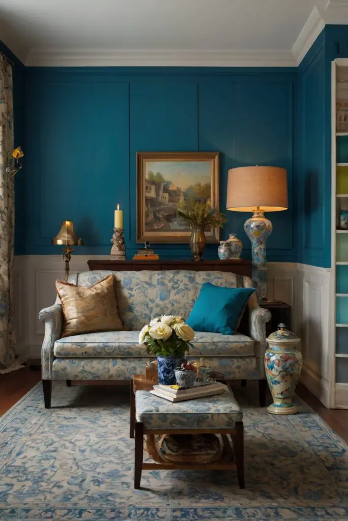
4. Rich jewel tones: Jewel tones like sapphire blue, emerald green, and ruby red inject vibrancy and luxury into a traditional space when used as accent colors against a neutral backdrop.
5. Monochromatic schemes: Using different shades of a single color, such as varying tones of blue or gray, can create a sophisticated and cohesive design in a traditional living room.
6. Timeless pairings: Traditional combinations like black and white, taupe and chocolate brown, or pale yellow and soft blue offer a classic and elegant aesthetic.
7. Traditional patterns: Incorporating classic patterns like floral prints, damask, or toile in coordinating colors can add visual interest and depth to the room.
Can I combine bold colors in a traditional living room design?
Yes, you can incorporate bold colors in a traditional living room design, but it’s essential to do so thoughtfully to maintain a balanced and cohesive look. Here are some tips for combining bold colors:
1. Accent walls: Consider painting one wall in a bold color as a focal point in the room while keeping the remaining walls neutral.
2. Statement furniture: Introduce bold colors through furniture pieces like a vibrant sofa, bold patterned armchairs, or colorful accent tables.
3. Accessories and decor: Use bold colors in accessories such as throw pillows, rugs, curtains, and artwork to add pops of color throughout the room.
4. Color blocking: Experiment with pairing bold colors in blocks or sections of the room to create visual interest without overwhelming the space.
5. Balance with neutrals: Balance bold colors with neutral tones to prevent the space from feeling too intense. Incorporating ample white, beige, or gray can help offset the bold hues.
6. Consider undertones: Pay attention to the undertones of bold colors to ensure they harmonize with the existing elements in the room.
7. Layering: Mix and match different bold colors in varying intensities and textures to create depth and dimension in the room design.
What is the significance of choosing the right color palette for a traditional living room?
Selecting the right color palette for a traditional living room is crucial as colors can significantly impact the overall look and feel of the space. Here’s why choosing the right color palette is essential:
1. Setting the tone: Colors set the tone for the room and influence the mood and ambiance. Warm colors create a cozy atmosphere, while cool tones evoke a sense of calm.
2. Enhancing architectural features: The right color palette can highlight architectural details like moldings, trim, or fireplace mantels, adding character and depth to the room.
3. Creating visual flow: A well-chosen color scheme can unify the various elements in the room, creating a cohesive and harmonious look.
4. Emphasizing focal points: Colors can draw attention to focal points in the room, such as a statement piece of furniture, a beautiful rug, or a stunning piece of art.
5. Personalizing the space: Colors reflect your personal style and taste, allowing you to customize the room to align with your preferences and personality.
6. Influencing perception: Colors can affect how we perceive the size and shape of a room. Light colors can make a space feel larger, while dark colors can create a sense of intimacy.
7. Timeless appeal: A well-chosen color palette in a traditional living room can withstand changing trends and remain stylish and classic for years to come.
How can I incorporate patterns and textures with color in a traditional living room?
Incorporating patterns, textures, and colors in a traditional living room can add depth, visual interest, and personality to the space. Here are some strategies to successfully combine these elements:
1. Layering: Mix and match different patterns and textures to create depth and dimension. Combine smooth surfaces with textured fabrics and bold patterns with subtle prints.
2. Color coordination: Select patterns that share at least one color to maintain a cohesive look. Consider a unifying color scheme to tie together diverse patterns.
3. Scale and proportion: Vary the scale of patterns to avoid overwhelming the space. Large-scaled patterns can make a statement, while small-scale patterns can add intricacy.
4. Mixing materials: Incorporate a variety of textures such as velvet, silk, linen, and wool to create a tactile experience and enhance visual interest.
5. Statement pieces: Use patterned upholstery, bold curtains, or a textured area rug as statement pieces to anchor the room and introduce focal points.
6. Accent walls: Consider using patterned wallpaper or textured paint on an accent wall to create visual interest without overpowering the entire space.
7. Accessorize thoughtfully: Introduce patterned throw pillows, blankets, or decorative objects in complementary colors to tie the room together and add personality.
What are the benefits of using neutral colors in a traditional living room?
Neutral colors play a vital role in traditional living room design, offering a versatile and timeless foundation for the space. Here are the advantages of incorporating neutral hues:
1. Timeless elegance: Neutrals like whites, creams, beiges, and grays provide a classic and sophisticated backdrop that can stand the test of time.
2. Enhanced versatility: Neutral colors serve as a neutral canvas that allows you to easily change accent colors, furniture, or decor without clashing with the existing palette.
3. Light reflection: Lighter neutrals can reflect natural light, making a room feel brighter, more open, and spacious.
4. Visual calmness: Neutral tones create a sense of serenity and calmness in a room, perfect for relaxation and unwinding.
5. Accentuated decor: Neutral walls and furniture can highlight colorful artwork, vibrant accessories, or bold furniture pieces, allowing them to take center stage.
6. Flexibility in design: Neutrals can easily blend with different design styles, allowing you to mix traditional elements with contemporary accents seamlessly.
7. Easy to accessorize: Neutrals provide a versatile backdrop for adding pops of color, textures, or patterns through accessories like pillows, throws, and rugs.
How to balance contrasting colors in a traditional living room design?
Achieving a balance of contrasting colors is key to creating a visually appealing and harmonious traditional living room design. Here’s how to effectively balance different hues:
1. Start with a dominant color: Select one primary color as the dominant hue in the room, typically a neutral or a soft tone, to serve as the foundation for the color scheme.
2. Add complementary colors: Introduce complementary colors, which are opposite on the color wheel, to create a dynamic contrast that energizes the space. For example, pair blue with orange or purple with yellow.
3. Use the 60-30-10 rule: Allocate 60% of the room to a dominant color, 30% to a secondary color, and 10% to an accent color for a well-balanced composition.
4. Consider the intensity: Balance bold colors with softer tones to prevent them from overpowering the room. Lighter shades can help tone down vibrant hues.
5. Create focal points: Use contrasting colors to highlight specific features or architectural elements in the room, drawing attention to areas you want to emphasize.
6. Repeat colors: Incorporate the same contrasting colors throughout the room in various elements like furniture, accessories, and fabrics to create a cohesive look.
7. Harmonize with neutrals: Neutrals can act as a unifying force between contrasting colors, providing a visual resting place and preventing the scheme from appearing too busy or chaotic.
Key Takeaways
– Choose colors based on the mood and purpose of the room.
– Classic color schemes include neutrals with accents, warm earth tones, and rich jewel tones.
– Incorporate bold colors thoughtfully through accent walls, furniture, and accessories.
– Selecting the right color palette enhances the room’s ambiance and personalizes the space.
– Layer patterns, textures, and colors to add depth and visual interest.
– Neutral colors offer timeless elegance, versatility, and flexibility in design.
– Balance contrasting colors by starting with a dominant color, using complementary hues, and harmonizing with neutrals.