Looking to create a stunning kitchen color scheme? Discover expert tips for balancing warm and cool tones for a cohesive look.
Balancing Warm and Cool Tones in Your Kitchen Color Scheme is essential for creating a harmonious and inviting space. To achieve this, start by selecting a primary color for the walls that sets the tone for the rest of the room. Consider warm tones like creamy whites, beige, or soft yellows for a cozy atmosphere, or cool tones like light blues or grays for a more calming vibe.
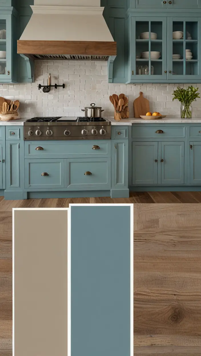
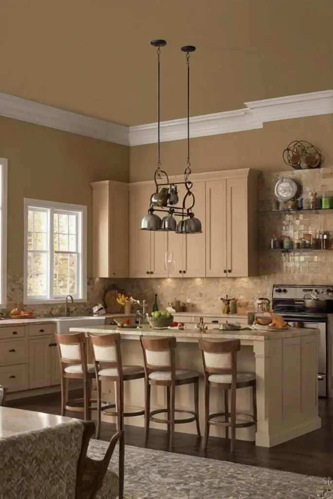
When coordinating accents or cabinets, mix warm and cool tones to balance the space. For example, pair warm wood cabinets with cool gray countertops. Additionally, add pops of color through accessories or artwork to tie the look together.
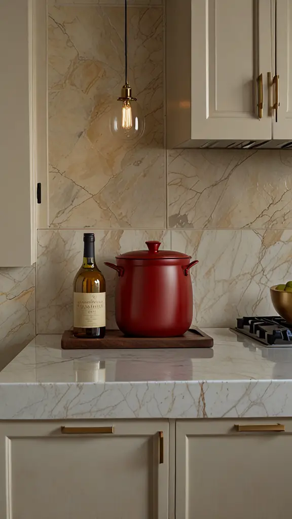
My Lovely Spring Paint for 2025
Ready for a Spring Makeover? Explore the Freshest 2025 Paint Trends!
White Sage/Green SW Pistachio green Soft blue Honeysweet/Orange Pink Sugar Sage Tint BMAs an Amazon Associate, I may earn a commission from qualifying purchases at no extra cost to you.
Collaborating with an interior designer can provide expert guidance on color matching, paint selection, and space planning to maximize the functionality and aesthetics of your kitchen. Interior designers have the expertise to recommend the right primer paint for walls and ensure the paint colors complement each other for a cohesive look.
By incorporating the expertise of an interior designer and carefully selecting a mix of warm and cool tones, you can create a stunning kitchen design that reflects your personal style and enhances the overall ambiance of your home.
How can I balance warm and cool tones in my kitchen color scheme?
To balance warm and cool tones in your kitchen color scheme, consider the 60-30-10 rule. This rule suggests using 60% of a dominant color (typically a warm or neutral tone), 30% of a secondary color (a complementary or contrasting tone), and 10% of an accent color (usually a bold or vibrant shade). By following this rule, you can achieve a harmonious balance of warm and cool tones in your kitchen.
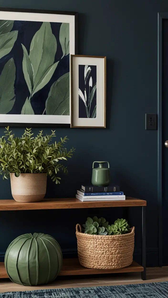
My fAV Spring DECOR for 2025
Discover Spring’s Best 2025 Decor Combinations – Perfect for Any Room!
Oversized Indoor Plants White Curved Sofas Rugs BOH Brown Cream Moroccan Hype Boho Rug Outdoor Patio Furniture Sets Topfinel Pillow CoversAs an Amazon Associate, I may earn a commission from qualifying purchases at no extra cost to you.
Another way to balance warm and cool tones is by using a color wheel. Colors that are opposite each other on the color wheel are complementary and can create a striking balance in your kitchen. For example, pairing warm red tones with cool green tones or warm yellow tones with cool blue tones can create a visually appealing contrast.
Incorporating natural elements like wood or stone can also help bridge the gap between warm and cool tones in your kitchen. Wood adds warmth to a space, while stone provides a cool, neutral base. By combining these elements, you can achieve a balanced color scheme that is both inviting and cohesive.
What is the best way to choose complementary colors for my kitchen decor?
When choosing complementary colors for your kitchen decor, consider the color wheel. Complementary colors are opposite each other on the color wheel and create a vibrant contrast when paired together. For example, blue and orange, red and green, or yellow and purple are complementary color pairs that can add visual interest to your kitchen.
Another approach is to use a monochromatic color scheme, which involves choosing different shades of the same color. This can create a harmonious and cohesive look in your kitchen. For instance, using varying shades of blue from light to dark can add depth and dimension to your space.
Additionally, you can look to nature for inspiration when selecting complementary colors. Nature often combines colors in beautiful and unexpected ways, so drawing inspiration from natural landscapes or elements can help you create a unique and inviting color scheme for your kitchen decor.
Can I mix warm and cool tones in the same kitchen space?
Yes, mixing warm and cool tones in the same kitchen space can create a dynamic and balanced look. The key is to find a harmonious balance between the two tones. You can achieve this by using one tone as the dominant color and the other as an accent or secondary color.
For example, if you have warm wood cabinets in your kitchen, you can incorporate cool blue or gray accents in the backsplash or accessories. This balance prevents the space from feeling too overwhelming with one type of tone and adds visual interest.
Another approach is to use a neutral base, such as white or beige, as a backdrop for mixing warm and cool tones. This allows you to experiment with different colors without overwhelming the space and provides a cohesive look that ties everything together.
How do I determine the dominant color tone for my kitchen?
To determine the dominant color tone for your kitchen, consider the overall style and mood you want to create. Warm tones, such as reds, oranges, and yellows, can add energy and warmth to a space, while cool tones, like blues, greens, and grays, create a calming and serene atmosphere.
Additionally, look at existing elements in your kitchen, such as cabinets, countertops, and flooring, to determine if they lean more towards warm or cool tones. Choosing a dominant color tone that complements these existing elements can help create a cohesive and harmonious color scheme.
If you’re unsure about which tone to choose, consider the natural light in your kitchen. Warm tones tend to look best in spaces with ample natural light, while cool tones can help brighten a space that lacks natural light. By taking these factors into account, you can determine the dominant color tone that best suits your kitchen design.
What are some alternative paint options for achieving a balanced color scheme in my kitchen?
In addition to traditional paint colors, there are several alternative options for achieving a balanced color scheme in your kitchen. One option is to use chalkboard paint, which can add a unique and customizable element to your kitchen. Chalkboard paint comes in various shades, from warm grays to cool blacks, and allows you to create a focal point or accent wall in your space.
Another alternative is metallic paint, such as gold or silver, which can add a touch of luxury and sophistication to your kitchen. Metallic accents can be used as a subtle way to introduce warm or cool tones into your color scheme and create a visually interesting contrast.
Additionally, you can consider using accent wallpaper to add texture and pattern to your kitchen walls. Wallpaper comes in a variety of designs and colors, making it a versatile option for achieving a balanced and personalized color scheme in your kitchen.
How can I ensure that the colors in my kitchen match the overall room decor?
To ensure that the colors in your kitchen match the overall room decor, consider creating a cohesive color palette that flows seamlessly throughout the space. Start by selecting a main color that will serve as the anchor for your kitchen design. This color should complement the existing decor in your home and set the tone for the rest of the space.
Next, choose secondary and accent colors that tie into the main color and enhance the overall aesthetic of the room. For example, if your living room features cool blue tones, consider incorporating similar shades in your kitchen to create a sense of continuity and harmony.
Integrating patterns and textures can also help incorporate colors from your existing decor into your kitchen. Whether through textiles, rugs, or decorative accessories, mixing patterns and textures can add depth and visual interest to your space while ensuring that the colors complement each other.
Why is it important to consider the lighting in my kitchen when selecting warm and cool tones?
Lighting plays a critical role in how colors appear in a space, making it essential to consider when selecting warm and cool tones for your kitchen. Natural light can influence the way colors are perceived, with warm tones appearing richer and cooler tones appearing crisper in natural sunlight.
When choosing colors for your kitchen, take into account the direction of natural light in the room. North-facing kitchens tend to receive cooler light, which can enhance cool tones, while south-facing kitchens receive warmer light that can intensify warm tones. Understanding how natural light interacts with colors can help you select the right tones for your space.
Additionally, artificial lighting, such as overhead fixtures and under-cabinet lighting, can impact the way colors are displayed in your kitchen. Warm white bulbs can enhance warm tones, while cool white bulbs can accentuate cooler tones. Consider the type and placement of lighting fixtures to ensure that the colors in your kitchen are illuminated in the best possible way.
Key Takeaways:
– **Balancing warm and cool tones** in your kitchen color scheme is essential for creating a harmonious and inviting space.
– Utilize the **60-30-10 rule** to achieve a balanced color scheme by incorporating a dominant color, secondary color, and accent color.
– **Complementary colors** can add visual interest to your kitchen decor by creating a vibrant contrast.
– Mixing warm and cool tones can create **dynamic and balanced** look in your kitchen space.
– Consider the **natural light** in your kitchen when selecting warm and cool tones to ensure the colors are accurately represented.
– Utilize **alternative paint options** like chalkboard paint, metallic paint, or accent wallpaper to add a unique touch to your kitchen design.
– **Consistency** in color palette and coordination with the overall room decor is crucial for a cohesive kitchen design.