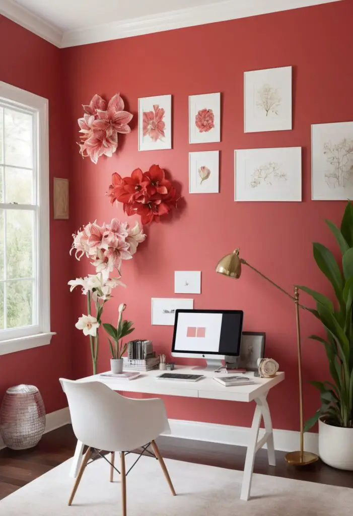
In the realm of interior design, the color palette is an ever-evolving canvas, reflecting contemporary tastes and trends. As we stride into 2024, a new hue emerges to redefine office chic: Amaryllis. This vibrant yet sophisticated shade holds the promise of invigorating workspaces with its dynamic energy and subtle elegance. Here’s why Amaryllis should be your top choice for office paint in 2024.
Why Amaryllis?
- Dynamic Presence: Amaryllis infuses spaces with a burst of vitality, setting a lively tone that inspires creativity and productivity. Its rich red undertones exude warmth and passion, creating an ambiance conducive to brainstorming sessions and collaborative endeavors.
- Timeless Sophistication: While Amaryllis is undoubtedly contemporary, its undertones of classic red imbue it with a timeless elegance that transcends fleeting trends. This duality makes it a versatile choice, seamlessly blending modern aesthetics with traditional sensibilities.
- Enhanced Focus: Studies have shown that certain colors can affect cognitive function, and Amaryllis is no exception. Its bold yet balanced hue stimulates mental acuity and concentration, fostering an environment where focus flourishes and ideas flow freely.
- Complementary Palette: Amaryllis effortlessly complements a wide range of materials and textures, from sleek metallic accents to natural wood finishes. This adaptability allows for seamless integration into existing office décor, ensuring a cohesive and harmonious aesthetic.
- Mood Elevation: Beyond its visual appeal, Amaryllis has the power to uplift spirits and elevate moods. Its warm, inviting nature creates a sense of comfort and optimism, transforming mundane workspaces into vibrant hubs of inspiration and positivity.
Tips to Match Amaryllis:
- Neutral Foundations: Pair Amaryllis with neutral hues such as soft greys or crisp whites to create a balanced backdrop that allows the vibrant red to take center stage without overwhelming the space.
- Accent Accents: Introduce pops of Amaryllis through accent furniture pieces, such as chairs or statement art pieces, to add visual interest and depth to the room without committing to full-wall coverage.
- Natural Elements: Incorporate natural elements like wooden furniture or potted plants to complement Amaryllis’s warmth and enhance its organic appeal, creating a harmonious and inviting atmosphere.
- Metallic Touches: Add a touch of glamour to Amaryllis-infused spaces with metallic accents in gold or brass, which contrast beautifully with the rich red tones and add a hint of opulence to the overall design.
- Layered Textures: Experiment with layered textures such as plush rugs, velvet upholstery, or textured wallpapers to add dimension and tactile interest to Amaryllis-dominated rooms, creating a sensory-rich environment that delights the senses.
Hue Matching with Amaryllis:
- Slate Grey: The cool undertones of slate grey provide a sophisticated counterbalance to Amaryllis’s warmth, creating a chic and modern color scheme that exudes understated elegance.
- Teal Blue: A harmonious blend of blue and green, teal complements Amaryllis beautifully, offering a refreshing pop of color that adds depth and complexity to the overall palette while maintaining visual harmony.
- Mustard Yellow: The bold, earthy tones of mustard yellow provide a striking contrast to Amaryllis, creating a dynamic and energetic color scheme that evokes feelings of warmth and vitality.
- Soft Pink: Soft pink hues offer a delicate and feminine counterpart to Amaryllis, creating a charming and whimsical aesthetic that balances the boldness of red with a touch of softness and romance.
- Olive Green: The muted tones of olive green provide a subtle yet sophisticated complement to Amaryllis, creating a timeless color scheme that feels both contemporary and classic.
Alternative Colors from Sherwin Williams and Benjamin Moore:
- Sherwin Williams – Reddened Earth: A rich, earthy red with subtle brown undertones, Reddened Earth offers a sophisticated alternative to Amaryllis, infusing spaces with warmth and depth.
- Sherwin Williams – Coral Reef: A vibrant coral hue with pink undertones, Coral Reef adds a playful and energetic vibe to any room, creating a lively and inviting atmosphere that stimulates creativity.
- Benjamin Moore – Cranberry Cocktail: A deep, luscious red with hints of purple, Cranberry Cocktail exudes luxury and sophistication, making it an ideal choice for upscale office settings or executive suites.
- Benjamin Moore – Raspberry Truffle: A sumptuous blend of red and brown, Raspberry Truffle radiates warmth and elegance, creating a cozy and inviting ambiance that encourages relaxation and focus.
- Benjamin Moore – Tawny: A warm, golden brown hue with hints of red, Tawny adds a touch of rustic charm to any space, creating a cozy and inviting atmosphere that feels both timeless and inviting.
Other Rooms to Use Amaryllis:
- Conference Rooms: Infuse conference rooms with the dynamic energy of Amaryllis to stimulate creativity and foster productive discussions among team members.
- Reception Areas: Create a warm and welcoming first impression by incorporating Amaryllis into reception areas, setting a positive tone for visitors and clients from the moment they step through the door.
- Executive Offices: Elevate executive offices with the sophisticated allure of Amaryllis, creating a refined and inspirational workspace that reflects leadership and vision.
- Collaborative Spaces: Foster collaboration and innovation in shared workspaces by incorporating Amaryllis into the design, encouraging spontaneous interactions and idea exchanges among colleagues.
- Break Rooms: Transform break rooms into vibrant hubs of relaxation and rejuvenation by infusing them with the energizing presence of Amaryllis, creating a welcoming space for employees to unwind and recharge.
Conclusion:
In the ever-evolving landscape of interior design, Amaryllis emerges as a standout hue for 2024, redefining office chic with its vibrant energy and timeless elegance. Whether adorning walls or accent pieces, this dynamic shade has the power to transform workspaces into vibrant hubs of creativity, productivity, and positivity. By embracing Amaryllis, you invite a fresh perspective into your office, where innovation thrives, and inspiration knows no bounds.