The significance of the horror color palette in film lies in its use of eerie color combinations, creating a dark and sinister atmosphere akin to haunted house colors.
Disclosure: This post contains affiliate links. We may earn a commission at no extra cost to you.
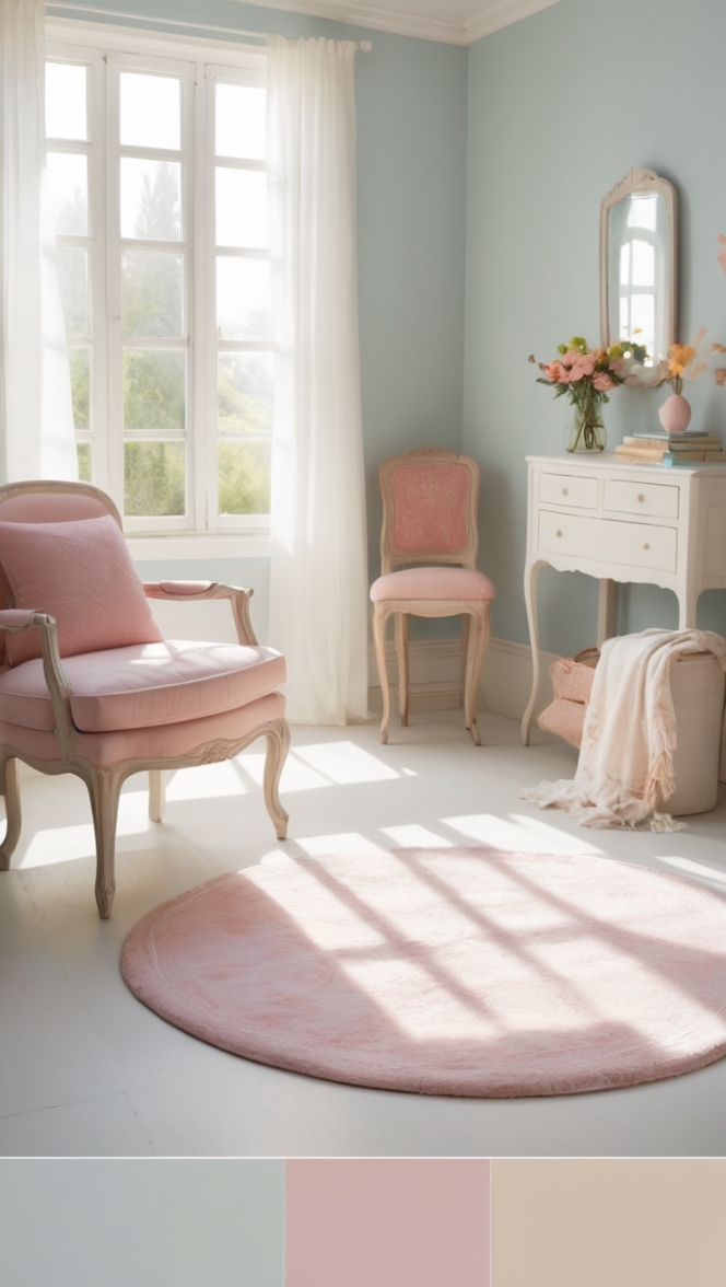
The horror color palette in film plays a crucial role in setting the tone and atmosphere of the movie. Dark, moody colors like deep reds, blues, and blacks are commonly used to create a sense of fear and unease. These colors evoke a sense of foreboding and can intensify the emotional impact of the film’s scenes. When incorporating a horror color palette into home decor, consider using these dark colors sparingly to avoid overwhelming the space. A few strategic touches, such as dark accent walls or furnishings, can create a spooky ambiance without feeling too oppressive.
The horror genre in film has always been known for its ability to evoke fear, suspense, and unease in viewers. One of the key elements that contribute to the overall atmosphere and mood of a horror film is the color palette used by filmmakers. Colors play a crucial role in setting the tone of a movie, creating a sense of foreboding, and building tension throughout the narrative. In this article, we will delve into the significance of the horror color palette in film and explore how different colors are used to elicit emotional responses from the audience.
### The Impact of Colors on Atmosphere and Mood
Colors have the power to influence our emotions and perceptions in subtle but profound ways. In horror films, the choice of color palette can greatly impact the overall atmosphere and mood of the movie. Dark, muted tones such as black, deep red, and dark blue are commonly used to create a sense of dread and suspense. These colors are often associated with danger, death, and the unknown, evoking feelings of fear and apprehension in viewers.
On the other hand, bright, vibrant colors can be used to contrast with the darker elements of a horror film, creating a sense of dissonance and unease. For example, a splash of bright red in an otherwise dark and gloomy scene can draw the viewer’s attention and signal impending danger or violence. By playing with contrasting colors, filmmakers can heighten the sense of tension and keep audiences on edge throughout the movie.
### Psychological Effects of Colors in Horror Films
Certain colors have been shown to have specific psychological effects on viewers when used in horror films. For example, the color red is often associated with blood, violence, and passion, making it a popular choice for horror filmmakers looking to evoke strong emotions in their audience. Red has been shown to increase heart rate and stimulate adrenaline production, leading to heightened feelings of fear and excitement.
Similarly, the color black is often used to symbolize death, evil, and the unknown in horror films. Black can create a sense of emptiness and void, representing the absence of light and safety. By using black in key moments of a horror movie, filmmakers can instill a sense of hopelessness and despair in viewers, intensifying the impact of the narrative.
### Enhancing Storytelling and Building Tension
Filmmakers use colors not just to create a visually striking movie, but also to enhance the storytelling and build tension throughout the narrative. By carefully selecting a color palette that complements the themes and motifs of the film, directors can convey subtle messages and foreshadow events to come. For example, a recurring color motif can be used to symbolize a character’s inner turmoil or to hint at a looming threat in the story.
Additionally, colors can be used to manipulate the viewer’s perception of time and space in a horror film. Warm, inviting colors can make a scene feel cozy and familiar, lulling the audience into a false sense of security before the tension ramps up. Conversely, cold, desaturated colors can create a sense of isolation and alienation, heightening the feeling of unease and disorientation in viewers.
### Influence on Emotional Response
The color palette of a horror film can have a profound impact on the audience’s emotional response to the narrative. By using colors strategically to evoke specific emotions and reactions, filmmakers can guide the viewer’s experience and shape their understanding of the story. For example, a sudden shift from warm, comforting colors to cold, unsettling tones can signal a change in mood or narrative direction, keeping viewers engaged and invested in the story.
Moreover, different cultures may interpret colors in horror films differently, leading to varied emotional responses among international audiences. For example, while red is commonly associated with danger and blood in Western cultures, it may symbolize luck and prosperity in Asian cultures. Filmmakers must be mindful of these cultural differences when choosing color palettes for their horror movies to ensure that the intended emotional impact resonates with viewers from diverse backgrounds.
### Notable Examples of Effective Use of Color Palettes
Several horror films have utilized color palettes to great effect, creating a sense of dread and unease that lingers long after the movie has ended. One notable example is Stanley Kubrick’s “The Shining,” which uses a combination of bright, bold colors and stark, monochromatic tones to convey the psychological horror and isolation experienced by the characters. The iconic use of blood-red elevators and eerie twin girls in blue dresses has become synonymous with the film’s chilling atmosphere.
Another example is Guillermo del Toro’s “Pan’s Labyrinth,” which juxtaposes fantastical, vibrant colors with dark, oppressive shadows to create a visually stunning and emotionally resonant story. The use of contrasting colors serves to underscore the dual nature of the narrative, blurring the lines between reality and fantasy and immersing the audience in the protagonist’s harrowing journey.
In conclusion, the horror color palette in film plays a crucial role in shaping the atmosphere, mood, and emotional impact of a movie. By carefully selecting and manipulating colors, filmmakers can create a sense of fear, suspense, and unease that resonates with audiences on a deep, visceral level. Whether through the use of dark, foreboding tones or bold, contrasting colors, the horror color palette remains a powerful tool for filmmakers to elicit strong emotional responses and immerse viewers in the terrifying world of horror cinema.

The Horror Color Palette: Setting the Tone for Fear
The horror color palette in film plays a crucial role in setting the tone and atmosphere of the movie. Dark, moody colors like deep reds, blues, and blacks are commonly used to create a sense of fear and unease. These colors evoke a sense of foreboding and can intensify the emotional impact of the film’s scenes.
1. Blood Red
For a truly terrifying touch, consider using a deep blood red paint on an accent wall in your home. This color will evoke a sense of danger and create a spooky atmosphere.
2. Midnight Blue
Dark blues, like midnight blue, can add a sense of mystery and depth to your home decor. Consider painting a ceiling or a small room in this color to create a chilling effect.
3. Shadow Black
Black is a classic horror color that can create a sense of dread and unease. Use black accents like furniture or decor pieces to add a touch of darkness to your space.
4. Haunting Purple
Purple is a color often associated with the supernatural and the mysterious. Consider using shades of purple in your home decor to create an eerie and haunting atmosphere.
5. Ghastly Green
Green can evoke feelings of sickness and decay, making it a perfect choice for a horror color palette. Use muted green tones in your decor to create a spooky ambiance.
6. Wicked Gray
Gray is a neutral color that can add a sense of coldness and emptiness to a room. Consider using shades of gray in your decor to create a chilling effect.
7. Sinister Brown
Dark brown tones can add a sense of earthiness and decay to your home decor. Use brown accents sparingly to create a sense of foreboding.
8. Macabre Maroon
Maroon is a deep, rich color that can add a touch of elegance to a horror color palette. Consider using maroon accents in your decor to create a sense of sophistication in your spooky space.
9. Creepy Charcoal
Charcoal gray is a dark, moody color that can add depth and drama to your home decor. Consider using charcoal accents to create a sense of mystery and suspense.
10. Terrifying Teal
Teal is a bold color that can add a sense of intensity and drama to your space. Use teal accents to create a striking contrast in your horror color palette.
11. Spine-Chilling Silver
Silver is a metallic color that can add a touch of glamour to a horror color palette. Consider using silver accents in your decor to create a sense of otherworldly beauty.
12. Petrifying Pink
Pink may seem like an unlikely choice for a horror color palette, but dark shades of pink can add a sense of unease and discomfort to your space. Use pink accents sparingly to create a sense of twisted beauty.
Creating a Spooky Ambiance
When incorporating a horror color palette into home decor, consider using these dark colors sparingly to avoid overwhelming the space. A few strategic touches, such as dark accent walls or furnishings, can create a spooky ambiance without feeling too oppressive.