

Looking to elevate your website with your brand colors? Learn how to use a color scheme generator for a cohesive look.

Disclosure: This post contains affiliate links. We may earn a commission at no extra cost to you.
To incorporate the brand color palette into your website design, start by identifying the primary colors of your brand. Use these colors for the background, headers, buttons, and other key elements on your site. Ensure that the colors are consistent throughout the design to maintain brand identity. You can also use accent colors from the palette for highlighting important information or creating visual interest. Be mindful of color contrast to ensure readability. Regularly review and update the color palette as needed to keep your website fresh and aligned with your brand.
How can I incorporate the brand color palette into my website design?
When designing a website, one of the key elements to consider is the brand color palette. The colors you choose can have a significant impact on how your brand is perceived and can help create a cohesive and memorable visual identity. Here are seven questions that may come to mind when thinking about incorporating your brand color palette into your website design:
1. What are the brand colors?
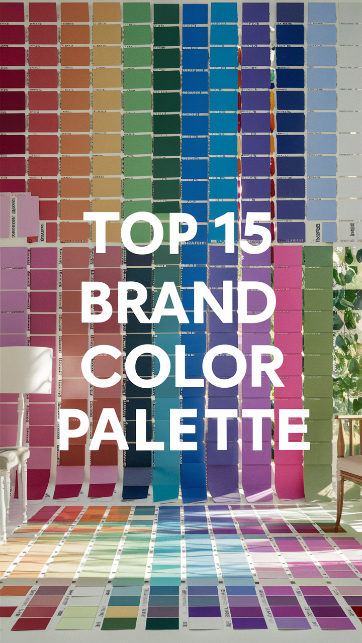
Before you can incorporate the brand color palette into your website design, you need to know what the brand colors are. This typically includes primary colors, secondary colors, and any accent colors that make up the brand’s visual identity.
2. How can I use the brand colors effectively?
Once you know the brand colors, it’s important to understand how to use them effectively in your website design. This may involve using certain colors for text, backgrounds, buttons, and other elements to create a harmonious and visually appealing layout.
3. Should I stick strictly to the brand colors?
While it’s important to incorporate the brand color palette into your website design, you may also want to consider using additional colors to complement the brand colors and add visual interest. Finding the right balance between brand colors and supplementary colors is key.
4. How can I create a color scheme that reflects the brand’s personality?
The colors you choose for your website should reflect the personality and values of your brand. For example, vibrant and bold colors may convey energy and excitement, while softer pastel colors may suggest a more calming and elegant brand image.
5. What if the brand colors don’t work well for web design?
In some cases, the brand colors may not translate well to web design due to issues such as contrast, readability, or accessibility. In such situations, you may need to adjust the shades or tones of the brand colors to ensure they work effectively in a digital environment.
6. How can I create a cohesive color palette for the entire website?
To create a cohesive color palette for your website, consider using the brand colors as a base and then selecting additional colors that complement and enhance the overall design. This can help create a sense of unity and consistency across all pages.
7. What tools can help me choose and implement the brand color palette?
There are various online tools and resources available that can help you choose and implement the brand color palette effectively in your website design. These tools can assist with color selection, color matching, and creating color schemes that work well together.
By considering these questions and carefully incorporating your brand color palette into your website design, you can create a visually appealing and cohesive online presence that accurately represents your brand identity.

12 Unique Ideas for Incorporating Brand Colors into Your Website Design
When it comes to creating a visually appealing website that aligns with your brand identity, incorporating your brand color palette is crucial. Here are 12 creative ways to infuse your brand colors into your website design:
1. Homepage Banner
Use your primary brand colors in the homepage banner to make a bold statement and immediately capture visitors’ attention.
2. Navigation Menu
Highlight the navigation menu items with your brand colors to guide users and create a cohesive design.
3. Call-to-Action Buttons
Make your call-to-action buttons stand out by using your brand’s accent colors to encourage clicks and conversions.
4. Section Dividers
Separate content sections with subtle hints of your brand colors to enhance visual hierarchy and organization.
5. Icons and Symbols
Integrate custom icons and symbols in your brand colors to add personality and reinforce brand recognition.
6. Testimonials and Reviews
Highlight customer testimonials and reviews in a color that complements your brand palette to build credibility and trust.
7. Footer Design
Incorporate your brand colors in the footer design for a cohesive look and to reinforce brand consistency across all pages.
8. Hover Effects
Add subtle hover effects in your brand colors to enhance user interaction and create a dynamic user experience.
9. Error Messages
Use your brand colors for error messages to maintain consistency and ensure a seamless user journey even in case of errors.
10. Social Media Integration
Customize social media icons and sharing buttons in your brand colors to drive engagement and reinforce brand presence.
11. Loading Animation
Create a loading animation in your brand colors to entertain users during page loading and leave a memorable impression.
12. Scroll Progress Bar
Add a scroll progress bar in your brand colors to help users navigate long pages easily and stay engaged with your content.
By implementing these unique ideas for incorporating your brand colors into your website design, you can create a visually stunning and cohesive online presence that resonates with your audience and reinforces your brand identity.


