
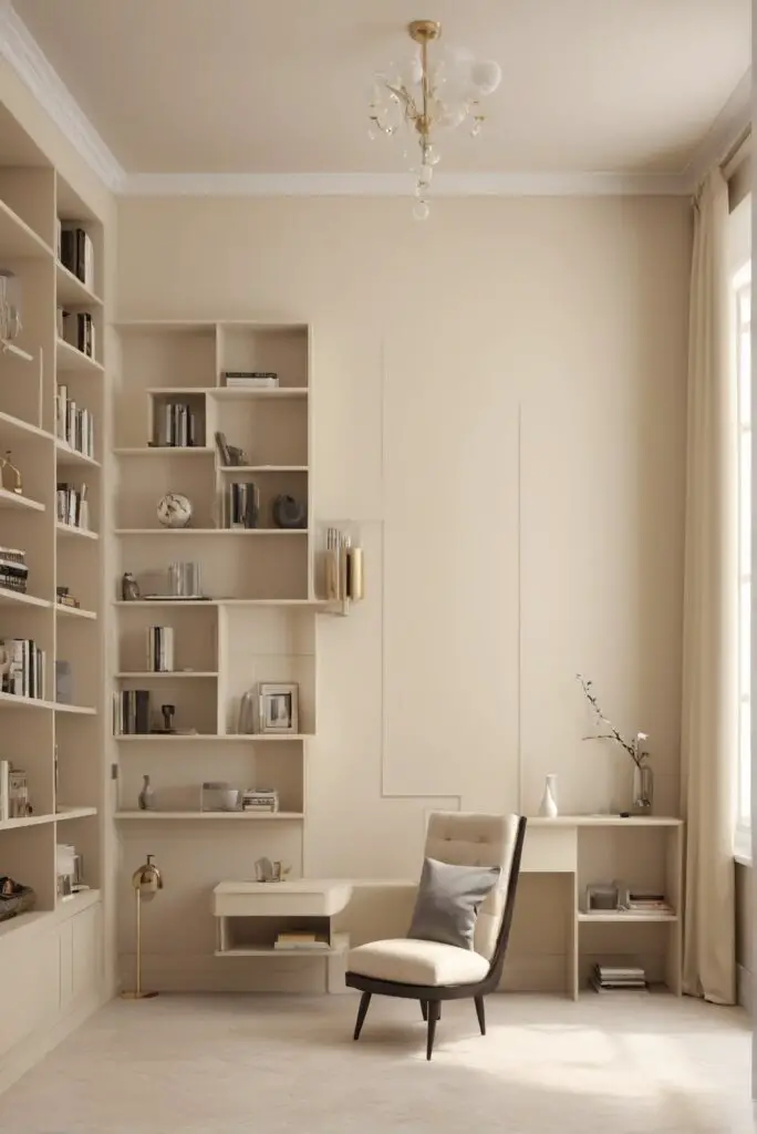
In the ever-evolving world of interior design, staying abreast of the latest trends is crucial to creating spaces that are not only visually appealing but also reflect your personal style. One trend that has gained significant traction in 2024 is the use of Compatible Cream as a paint color, particularly in libraries. This warm and contemporary shade adds a touch of sophistication and comfort to your reading haven, making it an excellent choice for those seeking a timeless yet modern ambiance.
Why Choose Compatible Cream?
Compatible Cream is a versatile color that effortlessly complements various design styles and aesthetics. Its warm undertones create a cozy atmosphere, making it an ideal choice for libraries where comfort and relaxation are paramount. Here are some compelling reasons to consider Compatible Cream for your library:
- Timeless Elegance: Compatible Cream exudes a timeless elegance that transcends passing trends. This classic color ensures that your library remains stylish and relevant for years to come, saving you from the hassle of frequent repainting.
- Versatility in Design: Whether your library features traditional wooden bookshelves or contemporary metal shelving units, Compatible Cream seamlessly integrates into any design scheme. It serves as a neutral backdrop, allowing your books, furniture, and decorative elements to take center stage.
- Welcoming Ambiance: The warm tones of Compatible Cream create a welcoming and inviting ambiance in your library. This is especially beneficial for spaces dedicated to reading and relaxation, as it encourages you to spend more time immersed in your favorite books.
- Enhanced Lighting: Compatible Cream reflects and enhances natural and artificial light, brightening up your library space. This not only contributes to a more visually appealing atmosphere but also improves the functionality of the room by providing better illumination for reading.
- Easy Coordination: Coordinating Compatible Cream with other colors and materials is a breeze. Whether you opt for contrasting or complementary hues, this versatile color adapts effortlessly, giving you the flexibility to personalize your library to suit your taste.
Tips for Matching Colors with Compatible Cream :
When incorporating Compatible Cream into your library, it’s essential to choose colors that complement or contrast harmoniously. Here are five tips to help you match colors seamlessly:
1. Earthy Greens:
Incorporate earthy green accents such as potted plants or emerald green throw pillows. The combination of Compatible Cream with green creates a soothing and nature-inspired palette, perfect for creating a tranquil reading environment.
2. Navy Blue Contrasts:
For a bolder look, pair Compatible Cream with deep navy blue. This classic combination adds a touch of sophistication and depth to your library, creating a visually striking contrast without overwhelming the space.
3. Subtle Grays:
If you prefer a more muted and understated aesthetic, consider combining Compatible Cream with subtle gray tones. This combination creates a calm and serene atmosphere, allowing your library to exude a quiet elegance.
4. Rich Burgundy Accents:
For a touch of warmth and opulence, introduce rich burgundy accents. This deep red hue complements Compatible Cream beautifully, adding a sense of coziness and luxury to your library.
5. Warm Wooden Elements:
Incorporate warm wooden elements such as bookshelves, tables, or flooring to enhance the cozy feel of Compatible Cream. The combination of cream and wood creates a harmonious and inviting space that is both timeless and on-trend.
Alternative Colors from Sherwin Williams and
Benjamin Moore :
If you’re considering similar shades from popular paint brands, Sherwin Williams and Benjamin Moore offer a range of alternatives to Compatible Cream. Here are five alternatives from each brand:
Sherwin Williams Alternatives:
- Alabaster (SW 7008):
- A slightly cooler off-white with subtle undertones, Alabaster provides a crisp and clean look that pairs well with Compatible Cream.
- Navajo White (SW 6126):
- A warm neutral with a hint of peachy undertones, Navajo White adds a touch of warmth without being overly creamy.
- Accessible Beige (SW 7036):
- A versatile beige with a balanced mix of warm and cool undertones, Accessible Beige complements Compatible Cream and works well in larger library spaces.
- Balanced Beige (SW 7037):
- A mid-toned beige with a perfect blend of warmth and neutrality, Balanced Beige is an excellent choice for creating a cozy and inviting library.
- Canvas Tan (SW 7531):
- A warm tan with a hint of orange undertones, Canvas Tan pairs well with Compatible Cream for a cohesive and inviting color scheme.
Benjamin Moore Alternatives:
- White Dove (OC-17):
- A soft and warm white, White Dove complements Compatible Cream and adds brightness to your library space.
- Muslin (OC-12):
- A subtle and warm beige, Muslin provides a neutral backdrop that pairs seamlessly with Compatible Cream, creating a serene atmosphere.
- Sandy Brown (OC-43):
- A warm brown with a hint of red, Sandy Brown adds depth and richness to your library, creating a cozy and inviting feel.
- Revere Pewter (HC-172):
- A versatile greige (gray-beige), Revere Pewter pairs well with Compatible Cream, offering a contemporary and sophisticated color scheme.
- Elmira White (HC-84):
- A warm off-white with a touch of yellow, Elmira White complements Compatible Cream, creating a cohesive and inviting look.
Other Rooms to Use Compatible Cream :
While Compatible Cream is an excellent choice for libraries, its versatility allows you to extend its warmth and sophistication to other rooms in your home. Consider using Compatible Cream in the following spaces:
1. Living Room:
Create a cozy and inviting living room by incorporating Compatible Cream on the walls. This neutral backdrop provides a warm canvas for your furniture and decor, promoting a comfortable and relaxing atmosphere.
2. Bedroom:
In the bedroom, Compatible Cream can be used to create a serene and tranquil environment. Pair it with soft textiles, such as bedding and curtains, to enhance the cozy and comforting feel of the space.
3. Home Office:
For a productive and inspiring home office, choose Compatible Cream as the main wall color. This neutral backdrop creates a calm and focused atmosphere, allowing you to concentrate on your work with ease.
4. Dining Room:
Transform your dining room into an elegant and inviting space by incorporating Compatible Cream on the walls. Pair it with rich wooden furniture and metallic accents for a sophisticated dining experience.
5. Hallways and Entryways:
Extend the warmth of Compatible Cream to your hallways and entryways to create a cohesive flow throughout your home. This neutral color serves as a unifying element, tying together different spaces with a consistent and inviting palette.
Conclusion :
In conclusion, Compatible Cream emerges as a frontrunner in 2024’s interior design trends, particularly for library spaces. Its timeless elegance, versatility in design, welcoming ambiance, enhanced lighting, and easy coordination make it a compelling choice for those seeking a warm and contemporary atmosphere.
When incorporating Compatible Cream into your library, consider these five tips for color matching, ensuring a seamless and visually pleasing result. Experiment with earthy greens, navy blues, subtle grays, rich burgundy accents, and warm wooden elements to find the perfect combination that suits your style and preferences.
For those exploring alternative colors from Sherwin Williams and Benjamin Moore, the suggested hues provide a diverse range of options to achieve a similar effect. Whether you opt for the cool off-white of Alabaster or the warm beige of Muslin, these alternatives offer flexibility in achieving your desired aesthetic.
Beyond libraries, Compatible Cream can be successfully implemented in various rooms, such as the living room, bedroom, home office, dining room, hallways, and entryways. Its ability to create a cozy and inviting atmosphere makes it a versatile choice for different spaces within your home.
In summary, embrace the warmth and sophistication of Compatible Cream to elevate your library and other living spaces. As trends evolve, this classic color ensures that your home remains a haven of style and comfort. Whether you’re an avid reader or someone seeking a serene retreat, Compatible Cream is the perfect canvas for creating a contemporary yet timeless environment within your home.


