
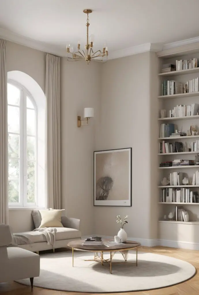
In the realm of interior design, the choice of paint color can significantly influence the ambiance and aesthetic appeal of a space. For those seeking a timeless yet contemporary vibe, Crisp Linen emerges as an exemplary choice. Its subtle sophistication and versatility make it a stellar option for revamping libraries and other modern spaces.
Why Crisp Linen?
Crisp Linen, as the name suggests, evokes a sense of freshness and clarity, making it an ideal hue for modernizing libraries. Here’s why I recommend this color for your next interior design project:
- Neutral Elegance: Crisp Linen boasts a soft, neutral tone that exudes understated elegance. It serves as an excellent backdrop for showcasing artwork, furniture, and décor elements, allowing them to stand out without overwhelming the space.
- Light Reflective Properties: The light-reflective properties of Crisp Linen brighten up rooms, creating an illusion of spaciousness. In libraries, where ample lighting is essential for reading and studying, this color helps enhance visibility and fosters a welcoming atmosphere.
- Versatile Coordination: Crisp Linen seamlessly coordinates with a variety of color schemes and design styles, from minimalist Scandinavian to classic traditional. Whether paired with bold accents or soothing pastels, it adds a touch of sophistication while maintaining harmony within the space.
- Timeless Appeal: Unlike trendy colors that may quickly fall out of favor, Crisp Linen possesses a timeless quality that ensures longevity in design. It transcends passing fads, making it a wise investment for library renovations that aim for enduring allure.
- Soothing Aura: The subtle warmth inherent in Crisp Linen induces a sense of tranquility and comfort, ideal for spaces dedicated to relaxation and intellectual pursuits. Its calming aura encourages concentration and contemplation, enhancing the overall library experience.
5 Tips to Match Color:
Achieving the perfect harmony in your library design involves careful consideration of color coordination. Here are five tips to effectively match Crisp Linen with other hues:
- Contrast with Deep Accents: Offset the lightness of Crisp Linen by incorporating deep, contrasting accents such as navy blue or charcoal gray for a visually striking effect.
- Complement with Earthy Tones: Enhance the natural appeal of Crisp Linen by pairing it with earthy tones like olive green or sandy beige, creating a harmonious connection to the surrounding environment.
- Accentuate with Metallic Finishes: Introduce touches of metallic finishes such as brass or copper to add a touch of glamour and sophistication to the muted elegance of Crisp Linen.
- Blend with Soft Pastels: Create a serene and serene atmosphere by combining Crisp Linen with soft pastel shades like blush pink or sky blue, evoking a sense of delicate charm and tranquility.
- Experiment with Monochromatic Schemes: Explore the depth and dimensionality of Crisp Linen by experimenting with monochromatic schemes, varying shades of white and off-white for a subtle yet visually engaging look.
5 Hue Matching:
When selecting hues to complement Crisp Linen, consider these five options for a cohesive color palette:
- Soft Sage: Infuse a hint of nature-inspired tranquility with soft sage green, enhancing the soothing ambiance of Crisp Linen while adding a touch of freshness to the space.
- Warm Taupe: Embrace warmth and sophistication by pairing Crisp Linen with warm taupe tones, creating a timeless and inviting atmosphere that exudes understated luxury.
- Dusty Rose: Add a touch of romance and femininity with dusty rose accents, balancing the crispness of Crisp Linen with soft, muted hues for a delicate and elegant aesthetic.
- Cool Slate: Achieve a modern and polished look by combining Crisp Linen with cool slate gray tones, creating a contemporary contrast that exudes urban chic sophistication.
- Subtle Lavender: Infuse a subtle hint of color and serenity with soft lavender undertones, complementing the purity of Crisp Linen while imbuing the space with a sense of calm and relaxation.
5 Alternative Colors from Sherwin Williams and
Benjamin Moore:
If Crisp Linen doesn’t quite fit your vision, consider these alternative colors from Sherwin Williams and Benjamin Moore:
- Sherwin Williams – Alabaster: A timeless off-white hue with warm undertones, Alabaster offers a versatile alternative to Crisp Linen, perfect for creating a light and airy ambiance in any space.
- Benjamin Moore – Revere Pewter: A sophisticated greige shade with subtle undertones of gray and beige, Revere Pewter lends a sense of warmth and depth to interiors, making it an excellent choice for modern libraries seeking a cozy yet contemporary feel.
- Sherwin Williams – Repose Gray: A soft and serene gray with subtle undertones of taupe, Repose Gray provides a neutral backdrop that complements a wide range of color schemes and design styles, making it a versatile option for library renovations.
- Benjamin Moore – Edgecomb Gray: A timeless and versatile greige hue with warm undertones, Edgecomb Gray strikes the perfect balance between gray and beige, offering a sophisticated yet understated backdrop for libraries seeking a classic and inviting atmosphere.
- Sherwin Williams – Agreeable Gray: A popular greige shade with warm undertones, Agreeable Gray exudes a sense of comfort and versatility, making it an excellent choice for libraries aiming for a welcoming and inviting ambiance.
Other Rooms to Use Crisp Linen:
Beyond libraries, Crisp Linen can enhance the aesthetic appeal of various other rooms in your home:
- Living Room: Create a light and airy living room retreat by painting the walls in Crisp Linen, allowing natural light to bounce off the surfaces and infuse the space with warmth and brightness.
- Bedroom: Foster a serene and tranquil bedroom oasis with Crisp Linen walls, setting the stage for restful sleep and relaxation amidst a soothing palette of neutral tones.
- Home Office: Cultivate a productive and inspiring home office environment with Crisp Linen as the backdrop, promoting focus and creativity while maintaining a sense of sophistication and style.
- Dining Room: Set the stage for memorable gatherings and intimate dinners by painting the dining room walls in Crisp Linen, creating a refined yet inviting atmosphere that enhances the dining experience.
- Bathroom: Transform your bathroom into a spa-like sanctuary with Crisp Linen walls, evoking a sense of cleanliness and serenity that elevates the overall bathing and grooming experience.
Conclusion:
In the ever-evolving landscape of interior design, Crisp Linen stands out as a timeless and versatile hue that breathes new life into modern spaces. Its neutral elegance, light-reflective properties, and soothing aura make it an exemplary choice for revamping libraries and beyond. By following the tips for color matching and exploring alternative options, you can effortlessly integrate Crisp Linen into your home, creating a cohesive and inviting atmosphere that inspires both relaxation and productivity. Whether adorning the walls of a library, living room, or bedroom, Crisp Linen promises to imbue your space with timeless sophistication and enduring charm.


