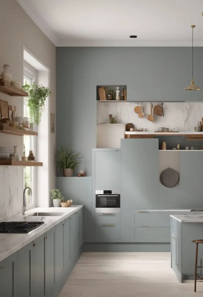
In the ever-evolving realm of interior design, selecting the perfect color for your kitchen can significantly impact the ambiance and overall aesthetic of your space. Topsail paint emerges as a contemporary choice, seamlessly blending modern elegance with timeless charm. This versatile hue from Sherwin Williams encapsulates a serene and sophisticated vibe, making it an ideal candidate for revitalizing your kitchen. Here’s why Topsail deserves a place on your palette.
Why Choose Topsail Paint?
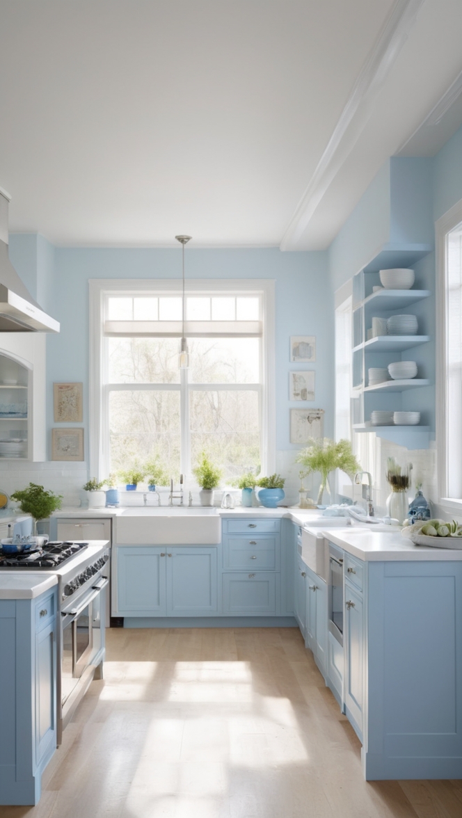
- Soothing Sophistication: Topsail boasts a delicate balance of blue and green undertones, creating a soothing backdrop that exudes sophistication. Its calming presence fosters a tranquil atmosphere, perfect for unwinding after a long day or enjoying leisurely meals with loved ones.
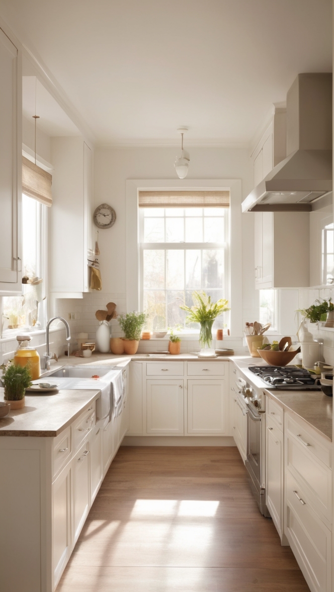
- Light-Reflective Properties: One of Topsail’s most alluring qualities is its ability to reflect light, infusing your kitchen with a luminous glow. This feature is particularly advantageous for smaller or dimly lit spaces, as it can enhance the perceived size and brightness of the room, creating an airy and welcoming environment.
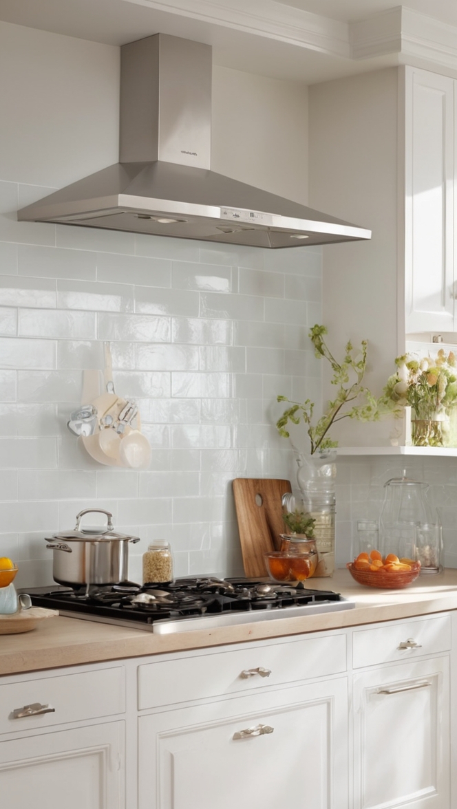
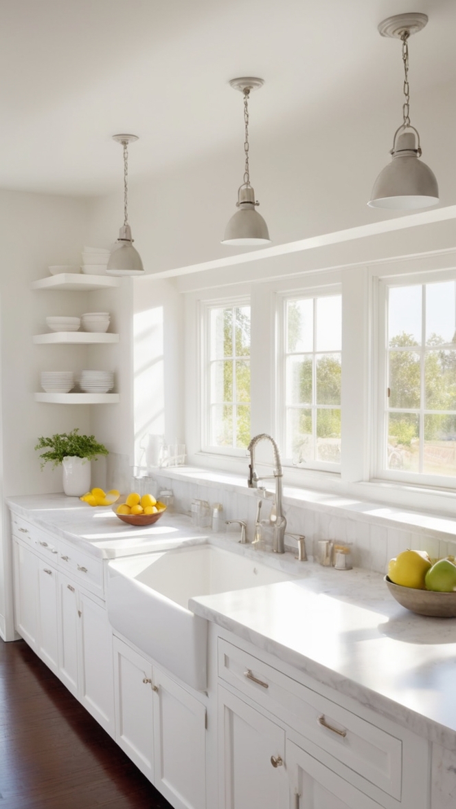
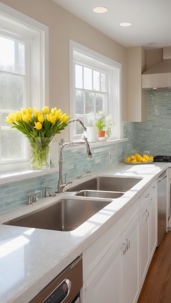
- Versatile Pairing Options: Whether your kitchen flaunts a modern, minimalist aesthetic or embraces rustic charm, Topsail effortlessly complements a myriad of design styles. Pair it with sleek stainless steel appliances and crisp white cabinetry for a contemporary look, or incorporate natural wood accents for a more organic feel. Its adaptability makes it a versatile choice for any kitchen renovation project.
- Timeless Appeal: While interior design trends may come and go, Topsail transcends fleeting fads with its enduring appeal. Its understated elegance lends itself to both classic and contemporary spaces, ensuring that your kitchen remains stylish and relevant for years to come.
- Easy Integration with Accents: Adding pops of color through decor accents and accessories is a breeze with Topsail as your backdrop. Experiment with vibrant hues like coral, mustard, or terracotta for a playful contrast, or opt for metallic finishes to infuse a touch of glamour into your kitchen decor.
Tips to Match Topsail Paint:
- Neutral Foundations: When selecting cabinetry and countertops to complement Topsail, opt for neutral hues such as white, gray, or taupe to create a harmonious balance and allow the paint color to take center stage.
- Natural Elements: Integrate natural materials like wood, stone, or marble into your kitchen design to enhance Topsail’s organic appeal. These textures add depth and visual interest while maintaining a cohesive aesthetic.
- Statement Lighting: Incorporate statement lighting fixtures in brass, copper, or matte black to accentuate Topsail’s elegance and create focal points within the space. Pendant lights above the kitchen island or a chandelier above the dining area can elevate the overall ambiance.
- Subtle Contrasts: Experiment with subtle contrasts by incorporating darker or lighter shades of blue and green throughout your kitchen design. This adds depth and dimension while maintaining a cohesive color scheme anchored by Topsail.
- Texture Play: Incorporate texture through textiles such as curtains, rugs, and upholstery to add warmth and visual interest to your kitchen. Opt for fabrics in soft blues, greens, or neutral tones to complement Topsail’s serene palette.
Hue Matching with Topsail:
- Cool Grays: Pairing Topsail with cool gray tones creates a sophisticated and contemporary look, enhancing the overall tranquility of the space while adding depth and contrast.
- Soft Greens: Embrace the green undertones of Topsail by pairing it with soft green accents or botanical motifs, evoking a sense of freshness and vitality within your kitchen.
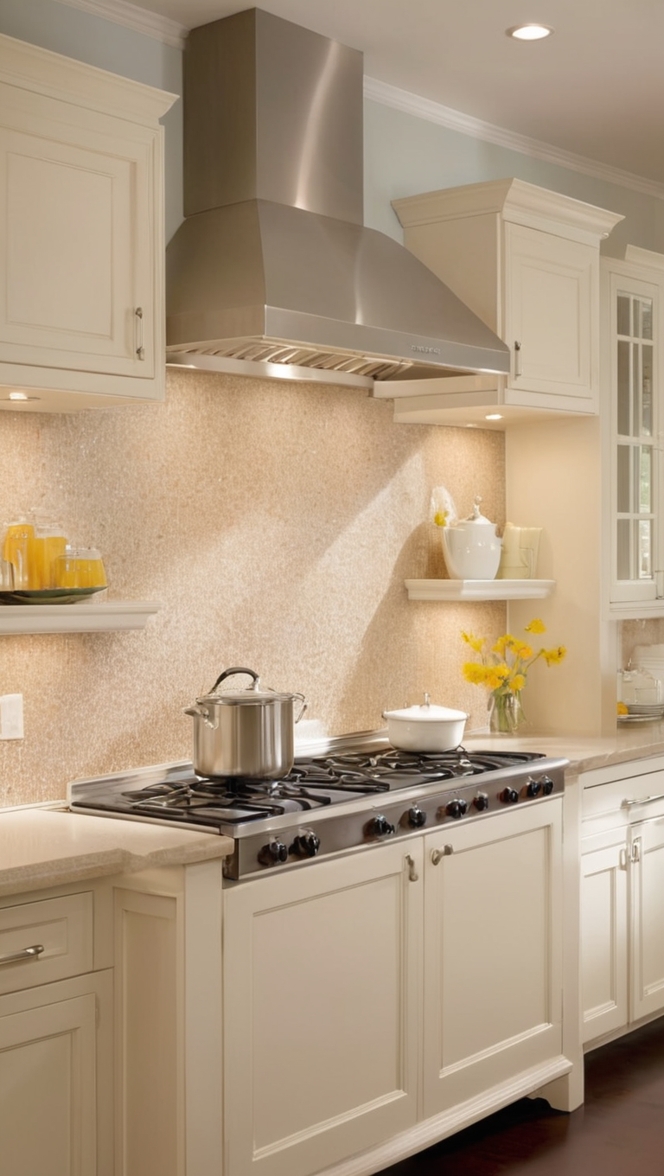
- Warm Whites: Balance Topsail’s cool undertones with warm white hues like ivory or cream for a timeless and inviting aesthetic that exudes understated elegance.
- Subdued Blues: Amplify Topsail’s serene vibe by incorporating subdued blue hues in varying shades, creating a cohesive color palette that promotes relaxation and calm.
- Earthy Browns: Introduce earthy brown tones through natural wood finishes or accents to ground Topsail’s airy palette and infuse warmth and richness into your kitchen design.
Alternative Colors from Sherwin Williams and Benjamin Moore:
- Sherwin Williams – Sea Salt: A pale, muted green with hints of gray, Sea Salt offers a soft and serene alternative to Topsail, perfect for creating a tranquil atmosphere in your kitchen.
- Sherwin Williams – Repose Gray: A versatile greige with warm undertones, Repose Gray complements Topsail beautifully, adding depth and sophistication to your kitchen design.
- Benjamin Moore – Gray Owl: This soft, versatile gray with subtle green undertones pairs effortlessly with Topsail, creating a timeless and sophisticated color palette for your kitchen.
- Benjamin Moore – Edgecomb Gray: A warm greige with a hint of taupe, Edgecomb Gray provides a subtle yet sophisticated backdrop for Topsail, adding warmth and depth to your kitchen space.
- Sherwin Williams – Agreeable Gray: A warm gray with beige undertones, Agreeable Gray harmonizes with Topsail, creating a cohesive and inviting atmosphere in your kitchen.
Other Rooms to Use Topsail:
Living Room: Incorporate Topsail into your living room design to create a serene and inviting space for relaxation and entertainment. Pair it with soft neutrals, plush textiles, and natural accents for a cozy yet elegant ambiance.
Bedroom: Infuse your bedroom with tranquility by painting the walls in Topsail. This soothing hue promotes restful sleep and relaxation, especially when paired with crisp white linens, soft lighting, and plush rugs.
Bathroom: Transform your bathroom into a spa-like sanctuary with Topsail paint. Its calming blue-green tones evoke a sense of serenity, perfect for unwinding after a long day. Pair it with marble countertops, sleek fixtures, and plush towels for a luxurious yet tranquil retreat.
Conclusion:
In the realm of interior design, selecting the perfect paint color can significantly impact the ambiance and overall aesthetic of your space. Topsail paint from Sherwin Williams emerges as a top contender, offering a modern yet timeless palette that exudes sophistication and tranquility. Its soothing blue-green undertones and light-reflective properties make it an ideal choice for revitalizing your kitchen, creating a serene backdrop that effortlessly complements a variety of design styles. By following these tips for matching Topsail paint and exploring alternative color options, you can transform your space into a haven of style and elegance that will stand the test of time.

